The Work Order Kiosk provides an efficient way to report maintenance or facilities
issues in college campus buildings. Consisting of a tablet that can be mounted on the wall,
the kiosk is designed to help students and faculty quickly
report issues while providing written documentation for maintenance staff.
Context
2020 Google Design Challenge
Duration
1 week
My Role
User researcher, UX designer
Tools
Adobe Illustrator, Miro
Team
Individual project
Prompt
Design Question
How might we create a system for reporting maintenance issues in campus buildings
that is streamlined, simple, and efficient for both students and faculty reporting as
well as those taking action on the issues?
Scoping
At the University of Washington, each campus building is home to one or more departments.
The main office for each department is responsible for communicating building maintenance
needs to the to the university facilities department. The main office consists of the
front desk receptionist, building manager, and other administrative personnel.
I decided to focus on Sieg Hall. Home to two departments, there are four floors consisting of
classrooms, computer labs, and faculty offices.
I chose to focus on one building because each building has separate leadership and processes
for communicating maintenance needs.
Users
Students, staff, and faculty who are regulars in Sieg;
Front desk staffers and maintenance team in Sieg
Design Process
User interviews, ideation, paper prototypes, usability tests, high fidelity prototypes
User Interviews
Overview
I conducted interviews with 3 undergrad students and 1 front desk receptionist. I chose
these users to understand the experiences of both those who report maintenance needs
and those who respond.
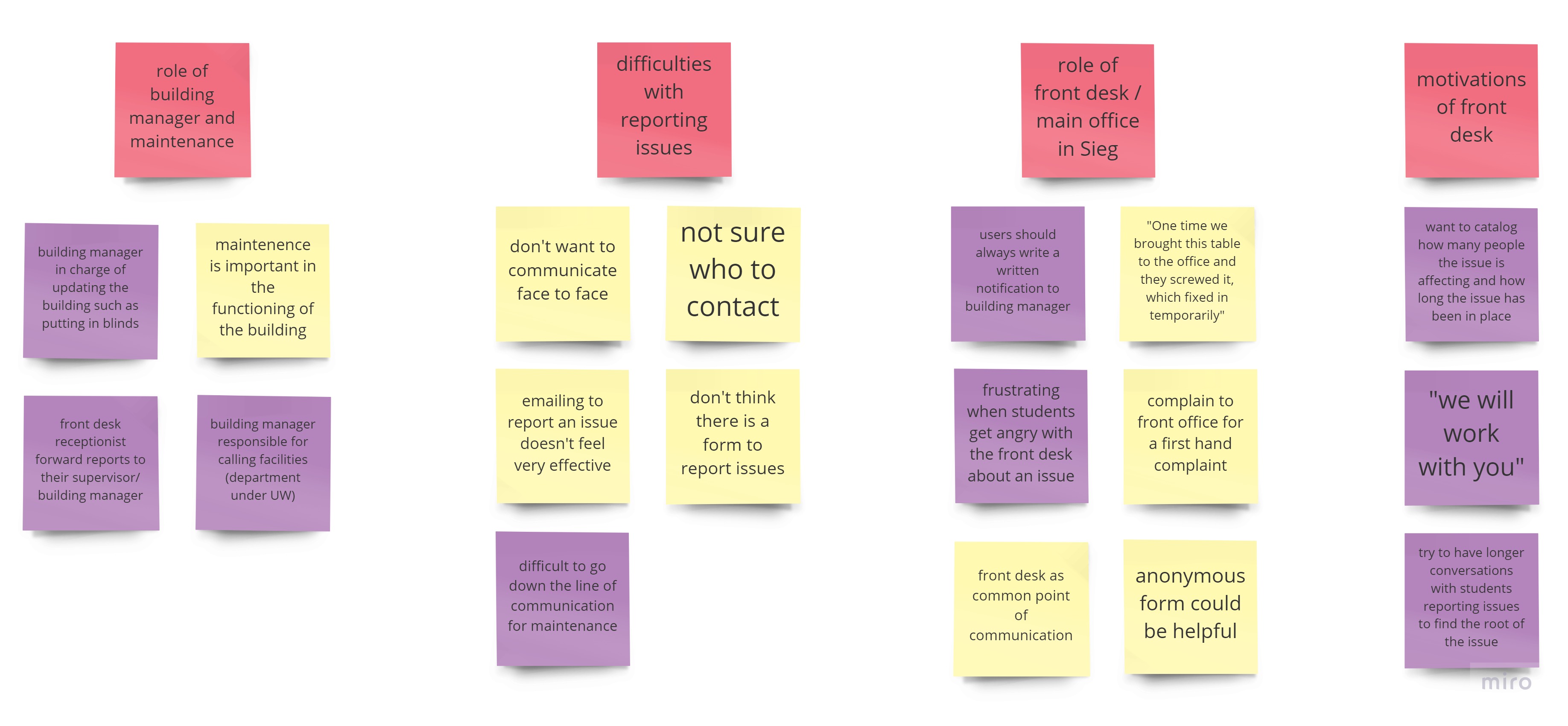
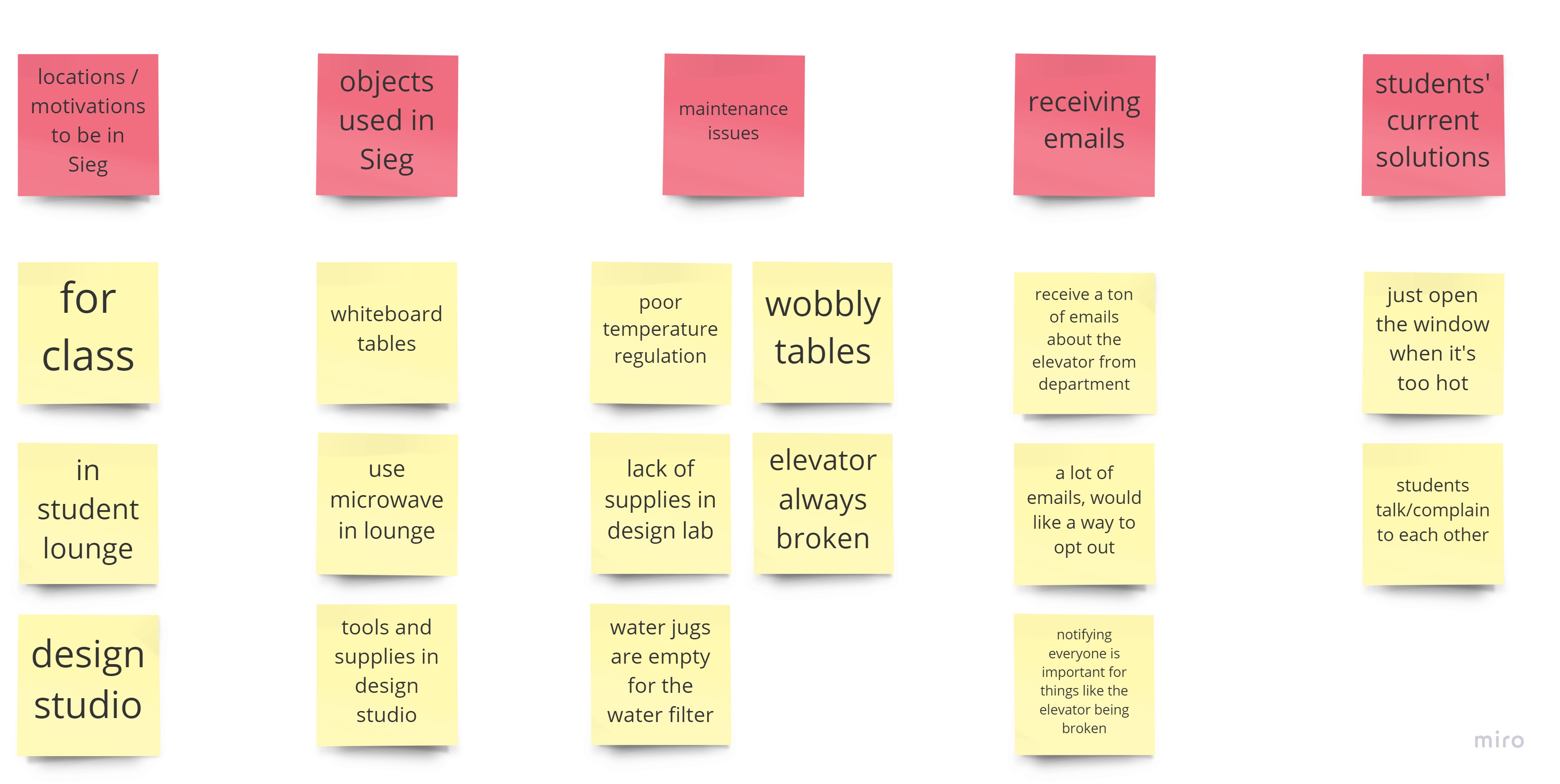
Affinity Diagramming
1 / 2
(Slideshow) Affinity diagramming (yellow = students, purple = front desk)
2 / 2
Affinity diagramming (yellow = students, purple = front desk)
From the four interviews, I gained the following insights.
Students are unsure of how to report maintenance issues; there is no clear process
to report issues.
Students do not want to go out of their way to report an issue.
Students go to the front desk/main office for general communication needs.
Communication regarding maintenance and building issues are funneled through the
building manager.
It is important for maintenance to catalog and have written documentation of
issues and reports.
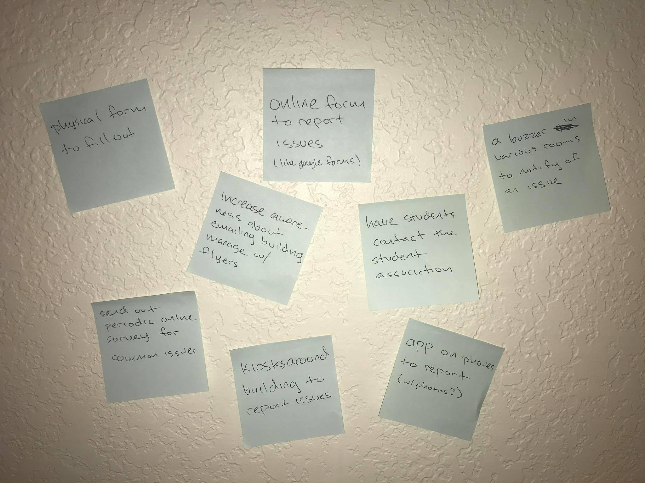
Ideation
Brainstorming
I explored possible solutions through an ideation round with the insights in mind.
Ideating
Highlighted Ideas
Kiosk stations around the building
Pros: prominent and distinct, usable by people from other departments
Cons: more physical resources required, users have to seek out the kiosk
App that students can download
Pros: users don't have to get out of their seats, doesn't require new resources
Cons: users have to download another app, not everyone has accessed to a smartphone,
might be distracting to have to pull out phone
Paper Prototypes
Overview
Ultimately, I decided to further iterate on the kiosk idea because I felt that
students would not report issues if doing so required pulling out their phone and
downloading an app. Kiosks located around the building would provide an accessible
way to report maintenance issues.
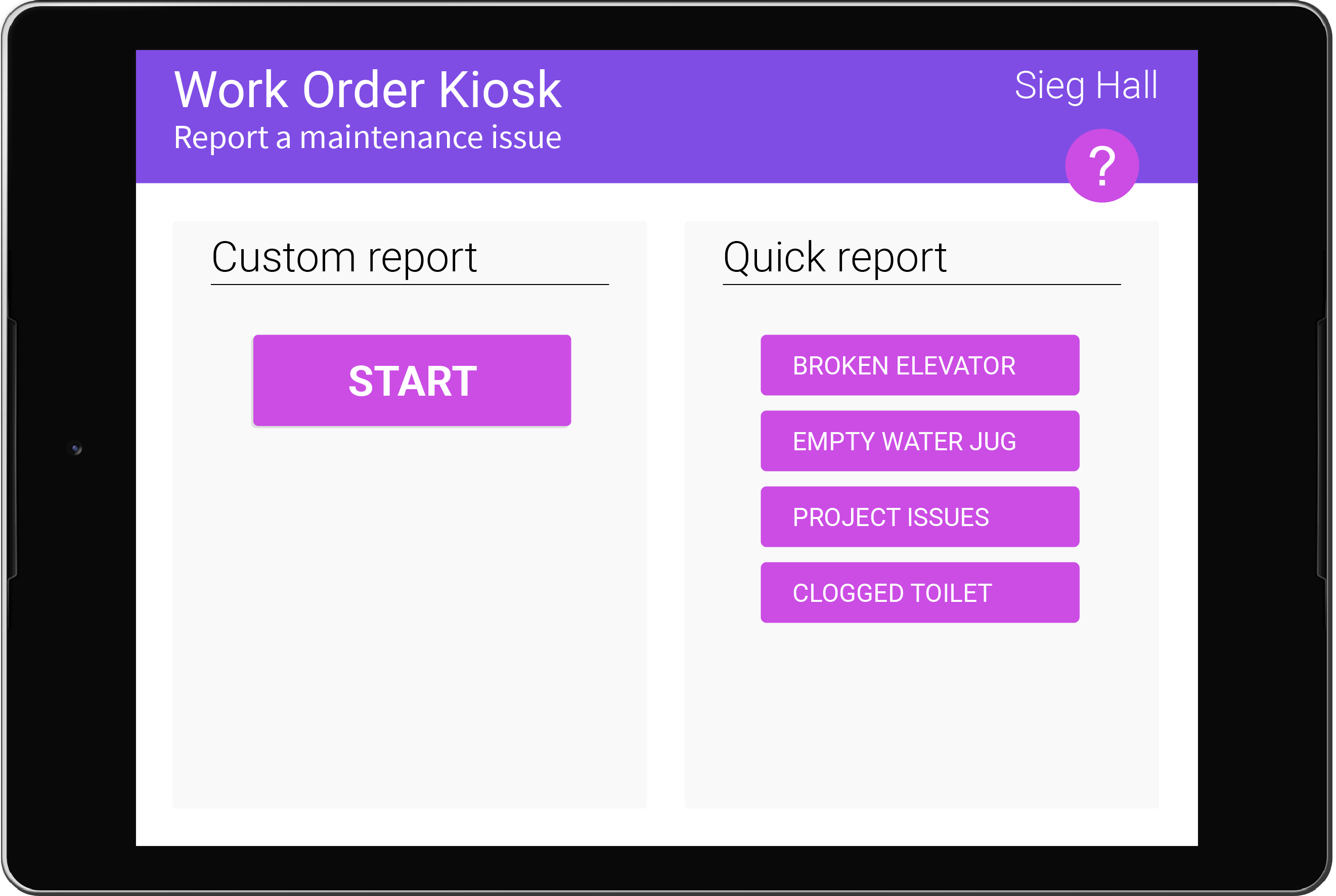
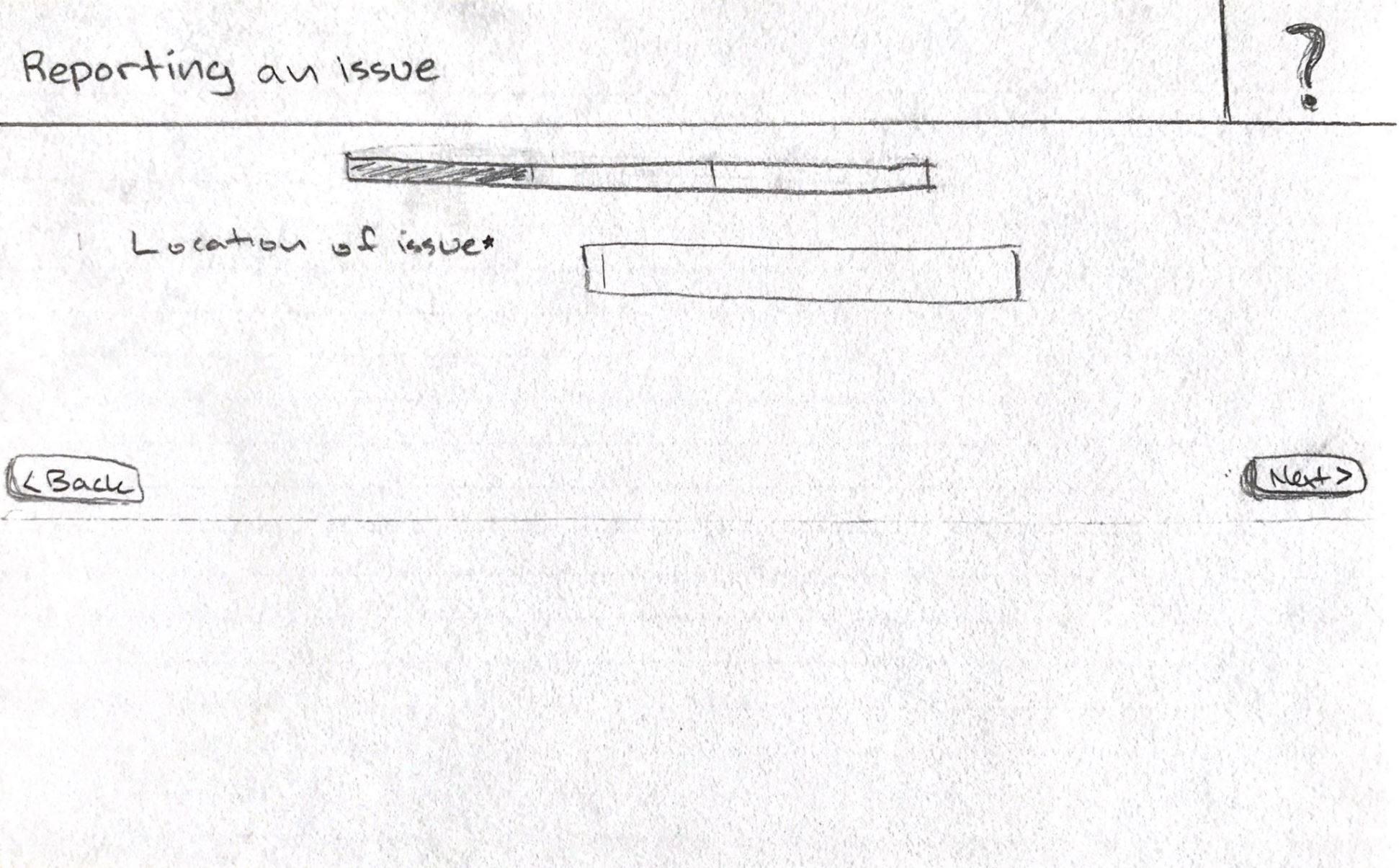
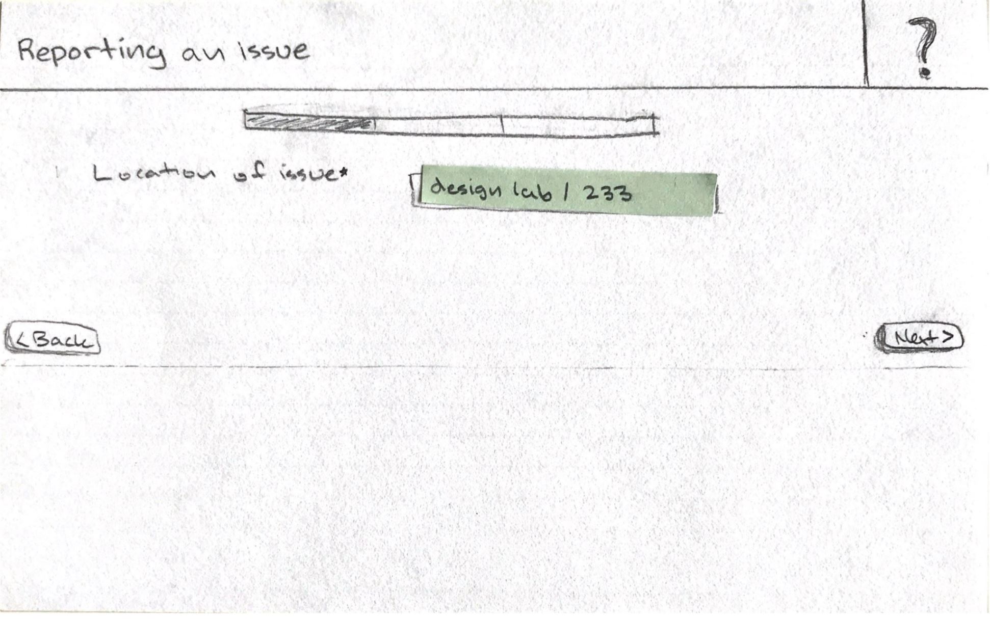
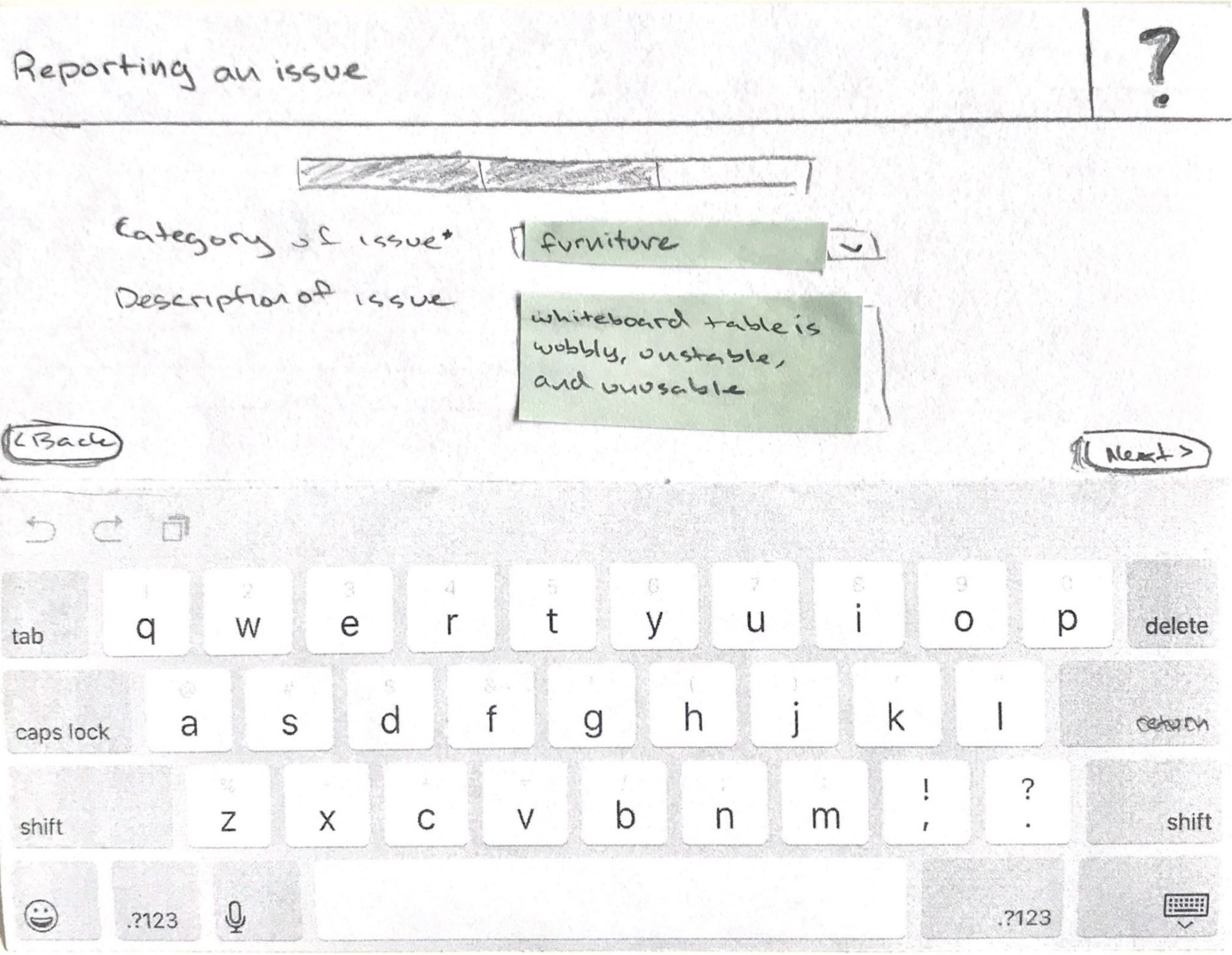
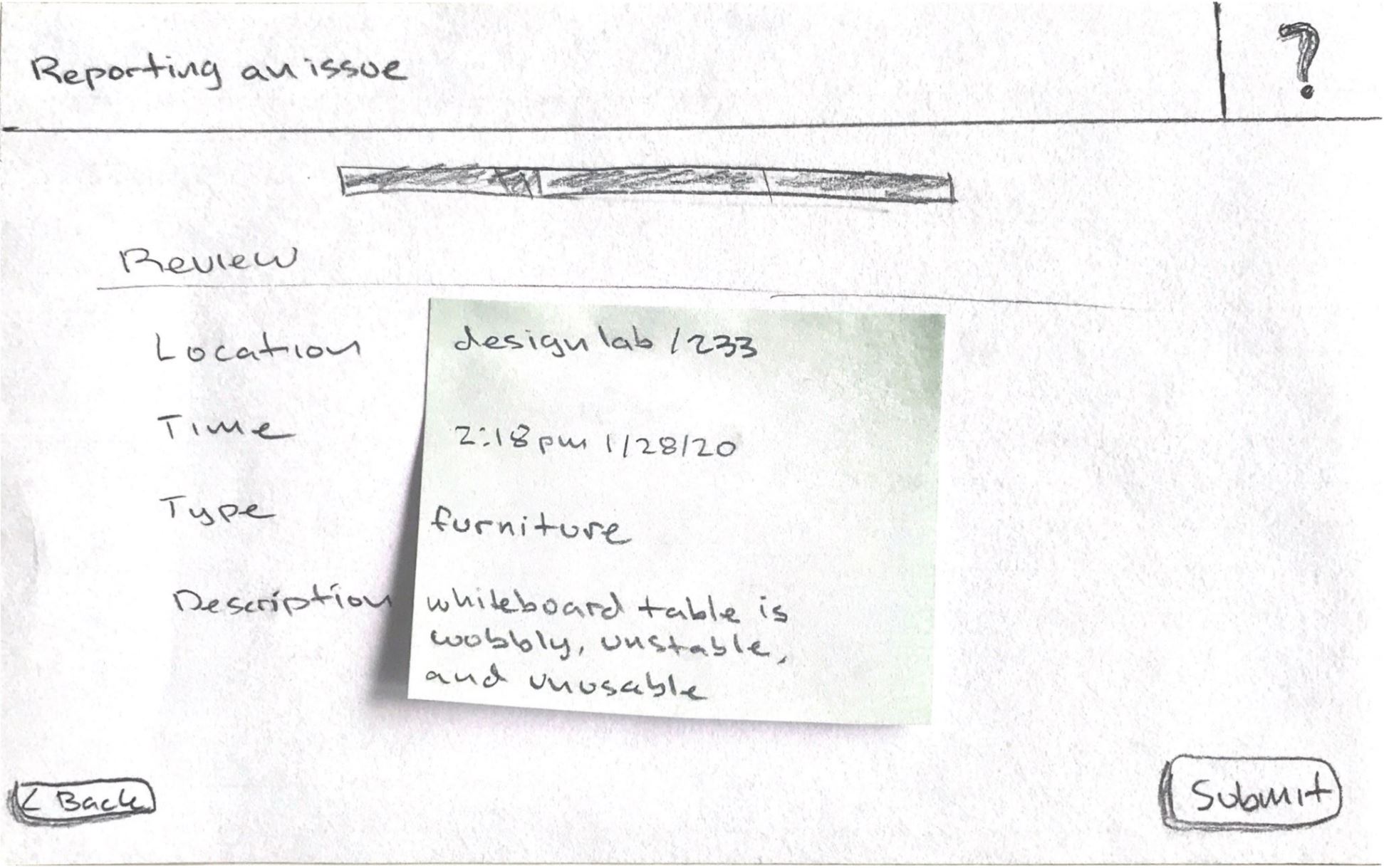
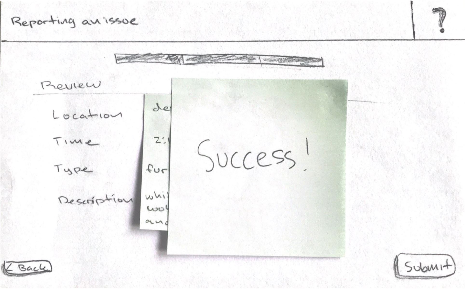
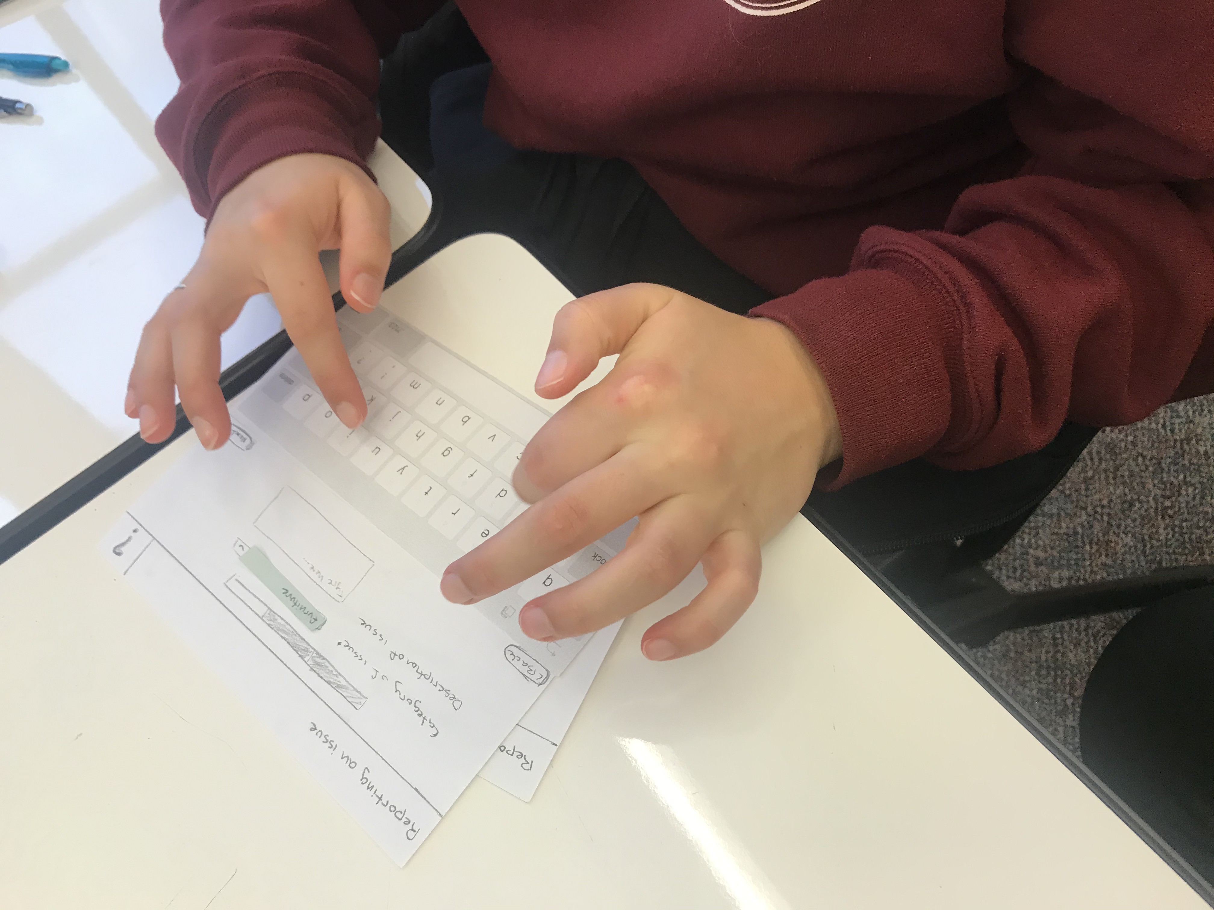
To explore the kiosk idea, I created paper prototypes highlighting two task flows.
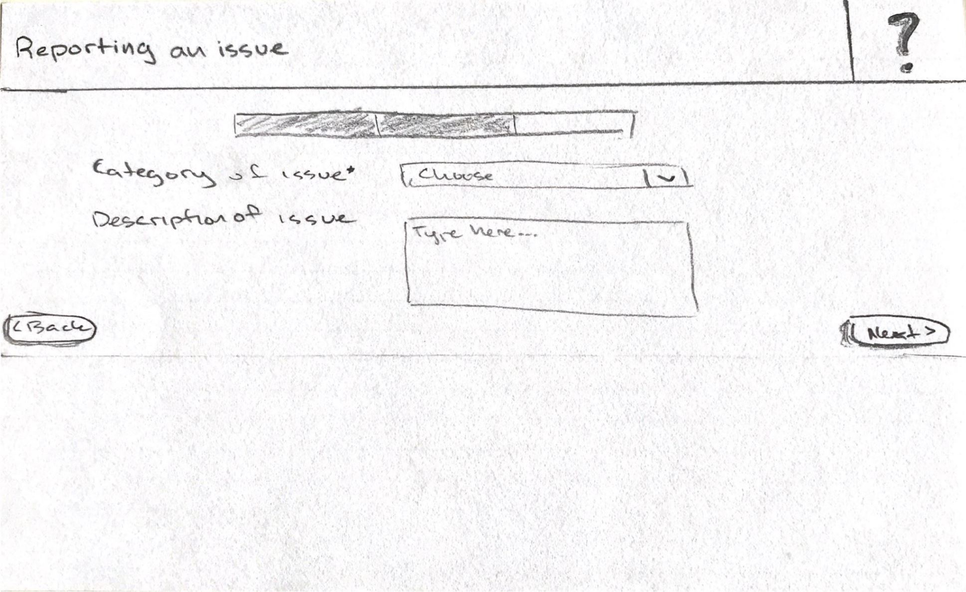
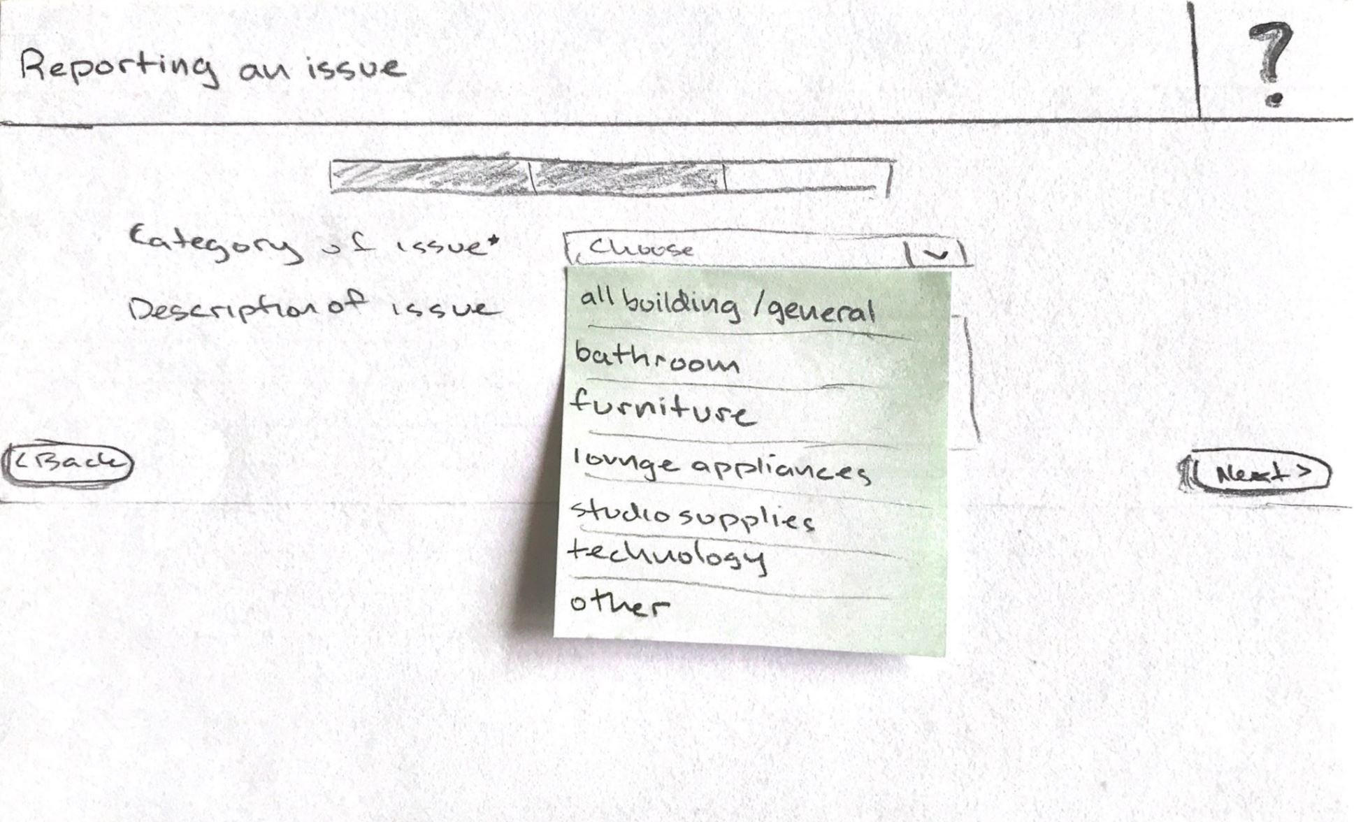
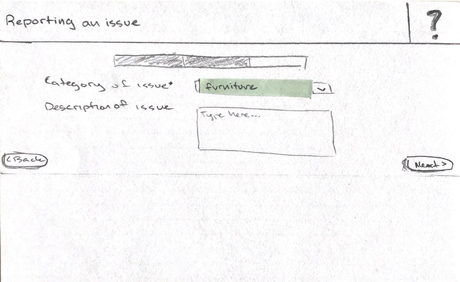
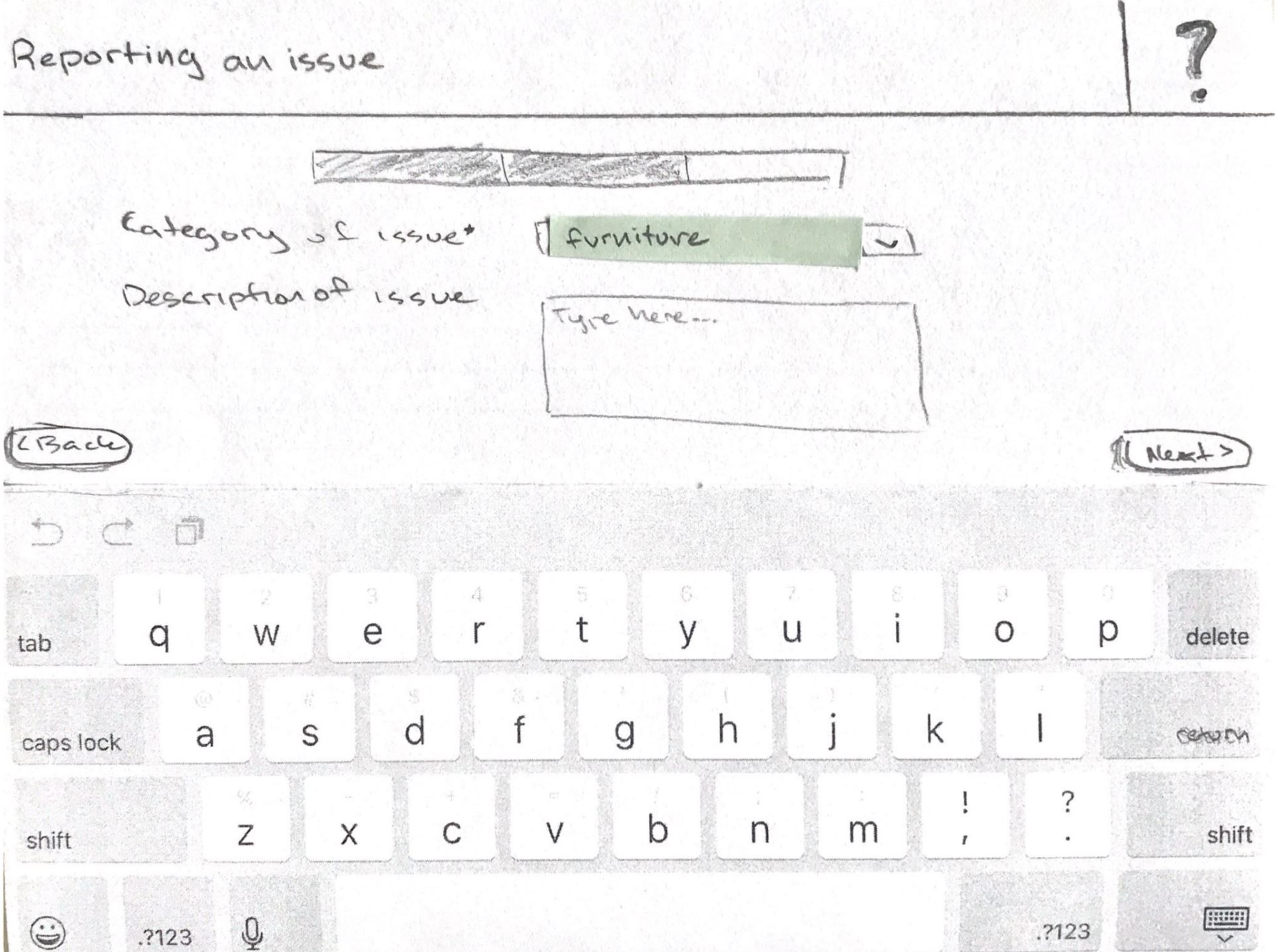
Task 1: Custom report
Task 1 requires reporting a wobbly whiteboard table in the design lab.
Whiteboard tables are ubiquitous in Sieg Hall since most of the classrooms are used
for design-related classes, which focus on collaboration and the design process.
1 / 12
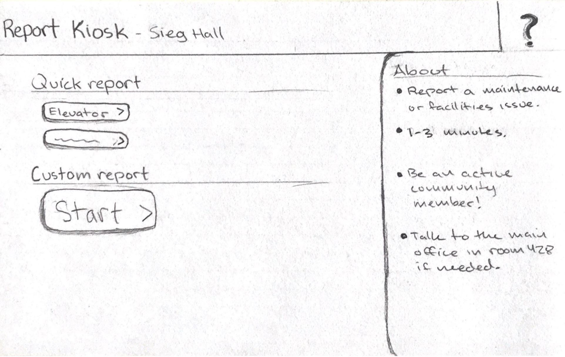
(Slideshow) Main screen, clicking "Start" custom report
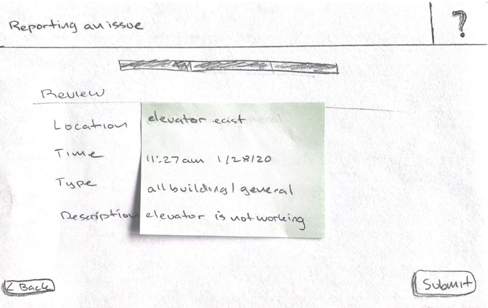
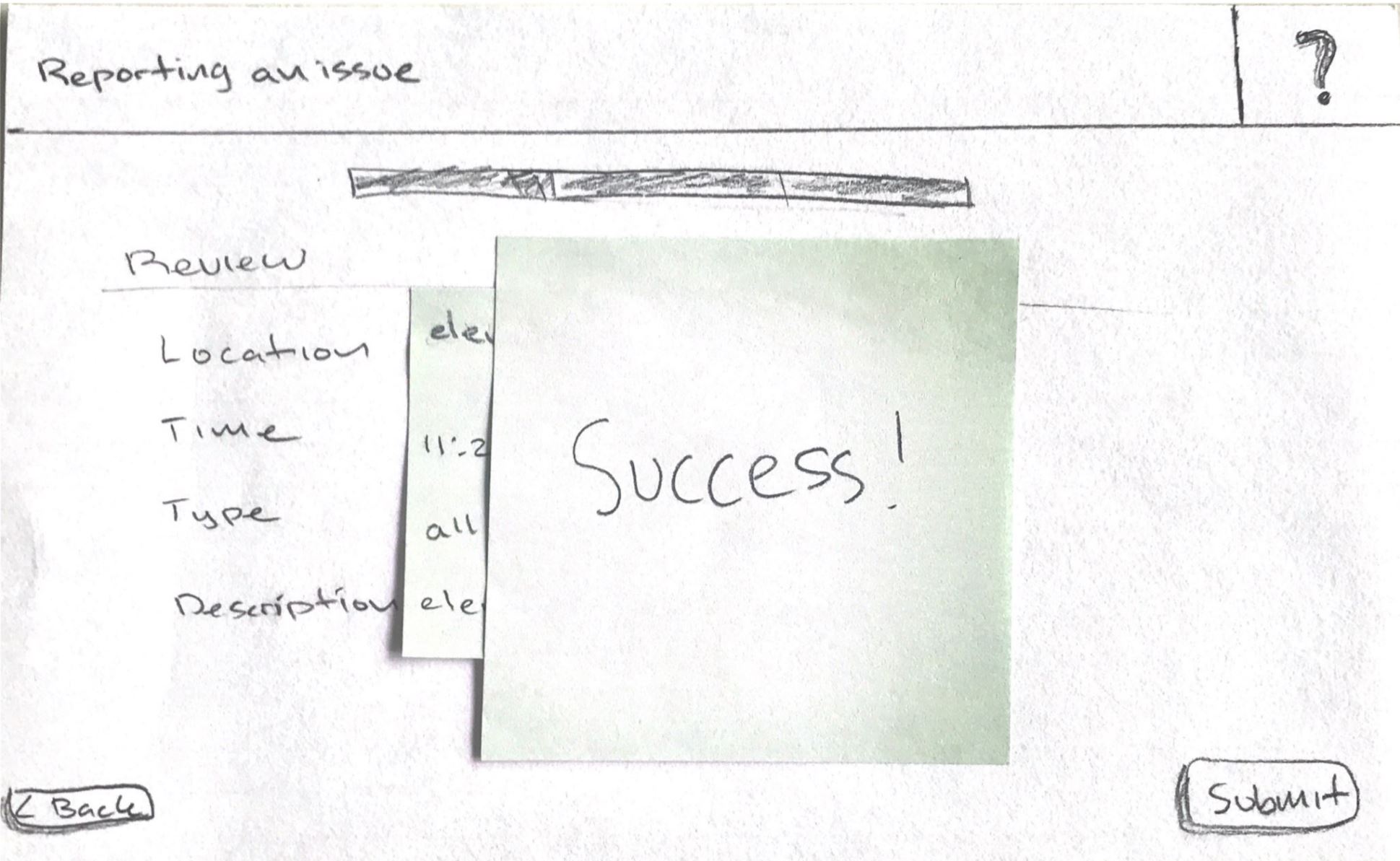
Task 2 requires reporting that the elevator is broken again.
Elevators are often broken in the older Sieg Hall. A barrier for wheelchair access,
a broken elevator is an important maintenance issue.
1 / 3
(Slideshow) Main screen, clicking "Elevator" quick report
In the “About” panel, I wanted to motivate students to report issues through a
nudge about community engagement and a reminder about the minimal time needed to
report. I also included a progress bar so students can feel the brevity of the task.
Usability Tests
Overview
I conducted four usability tests with students who frequent Sieg Hall. Testing the
paper prototypes allowed me to see the concept in action and revealed successes and
shortcomings.
Usability testing
Takeaways
Students are more motivated to complete the report when they notice the progress bar
shows minimal sections.
Students are confused when the quick report jumps to the review screen.
It is unclear how to edit a quick report.
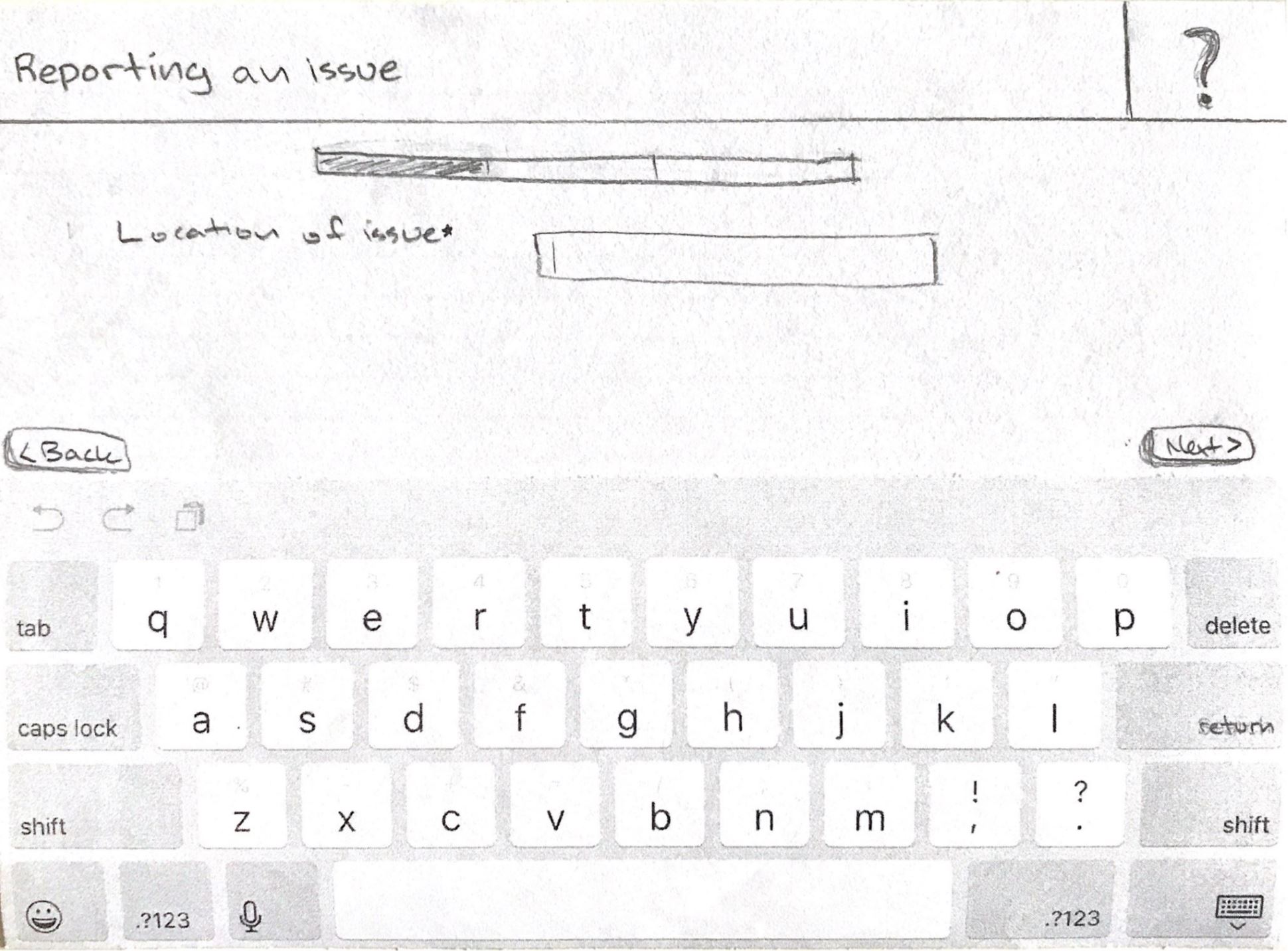
Students assume they can start typing right away on screens such as the location step.
Students would like at least a kiosk per floor.
High Fidelity Prototypes
Iteration
The findings from the usability tests motivated the following adjustments.
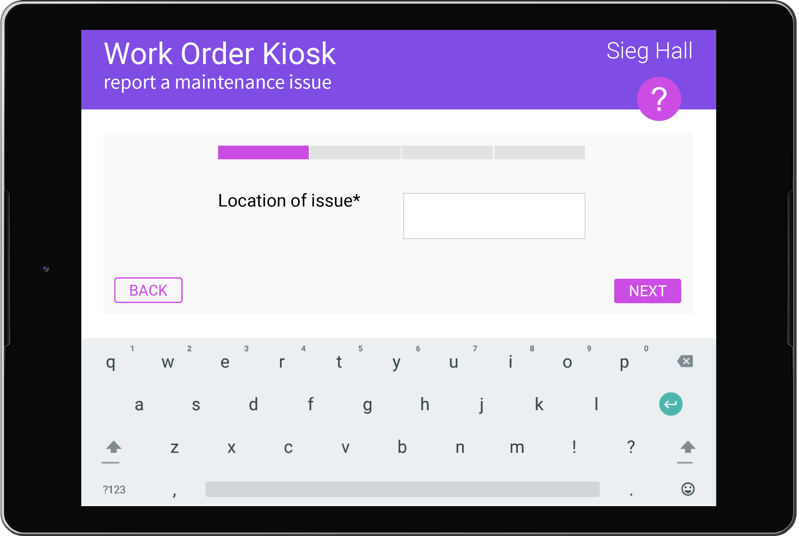
Choosing a quick report will pre-fill the form out so that users can easily edit the
information if needed. This replaces the original flow where quick reports jumps straight
to the review report screen, which caused confusion for users, therefore limiting the
information users wanted to include.
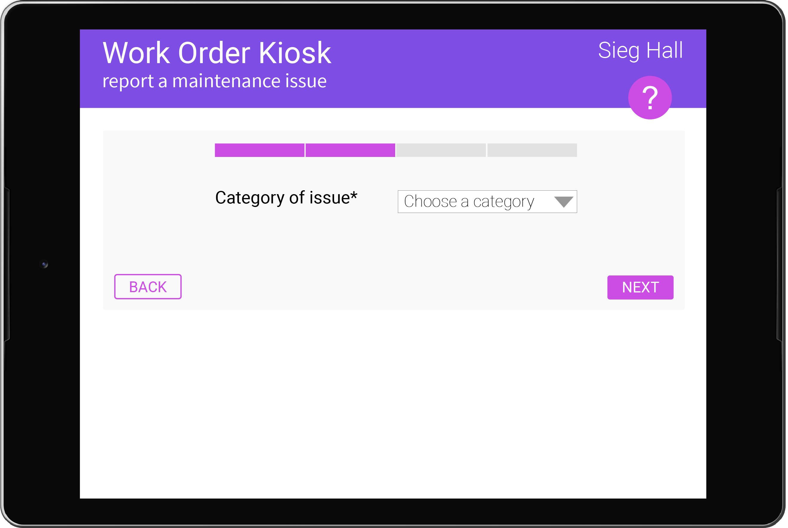
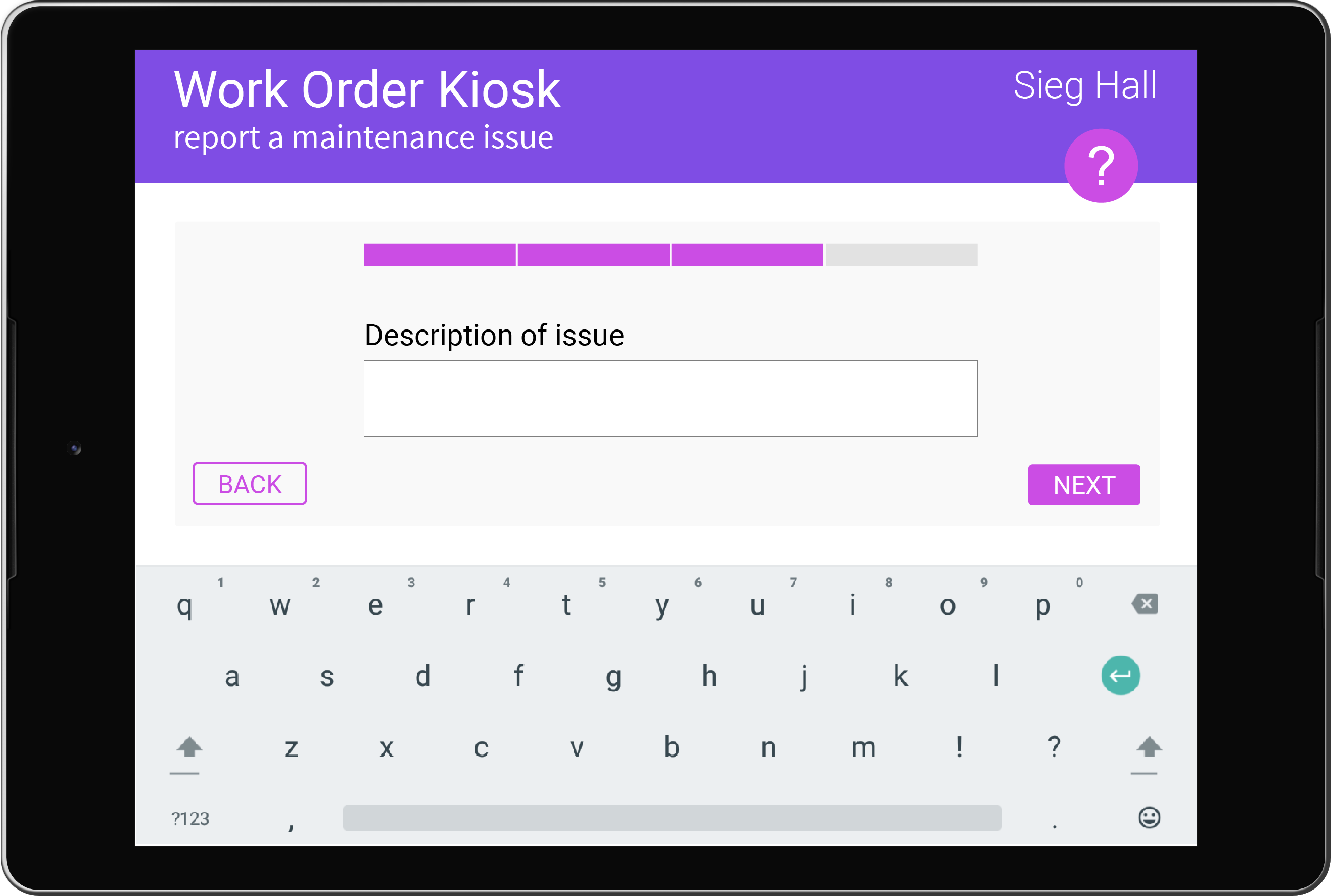
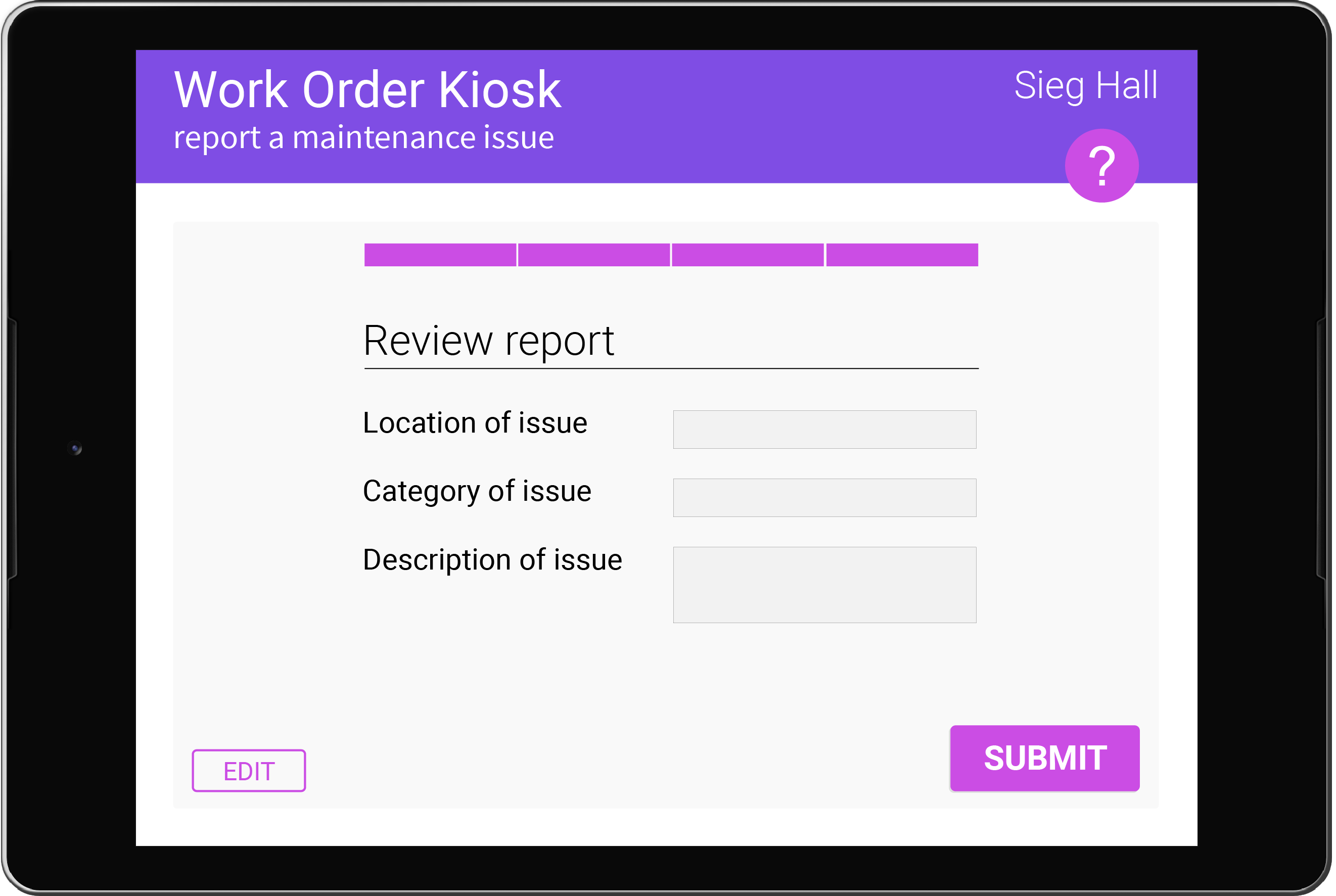
There will be four screens for the report instead of three screens. This change was
made so that no scrolling is needed on the category/description page.
The keyboard will automatically appear on pages that have a textbox. Users expected the
keyboard to appear immediately and were surprised they had to tap
the textbox for the keyboard to appear.
The automatic time stamp was removed because the information was not relevant to
the reporter.
The about panel was hidden because users found it unnecessary and visually awkward.
High Fidelity Mockups
For the design of the screens, I followed Material Design standards for UI features
such as buttons and colors. I also continued a minimalistic design strategy to meet
users' desires. Dark grey boxes represent text that is for review only and not for editing.
Overall, the kiosk would be a tablet that is mounted on a wall, tilted at an upward angle.
An ergonomic tilt is important so that the kiosk is similar to typing on a keyboard
or typing on a phone or tablet. There would
be at least one kiosk per floor, and/or located in major room locations.
On the maintenance end, the reports will include a timestamp. From the user
interviews, timestamps would allow the maintenance team to “catalog
how many people [an issue is] affecting and how long the issue has
been in place.” The maintenance team can then triage issues and flag
those that need to be addressed immediately, such as a broken
elevator.
Implementation & Future Directions
Implementation
To implement the kiosks, the team would have to collaborate with the building
manager/front office, maintenance team, and university administration. The team must
include at a minimum a program manager to communicate with the clients, a software
developer to develop the software for the kiosk, and a UX researcher and designer to
continue iterating on the concept.
Future Direction
In the future, I would like to conduct more user research to understand the problem
space more in depth, especially on the maintenance end. As I was only able to interview
the front desk receptionist, the experience of the building manager and janitors would
also be important and valuable. Generally, I would also want to more closely
evaluate the desirability, functionality, and usability of the kiosk system as a whole for
both user groups. It is also essential that the kiosks are accessible to all users in
terms of both digital and physical design. The kiosks can be expanded to multiple
buildings across campus as well.