
Hitched
A Solution for Wedding Coordinators
Hitched aims to put a wedding coordinator’s information and documents for each of their weddings into one place. Its four features, “Checklist”, “Schedule”, “Contacts”, and “Seating Chart” streamline key wedding functions, making them easily accessible for the coordinator on the wedding day.
Context
Course work for Introduction to User-Centered Design
Duration
10 weeks (autumn 2018)
My Role
Primary digital visual designer, UX designer
Tools
Adobe Illustrator, Figma, Lucidchart
Team
Anthea Bartlett, Sara Behbakht, Theresa Tran
Full Documentation
Process
Purpose
How might we support wedding coordinators in the execution of their client’s dream wedding day?
User Interviews
Overview
We conducted three semi-structured interviews with wedding planners and coordinators, as well as additional informational interviews with wedding vendors and a bride.
Insights
| Communicating with and keeping track of all parties included in a wedding is complicated and confusing. | Managing different wedding documents such as the seating chart, schedules, and contact information can be tedious. | This user is motivated by seeing the wedding come together after all the time and effort she put into the event. |
Personas
Overview
After synthesizing information from the interviews, we developed two personas focus on displaying the goals, desires, and pain points of planners and coordinators.
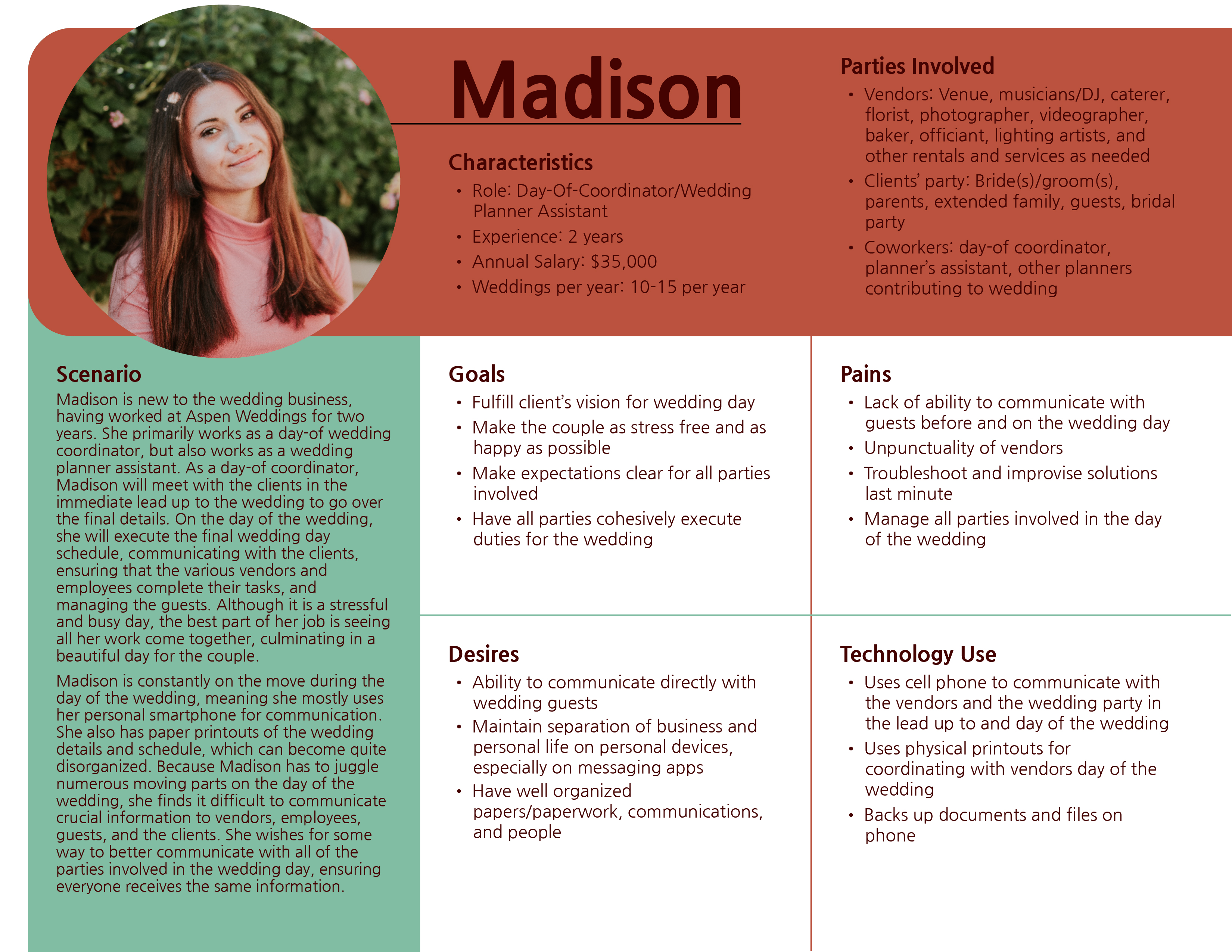
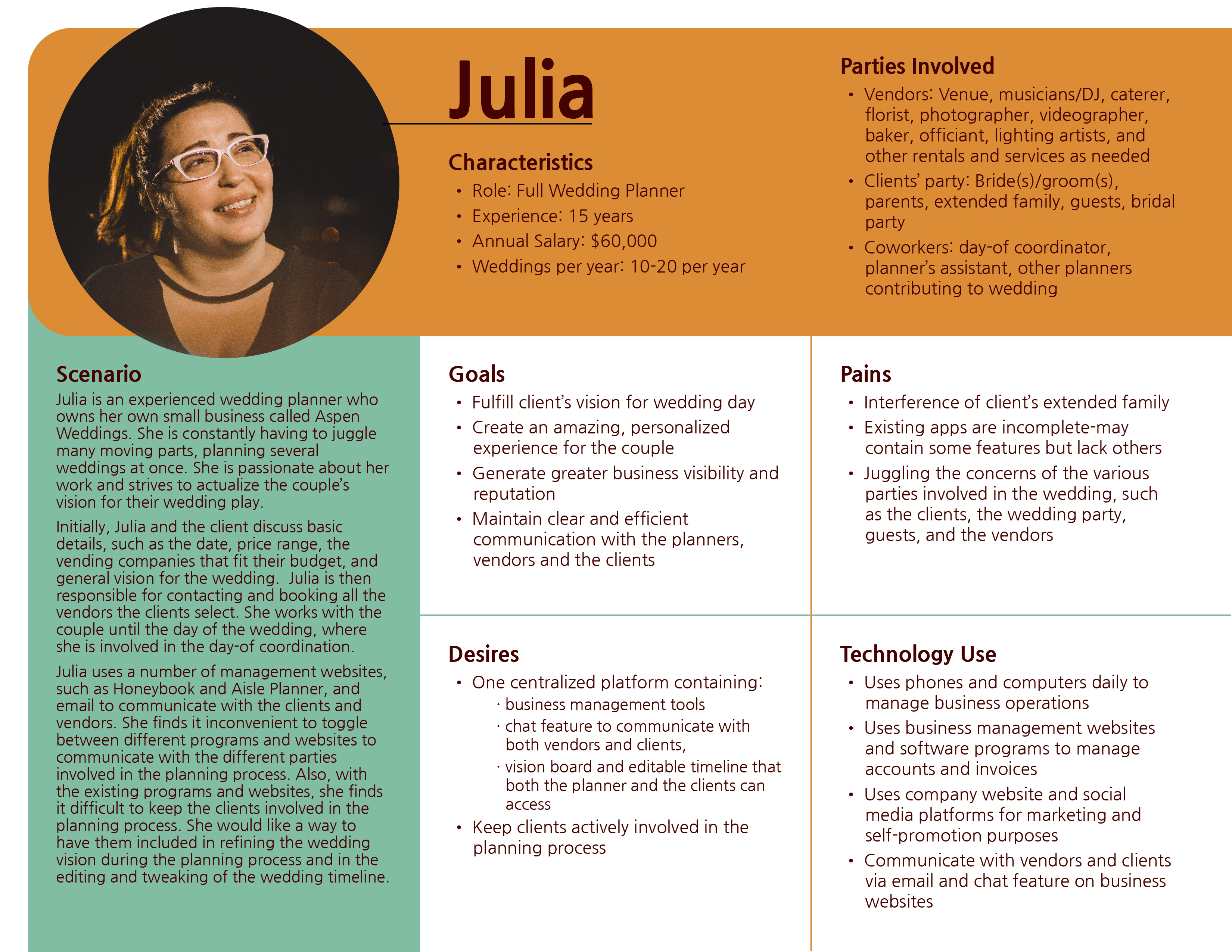
Takeaway
The personas were a crucial turning point for our project, showing us that planners and coordinators have two distinct roles.
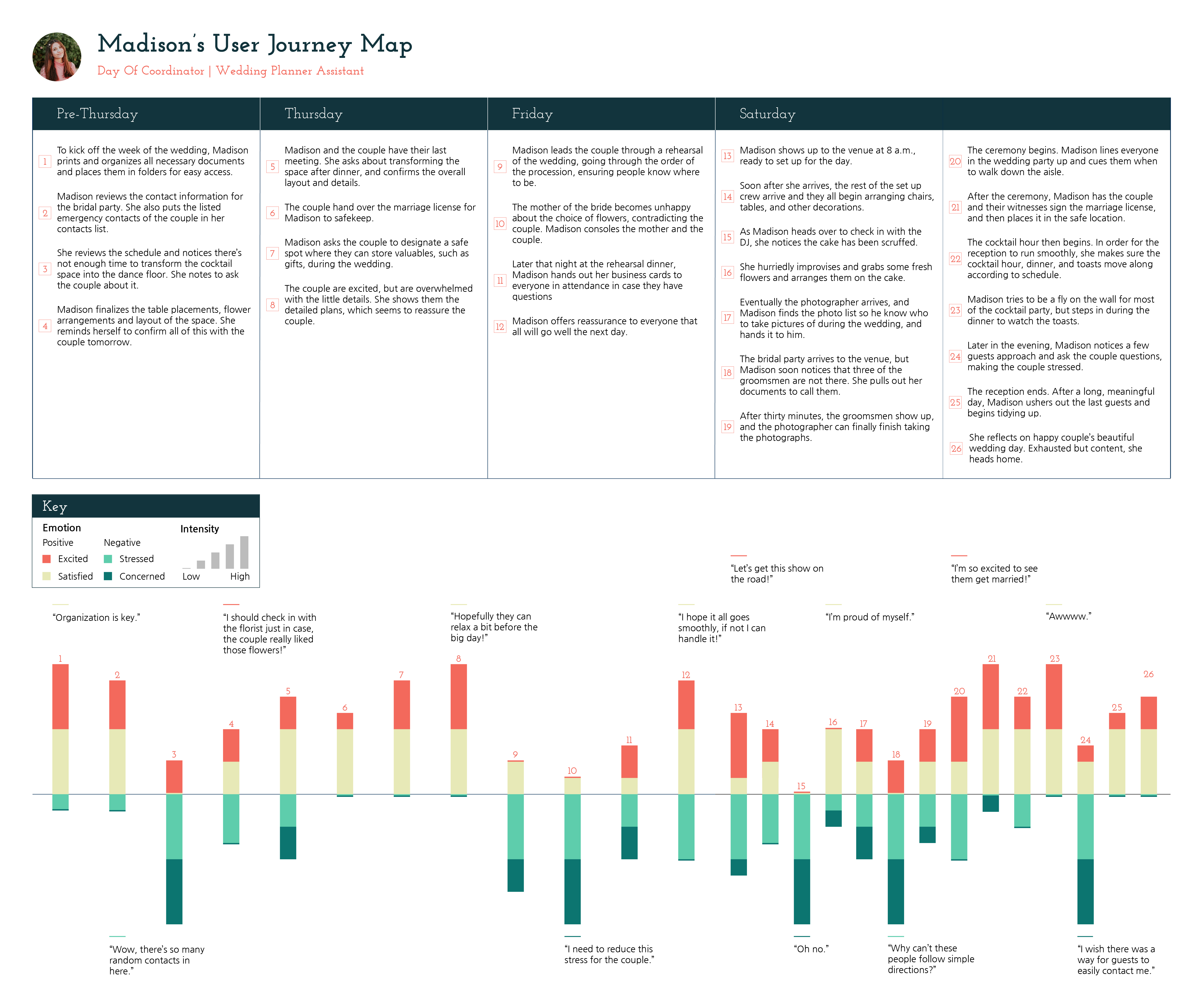
User Journey Map
Overview
Drawing from the user interviews and personas, we created a user journey map. Wedding planners work with the clients for a full year leading up to the wedding, while wedding coordinators focus on the week of the wedding. For the scope of this project, we decided to focus on coordinators because coordinators have a more focused role in the wedding process.
Design Requirements
Overview
Synthesizing our research, we generated the following design requirements.
| View and edit the details of the wedding day schedule. | Allow for organized communication with wedding stakeholders. | View the layout of the reception seating chart. | Access final list of materials for setting up the wedding. | Access a to-do list of tasks to be completed before the start of the wedding. |
Storyboards
Overview
Focusing on the day of the wedding, we created storyboards of situations that coordinators face with possible solutions. Creating storyboards allowed us to visualize the components of our design within the context of a wedding coordinator’s day.
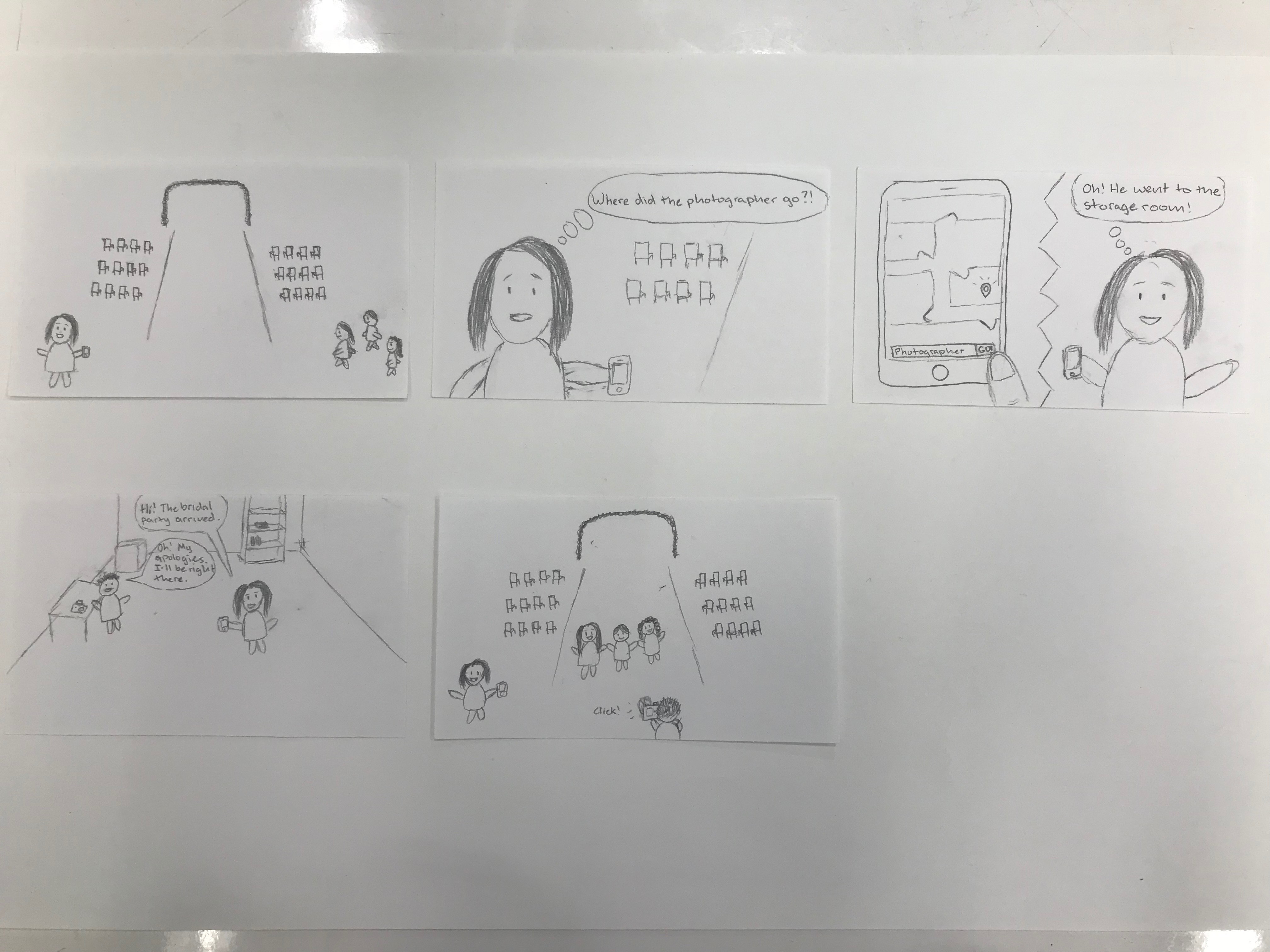
Takeaway
Because wedding coordinators are always on the move, and constantly has their phone on them, we decided to focus on an app-based solution.
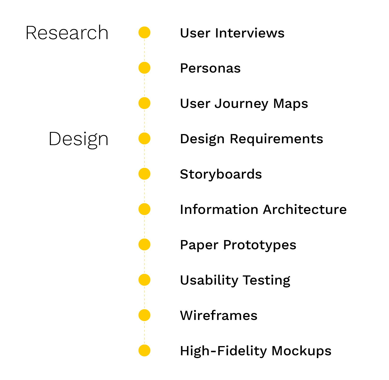
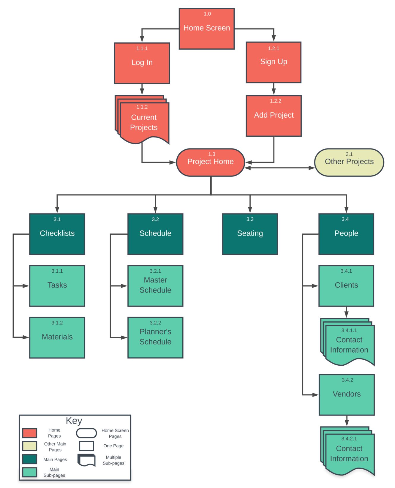
Information Architecture
Overview
Synthesizing our findings from the research, compiling potential solutions from the storyboards, and referring to the design requirements, we created an information architecture diagram to determine the overall structure and organization of the app.
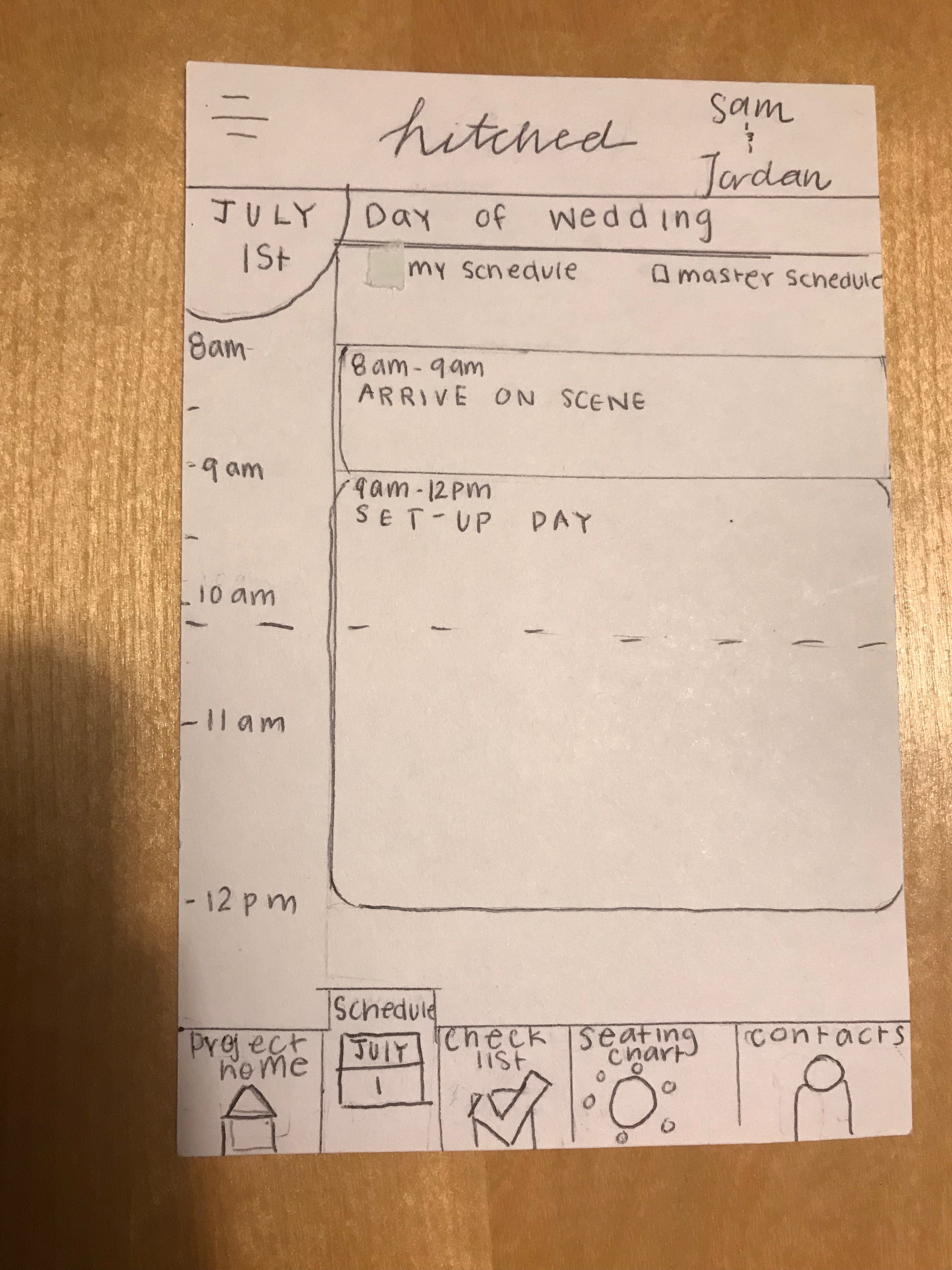
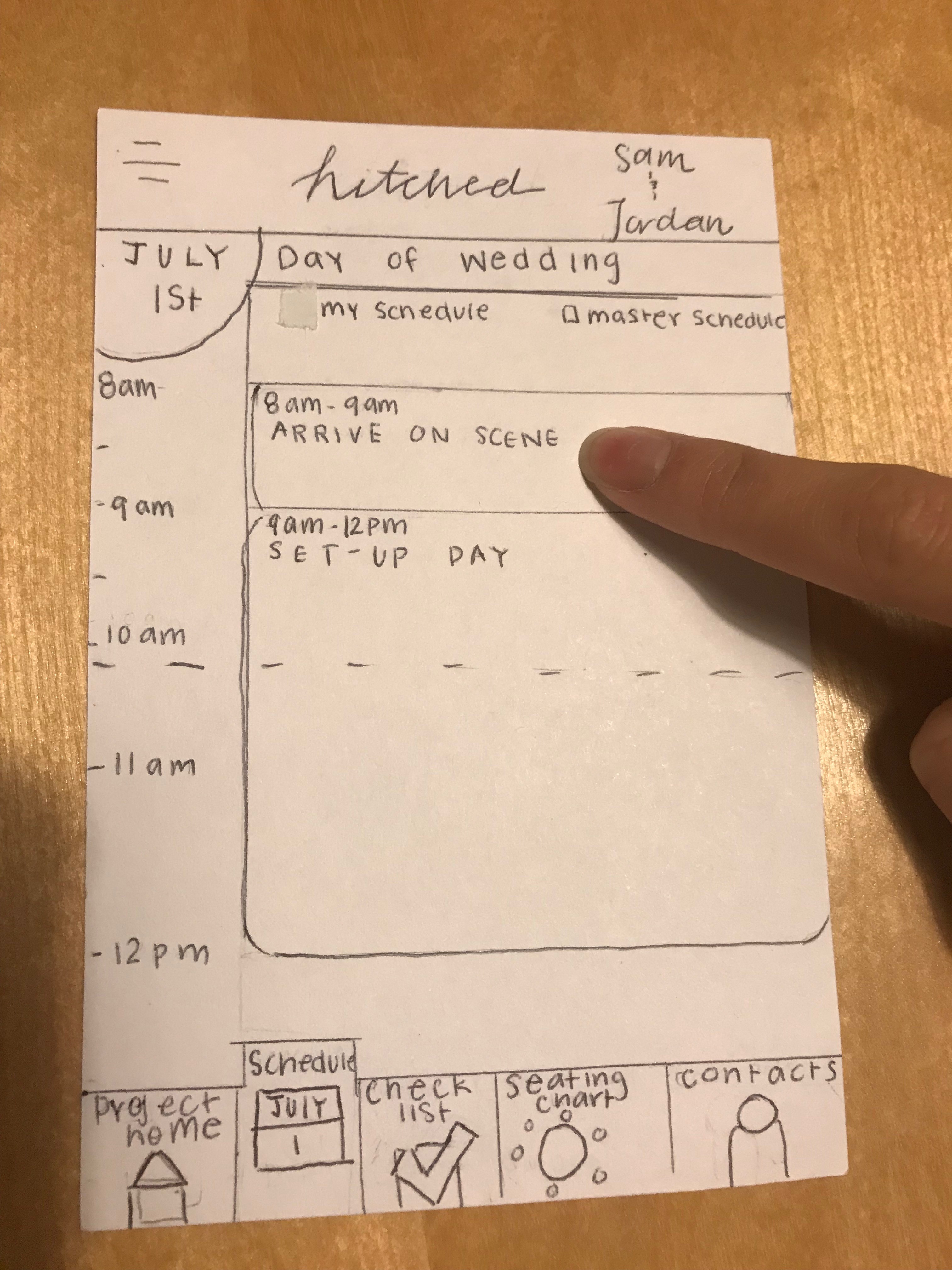
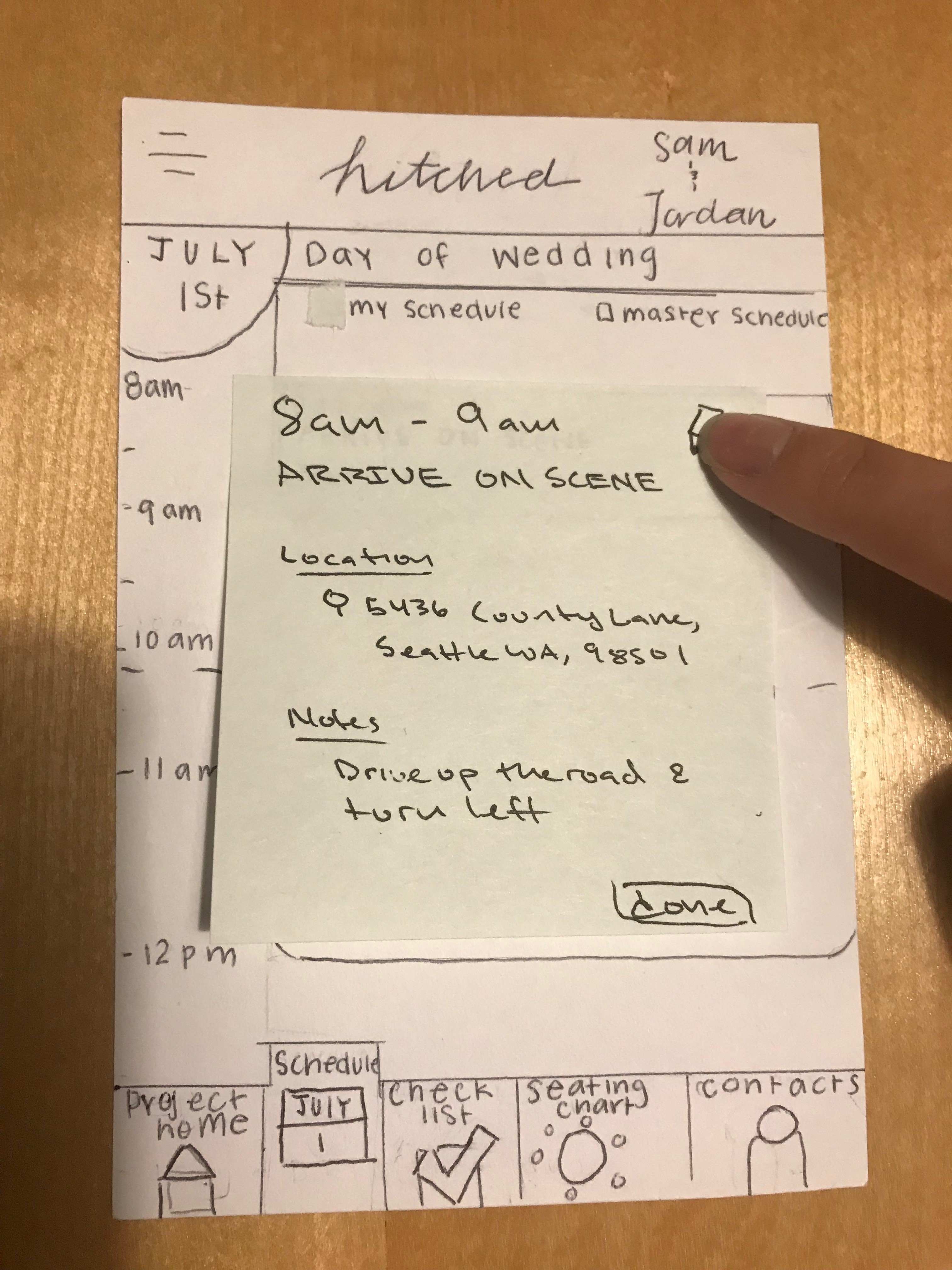
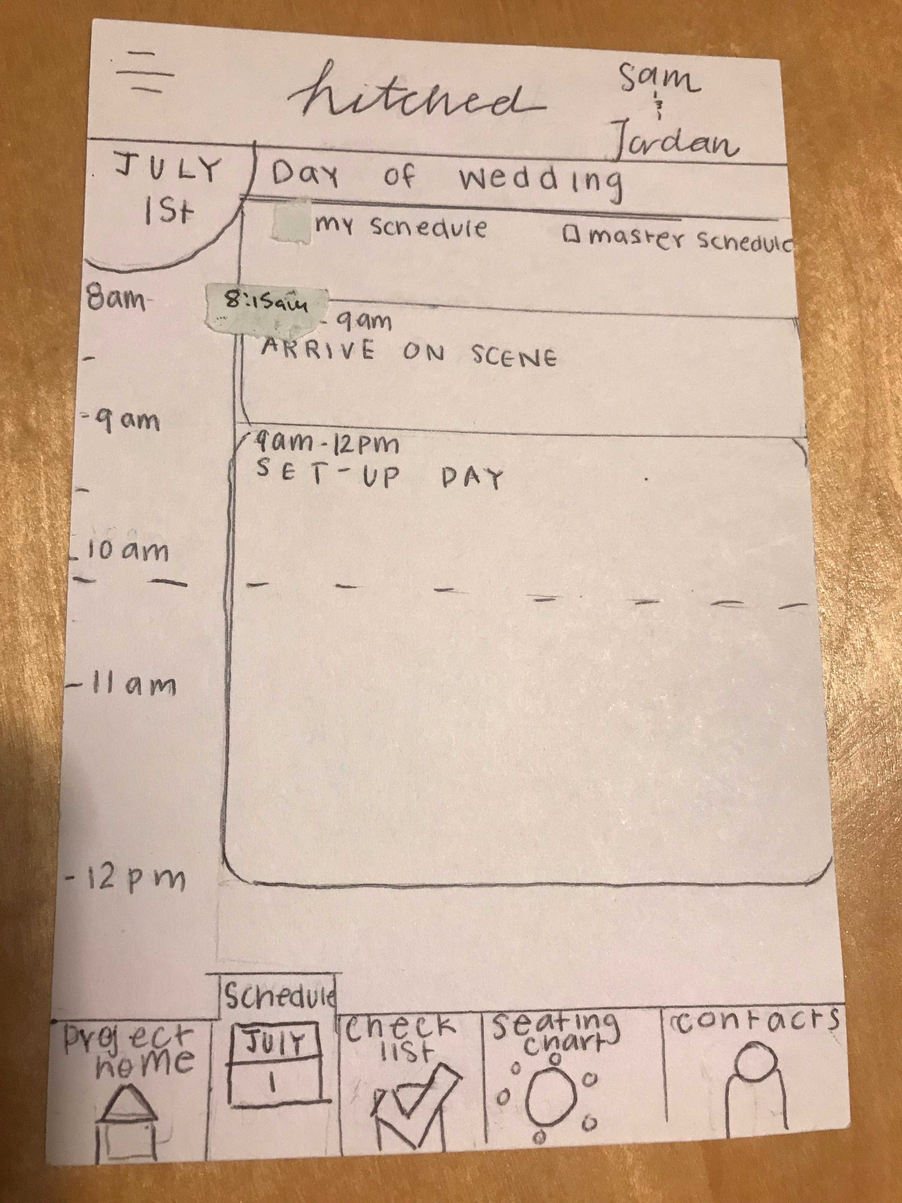
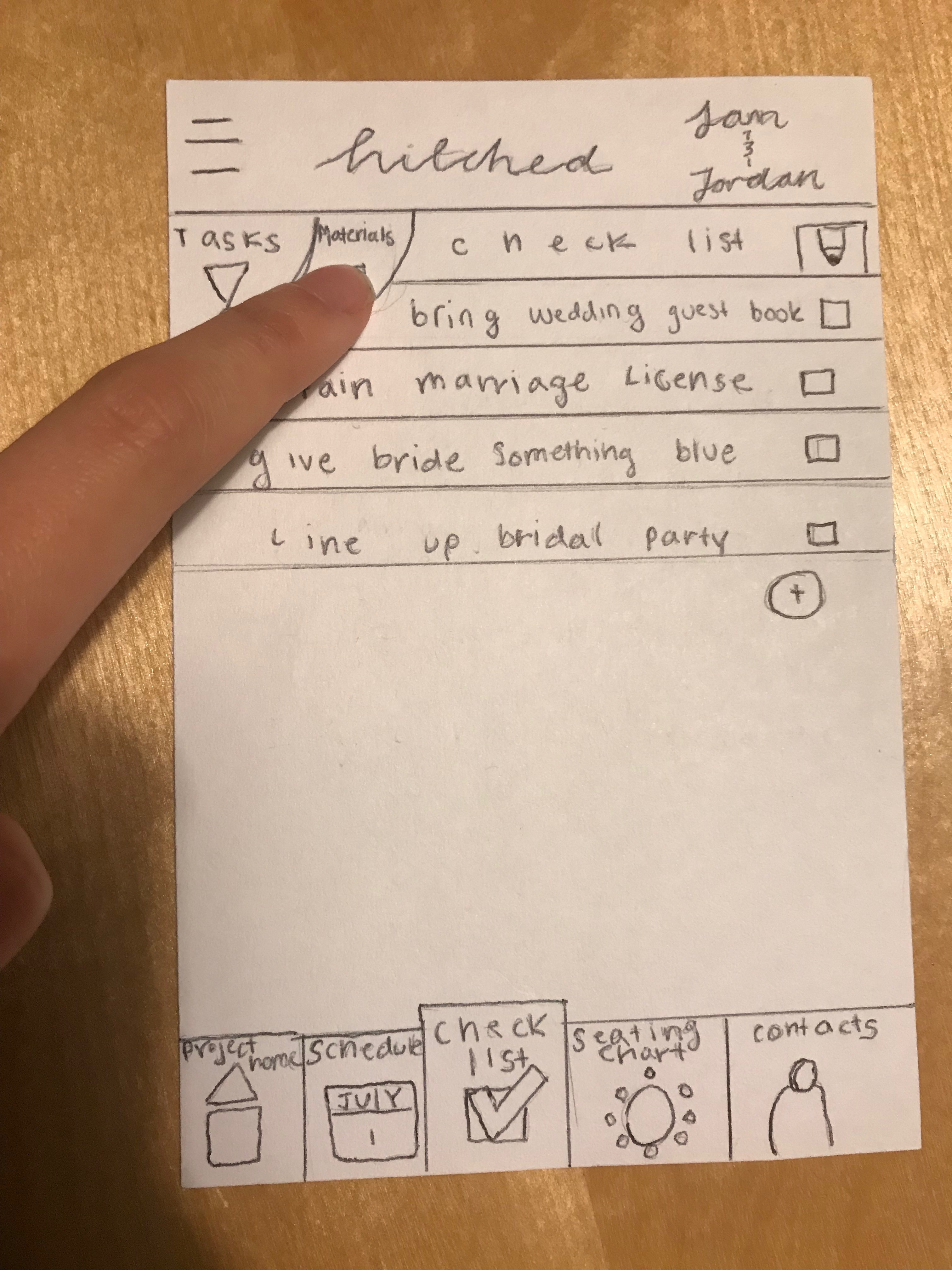
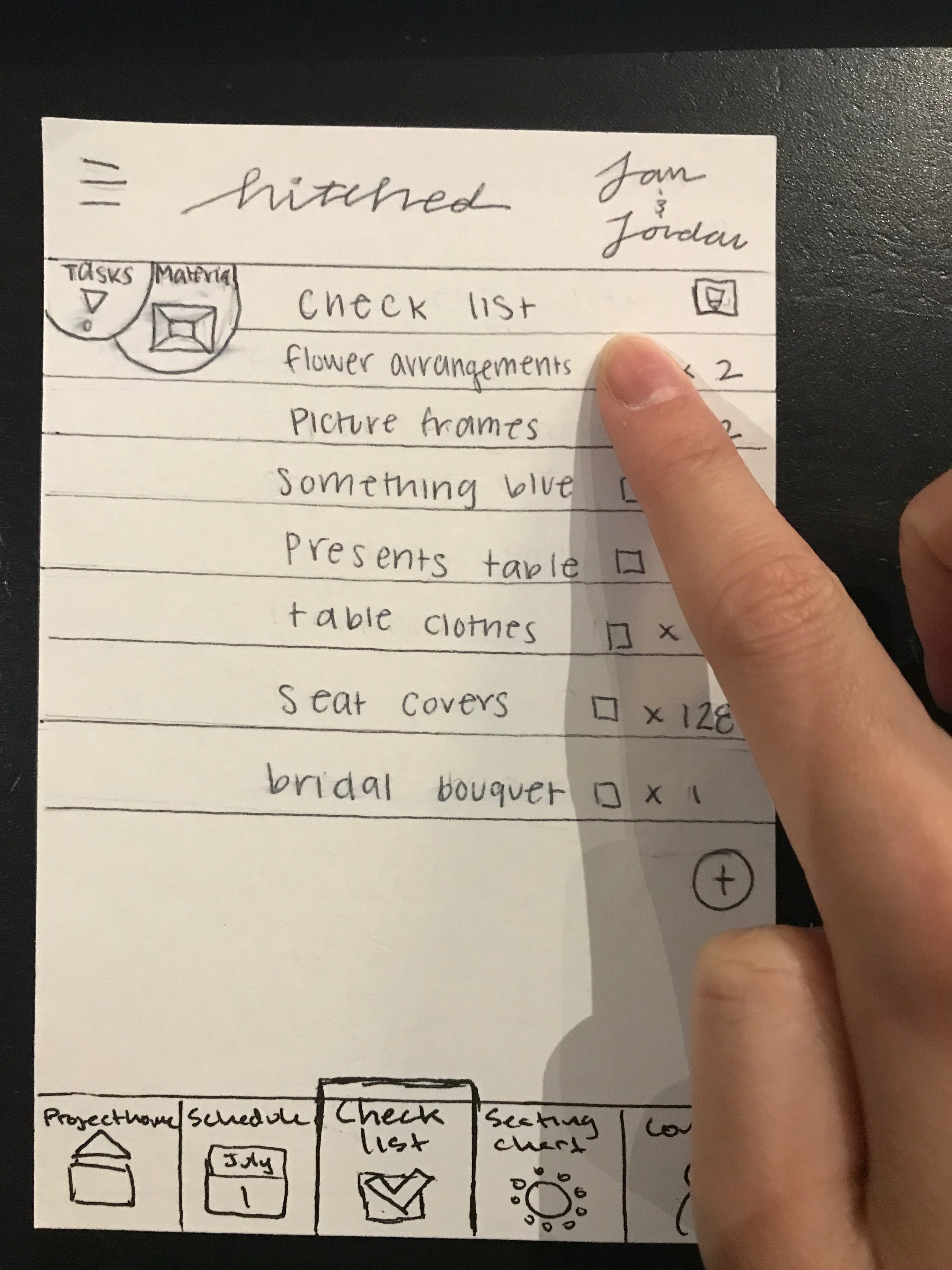
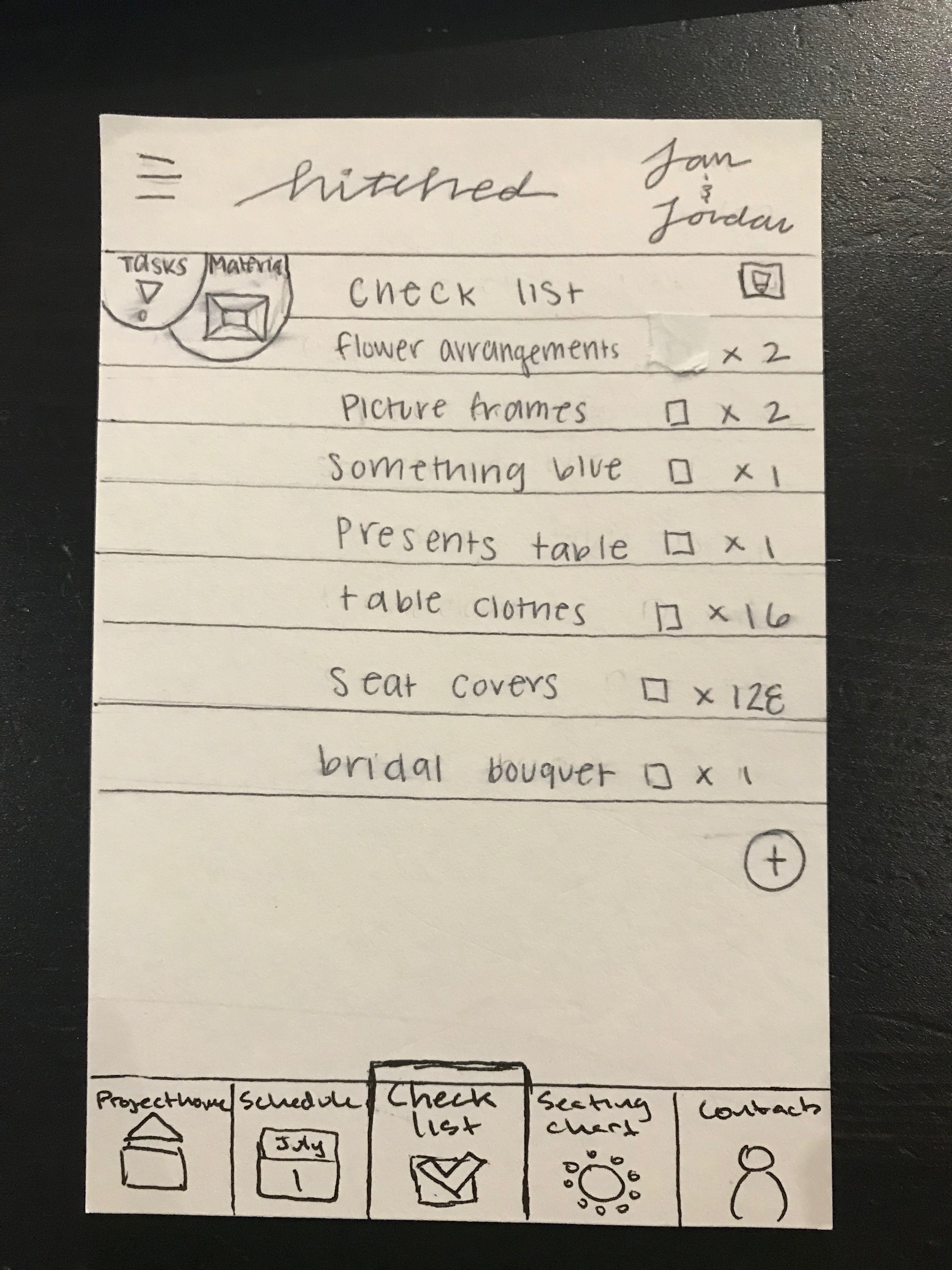
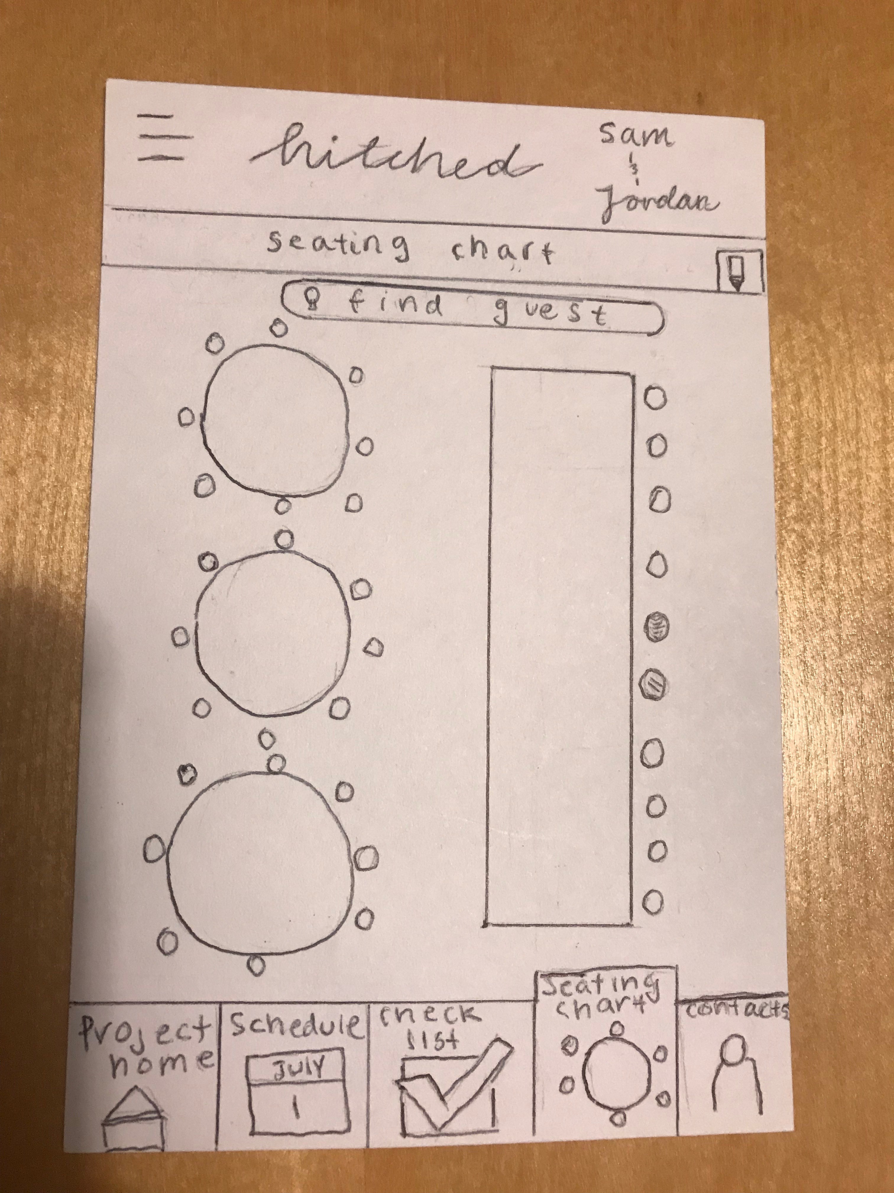
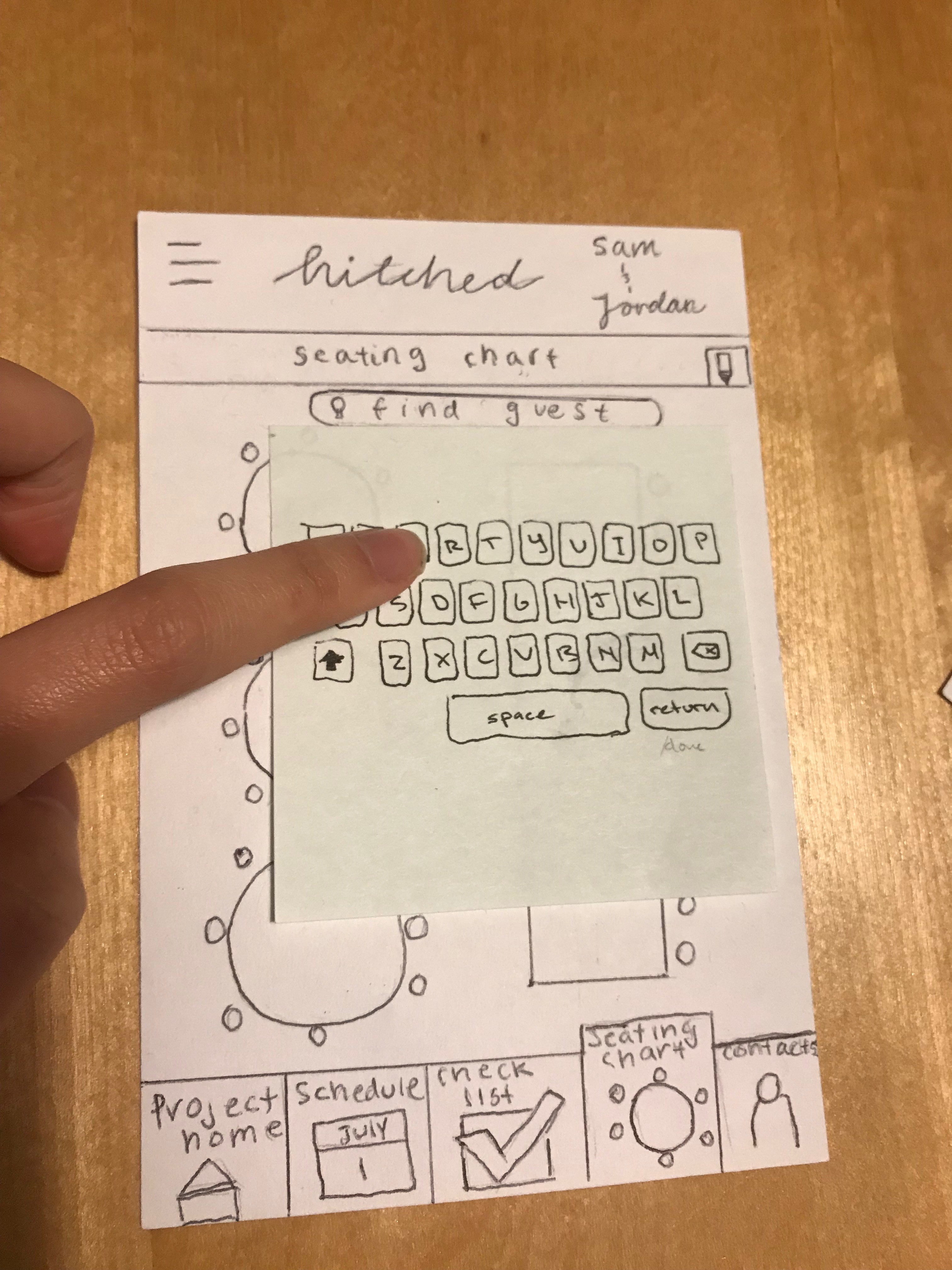
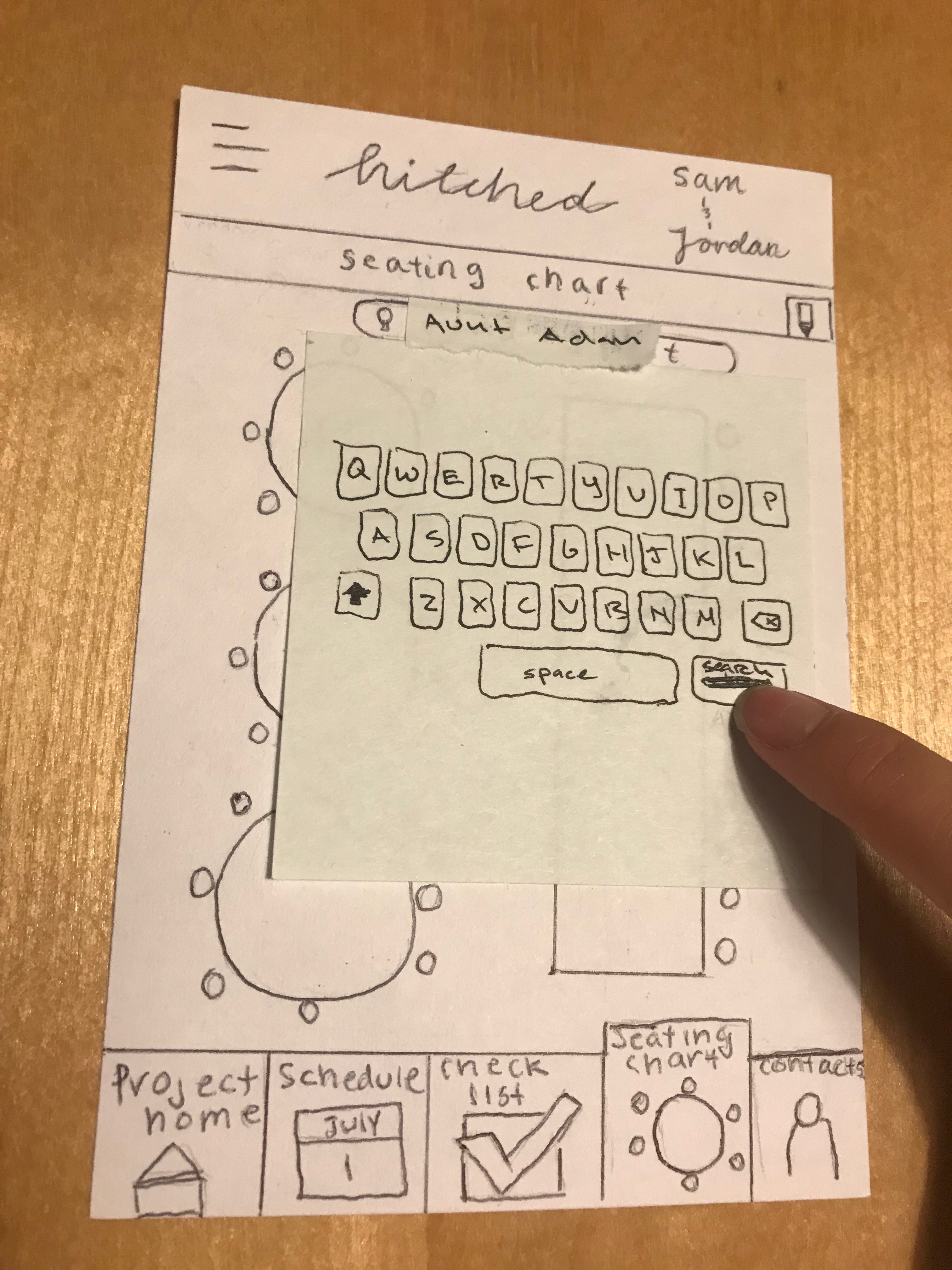
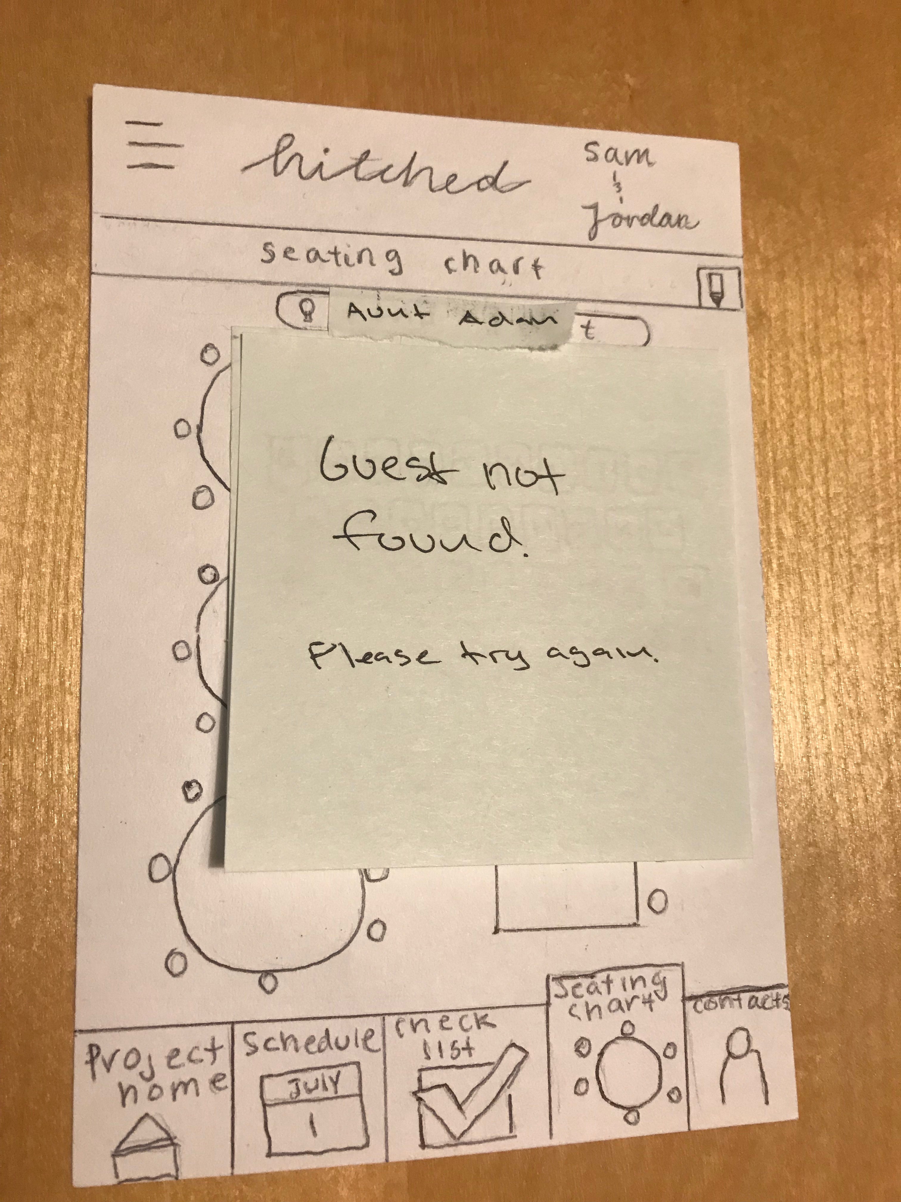
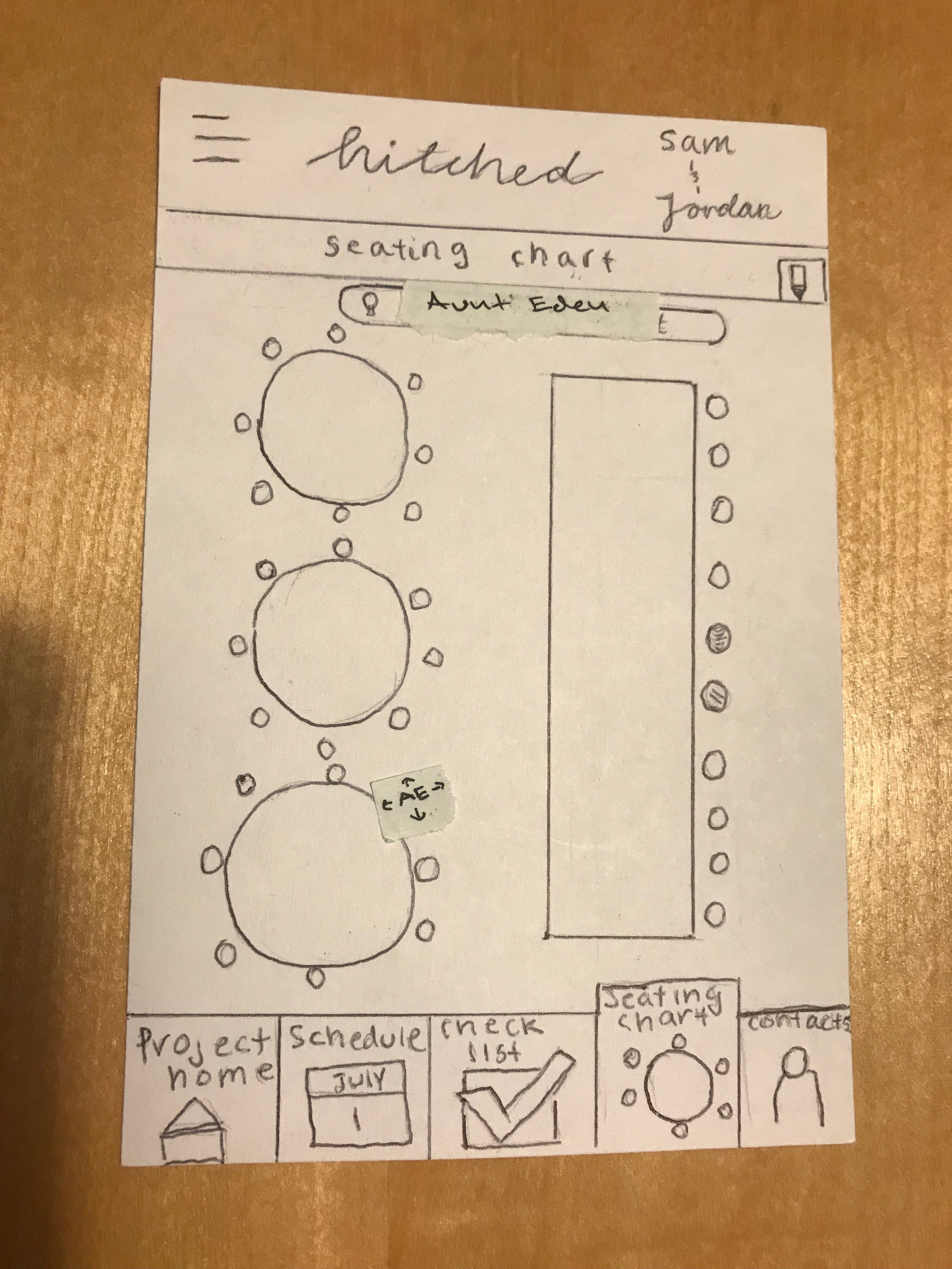
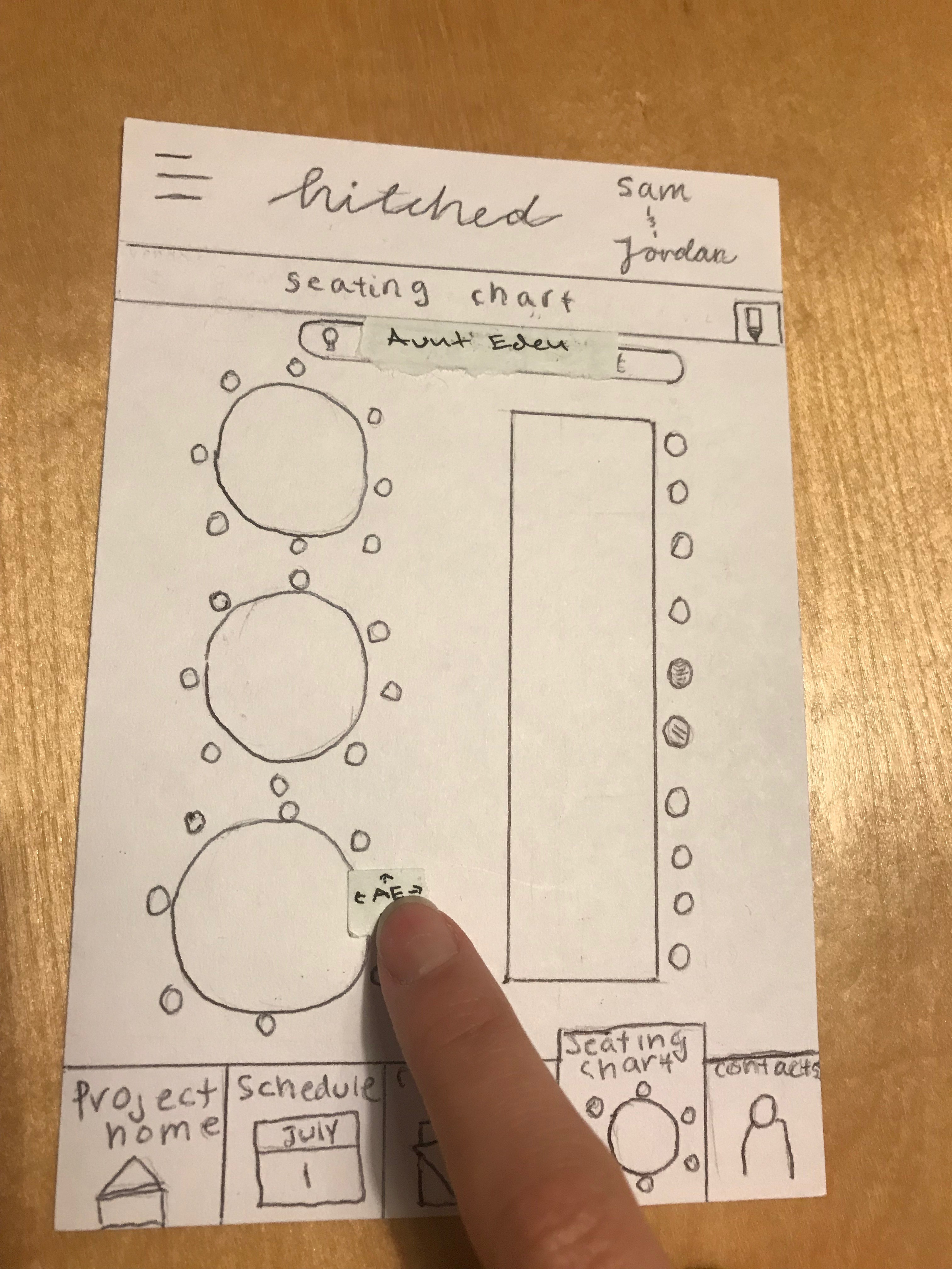
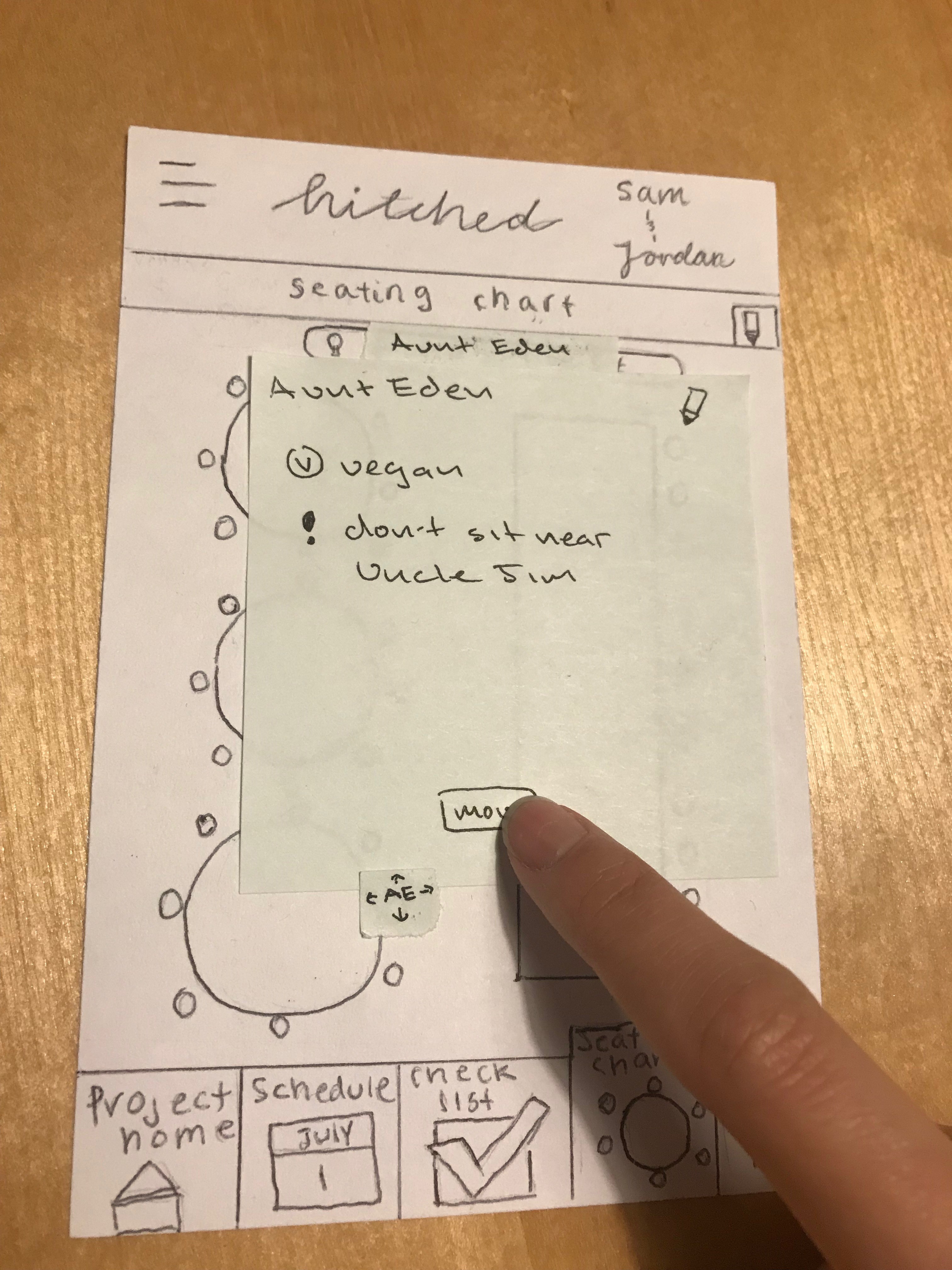
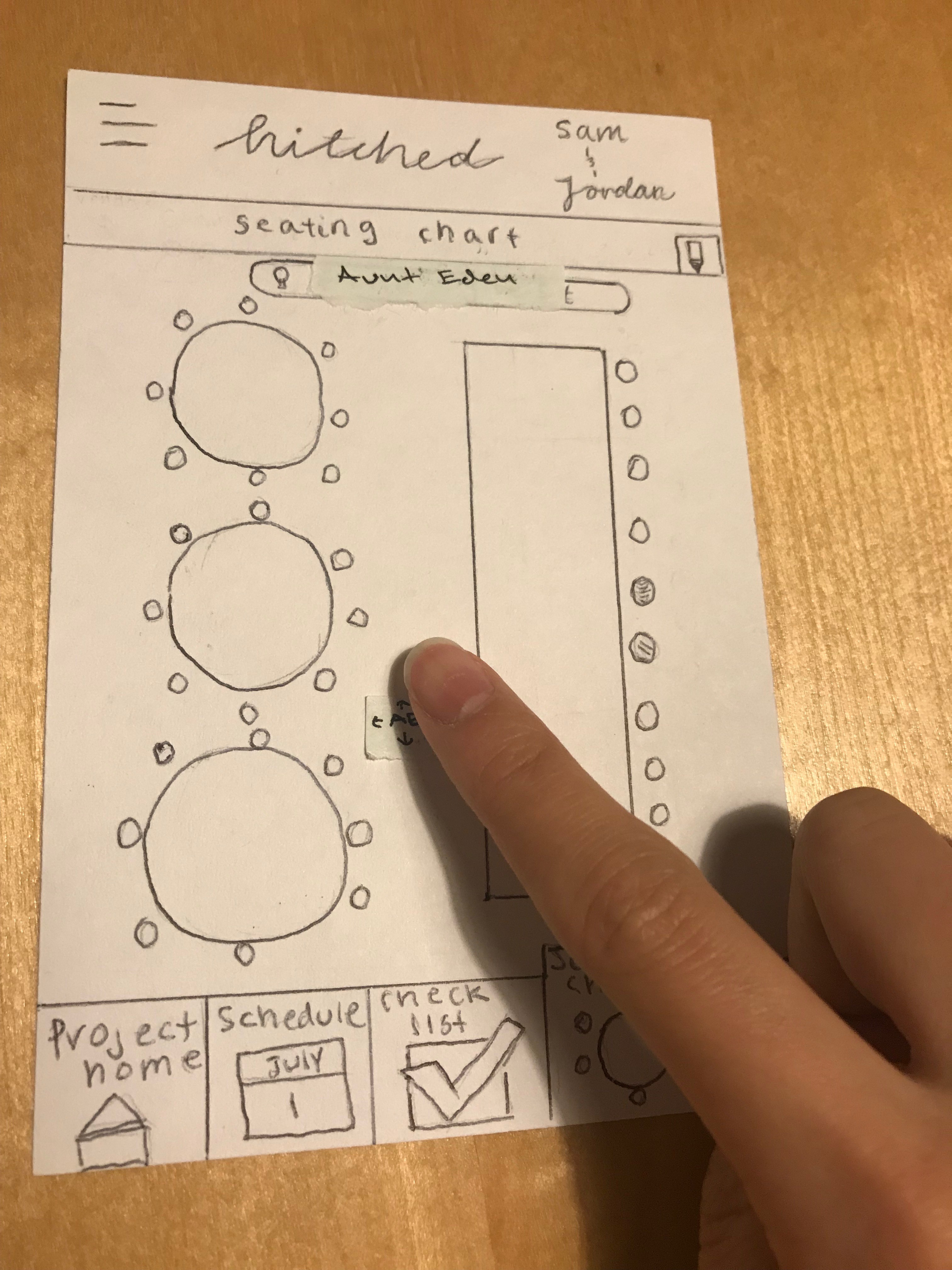
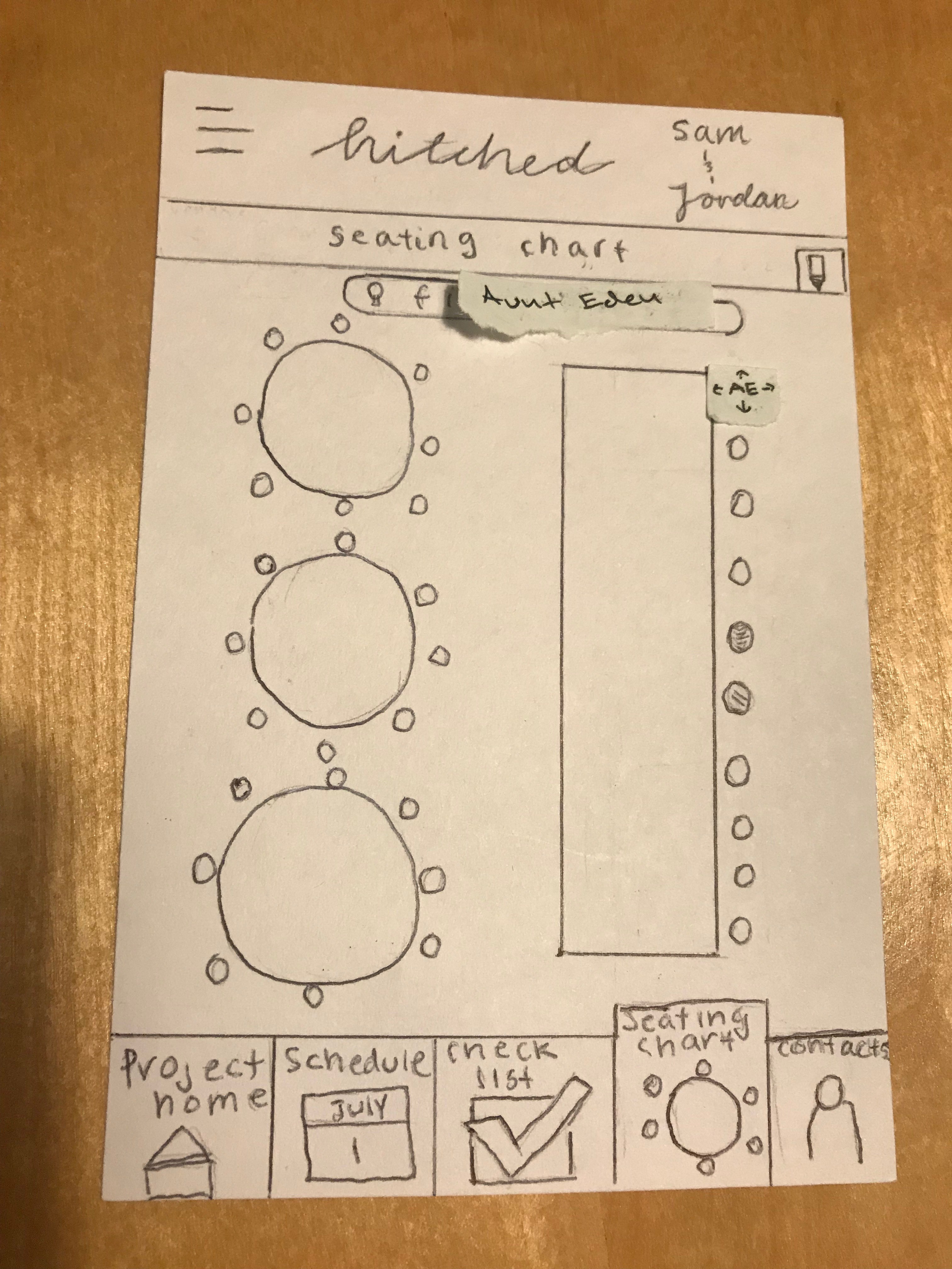
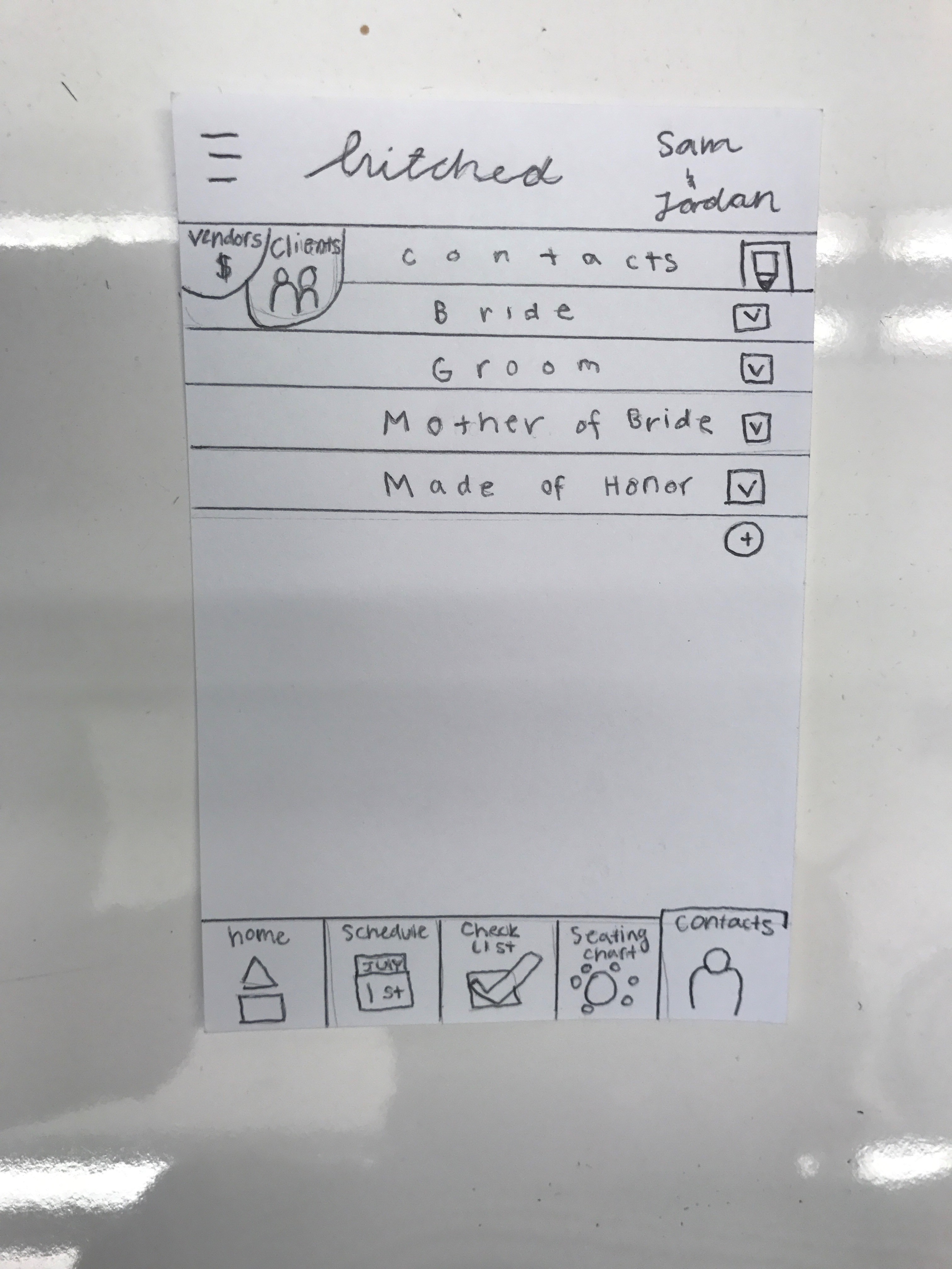
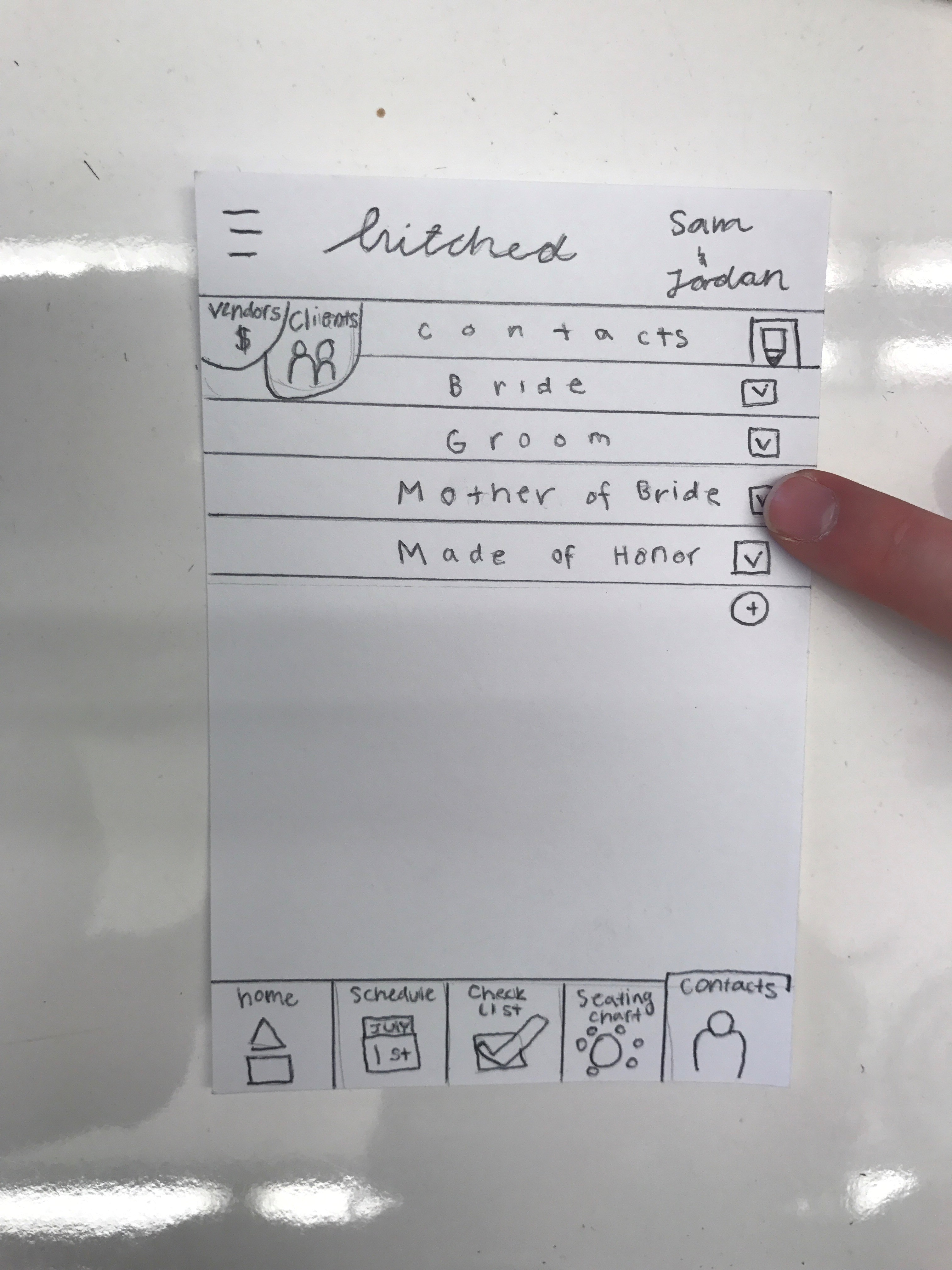
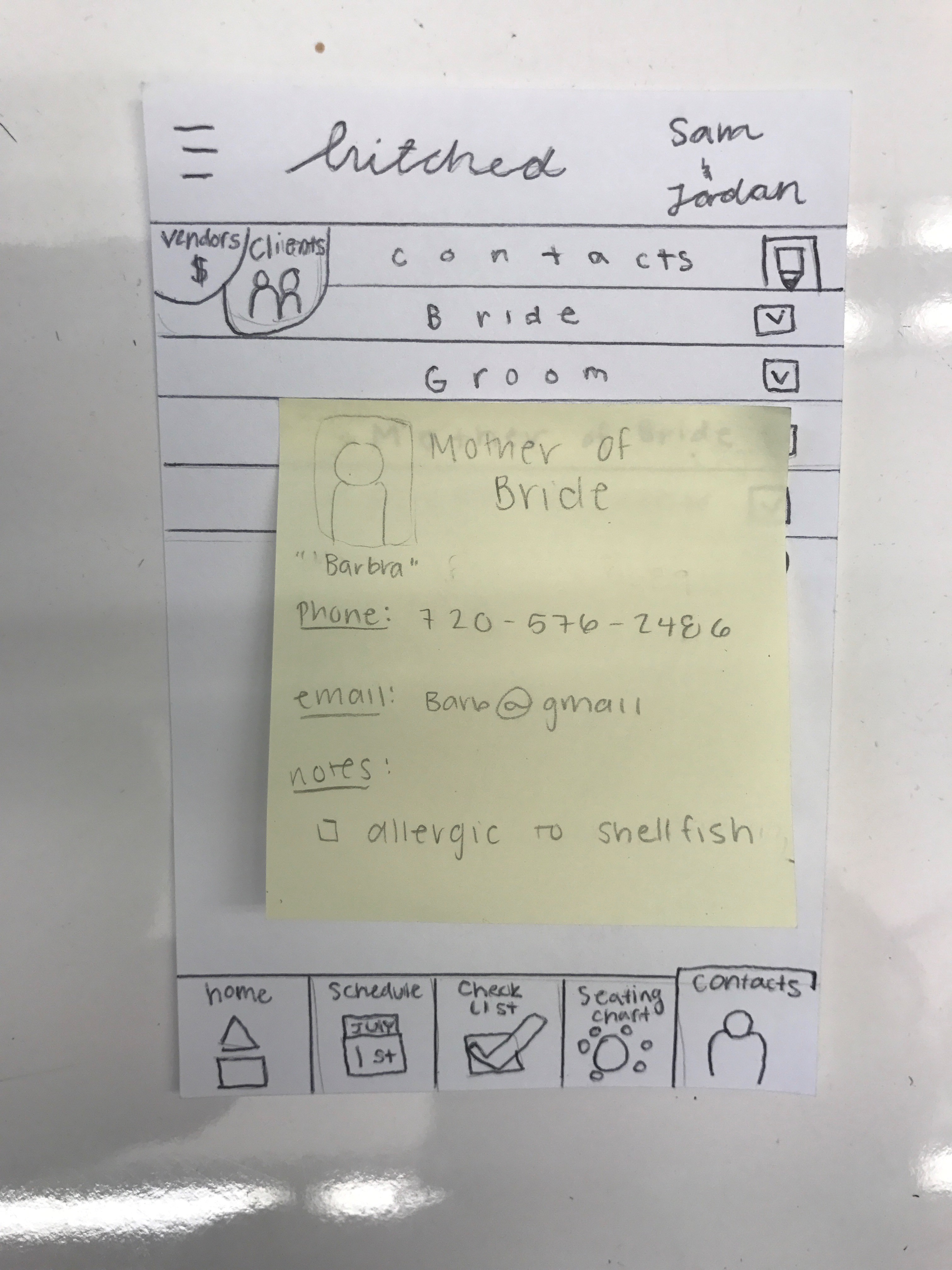
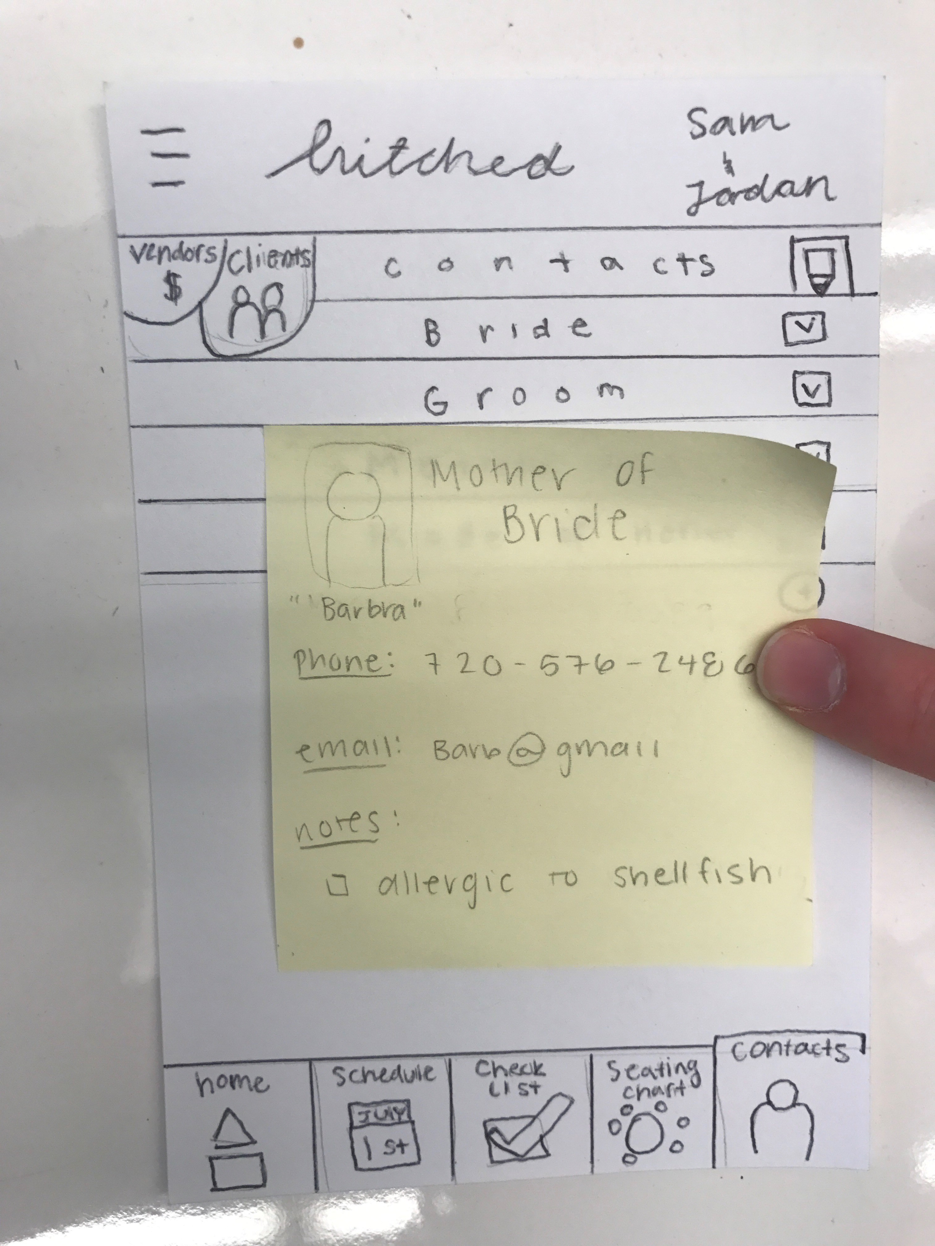
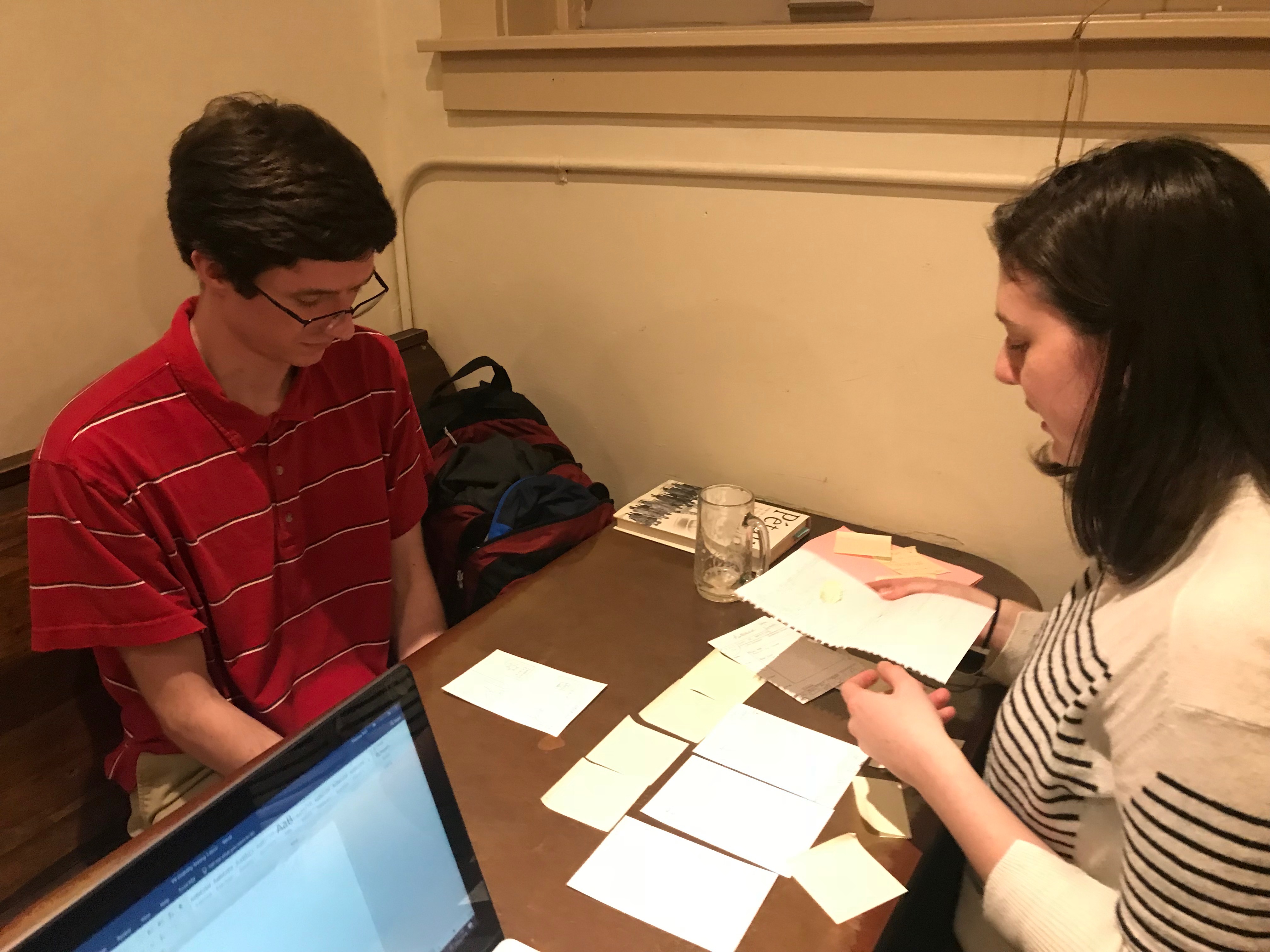
Paper Prototypes
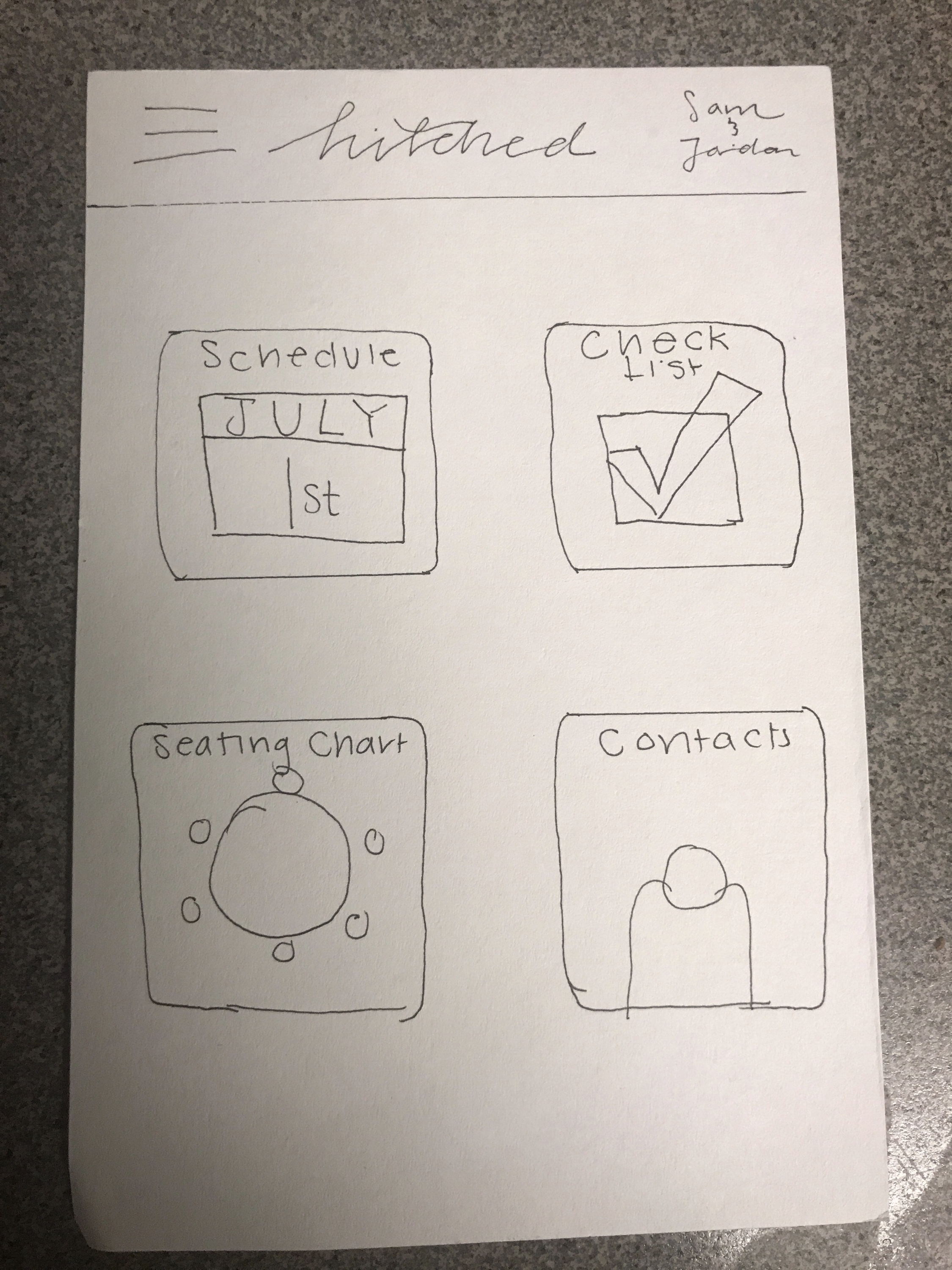
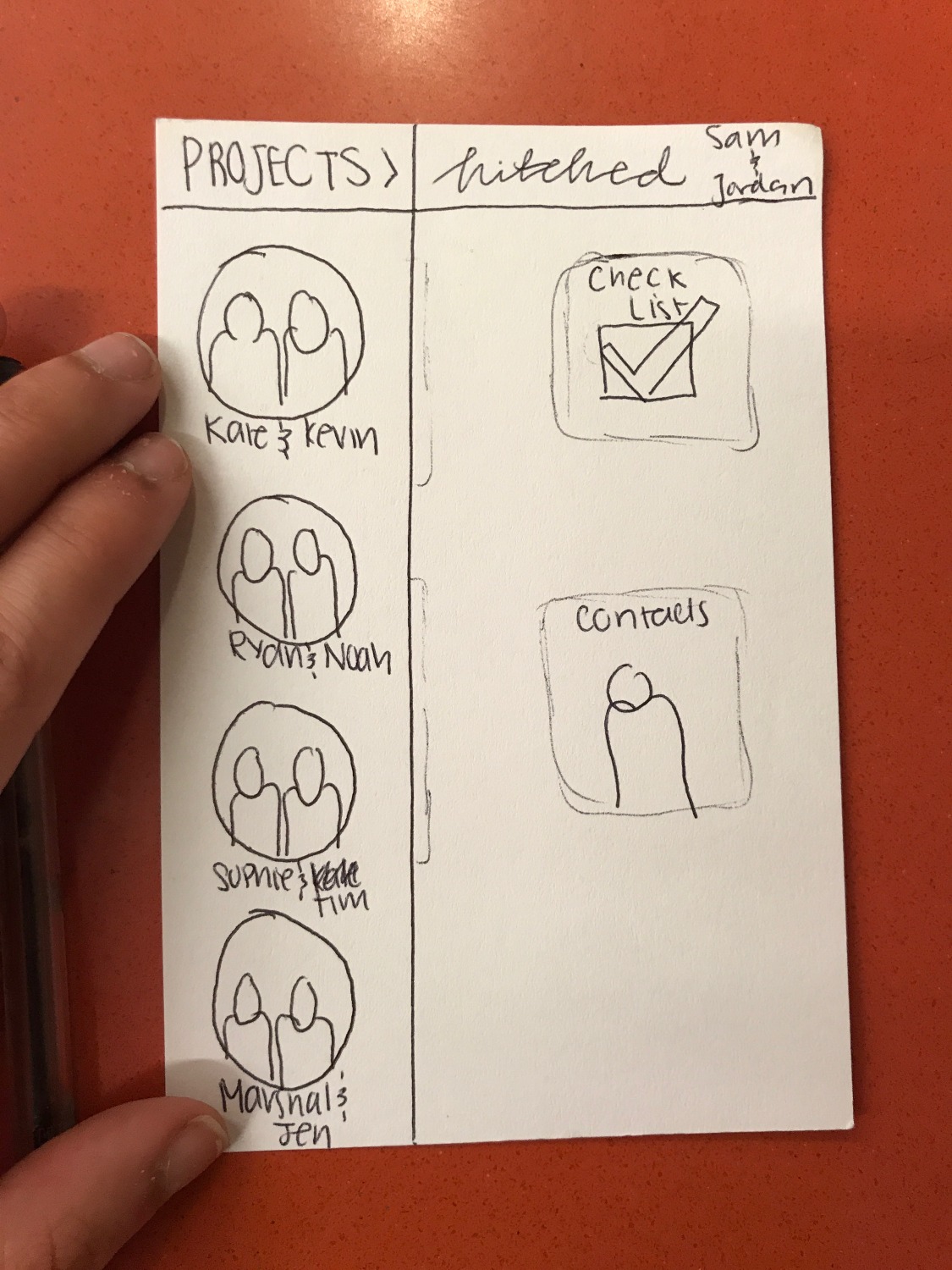
Overview
Translating the structure of the information architecture into paper prototypes, we were able to solidify the different functions on each page and a rough layout and style of the application.
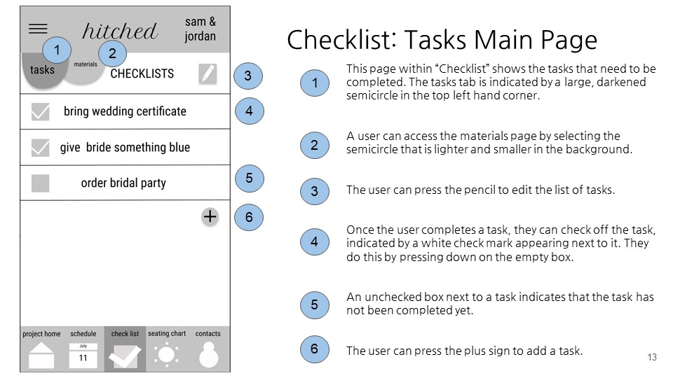
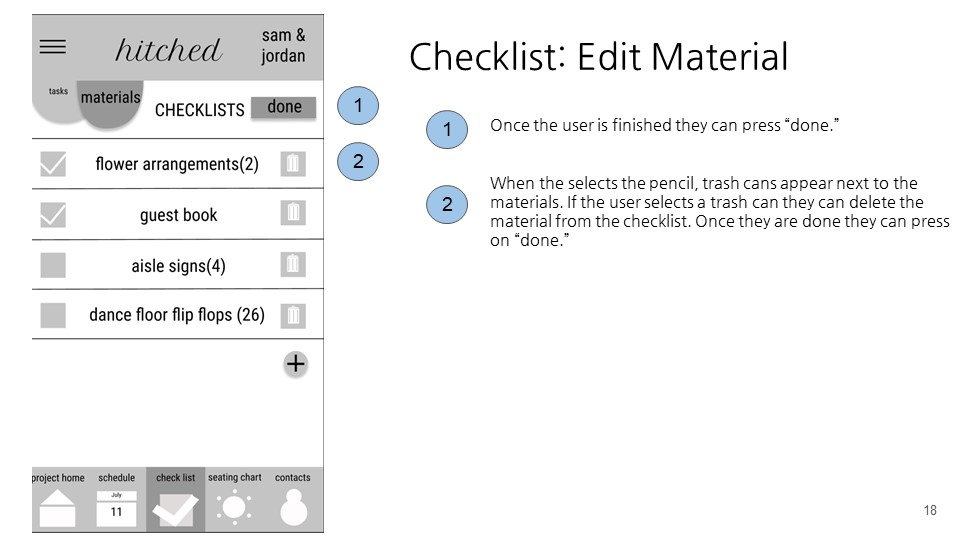
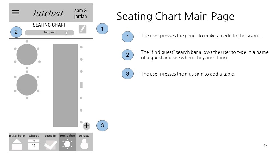
Key Features
Other than the home screen, our app has four key features.
- Schedule
- Checklists
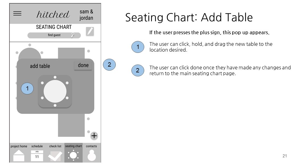
- Seating Chart
- Contacts
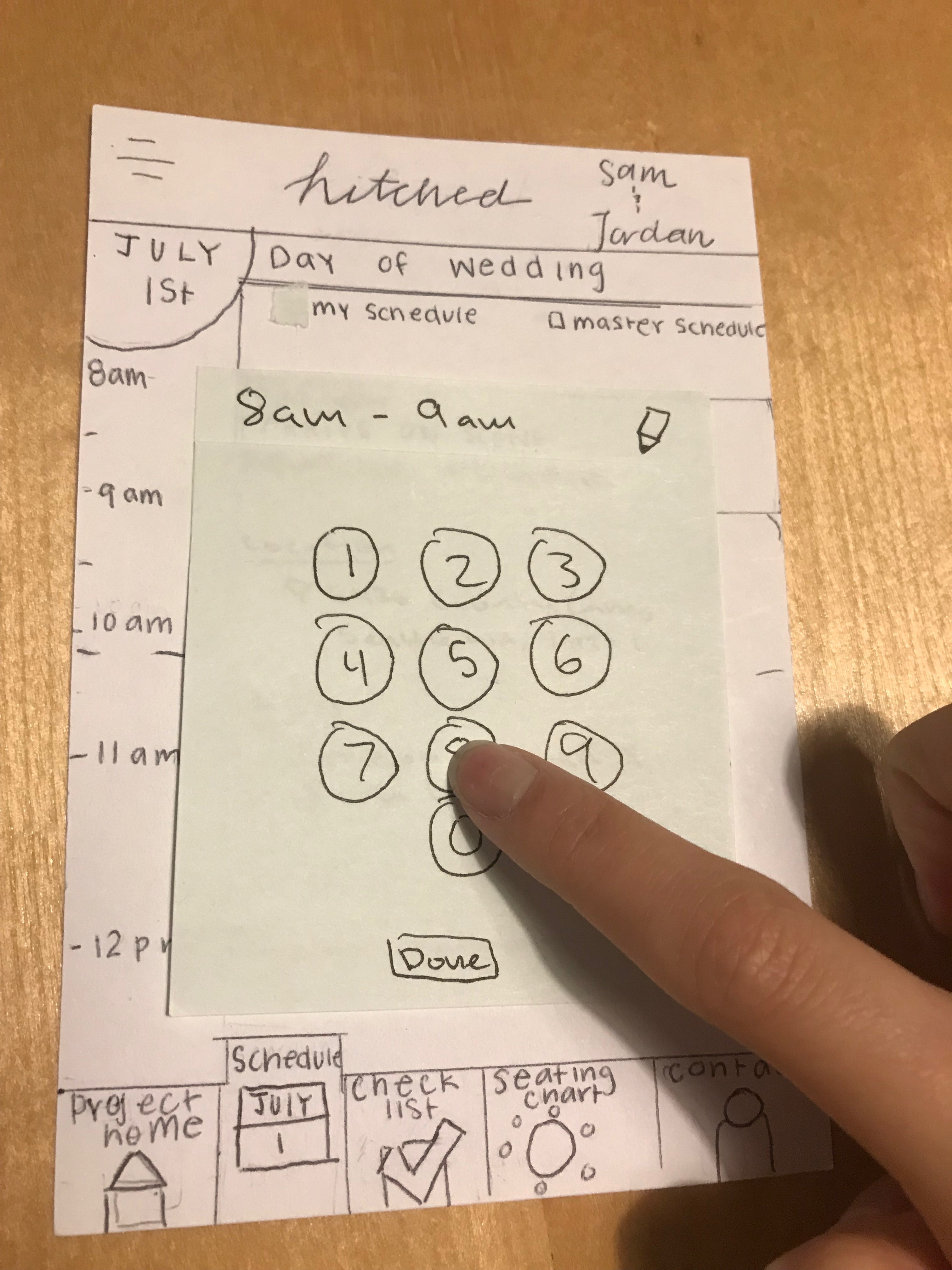
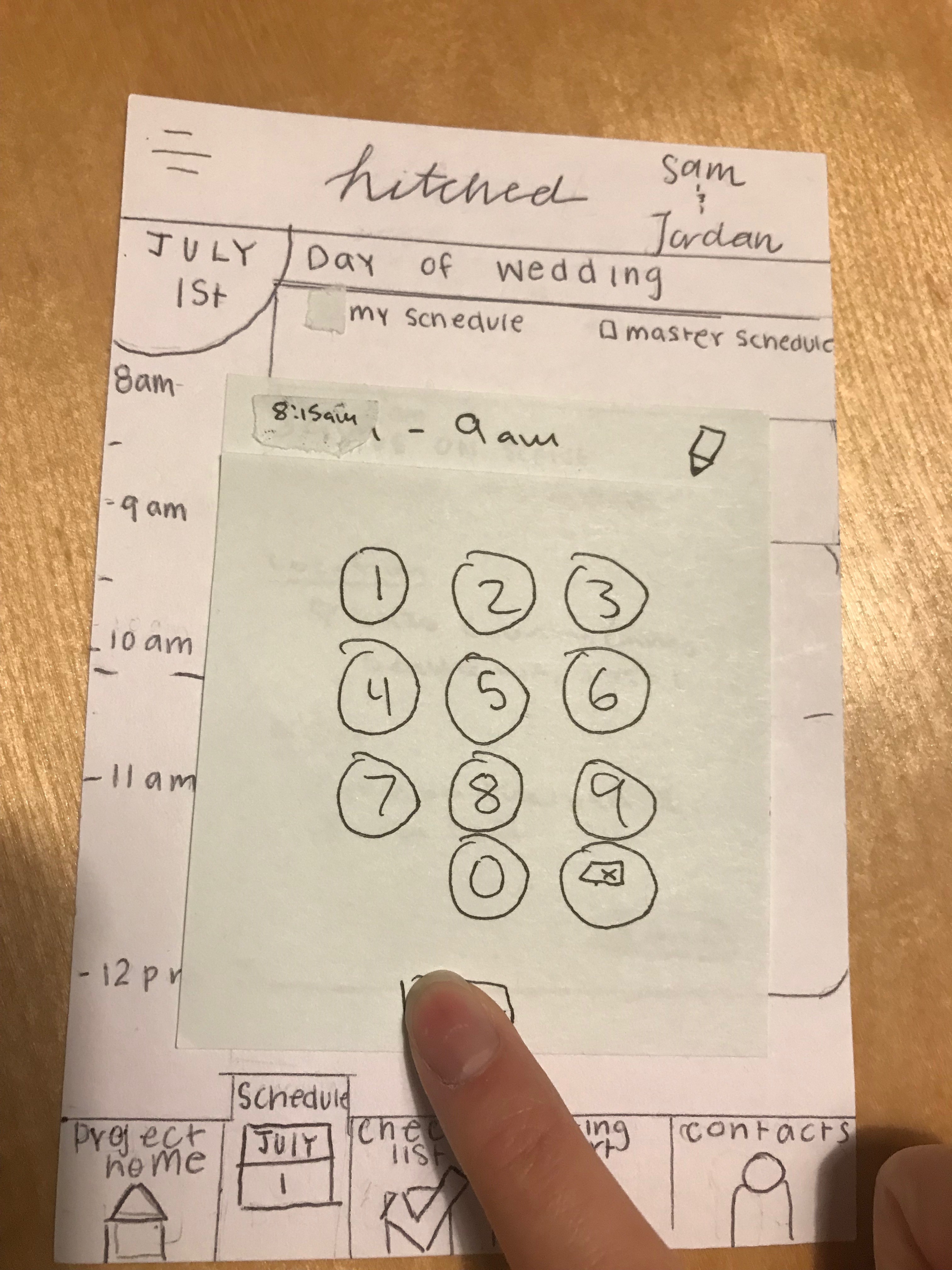
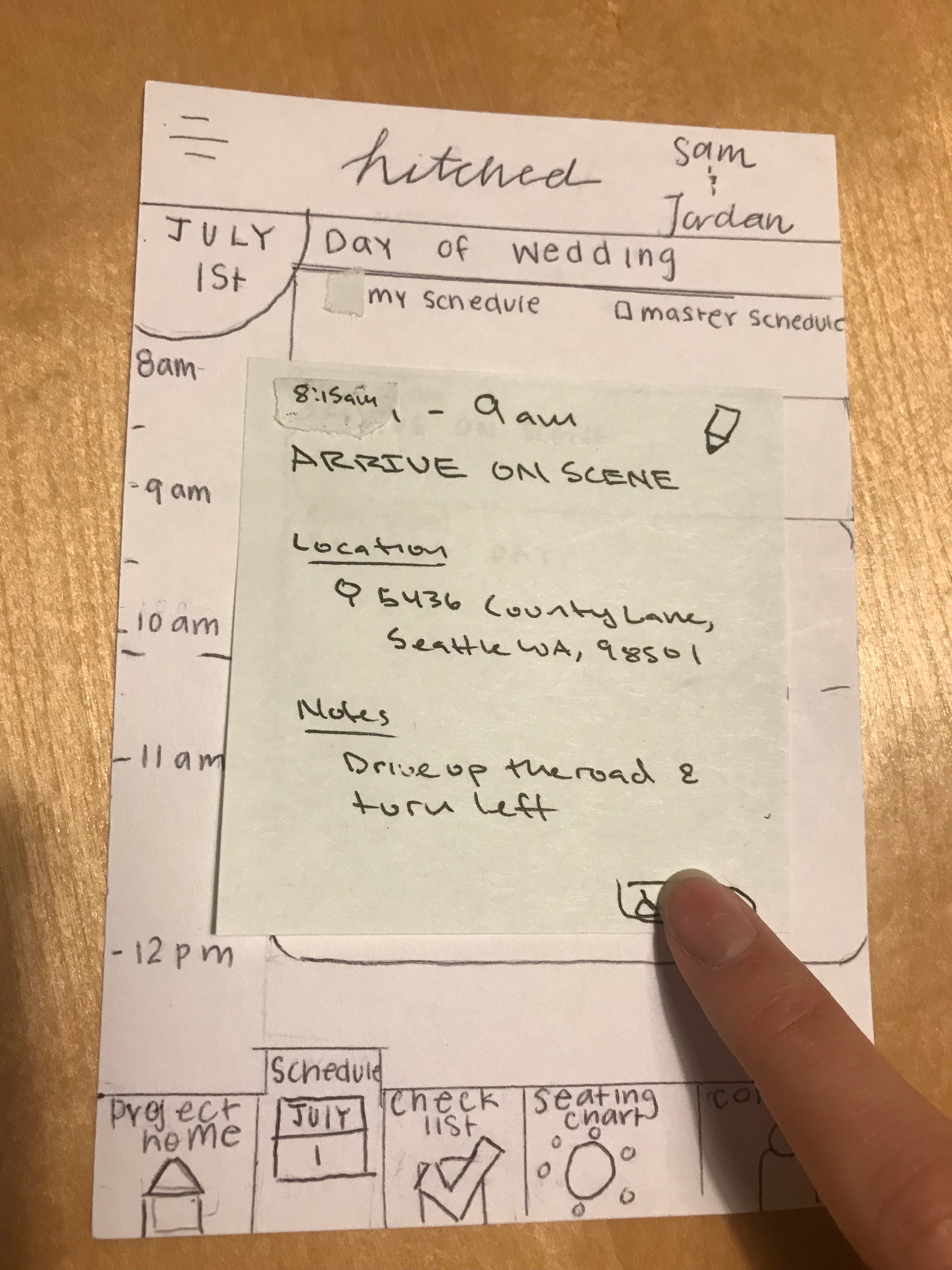


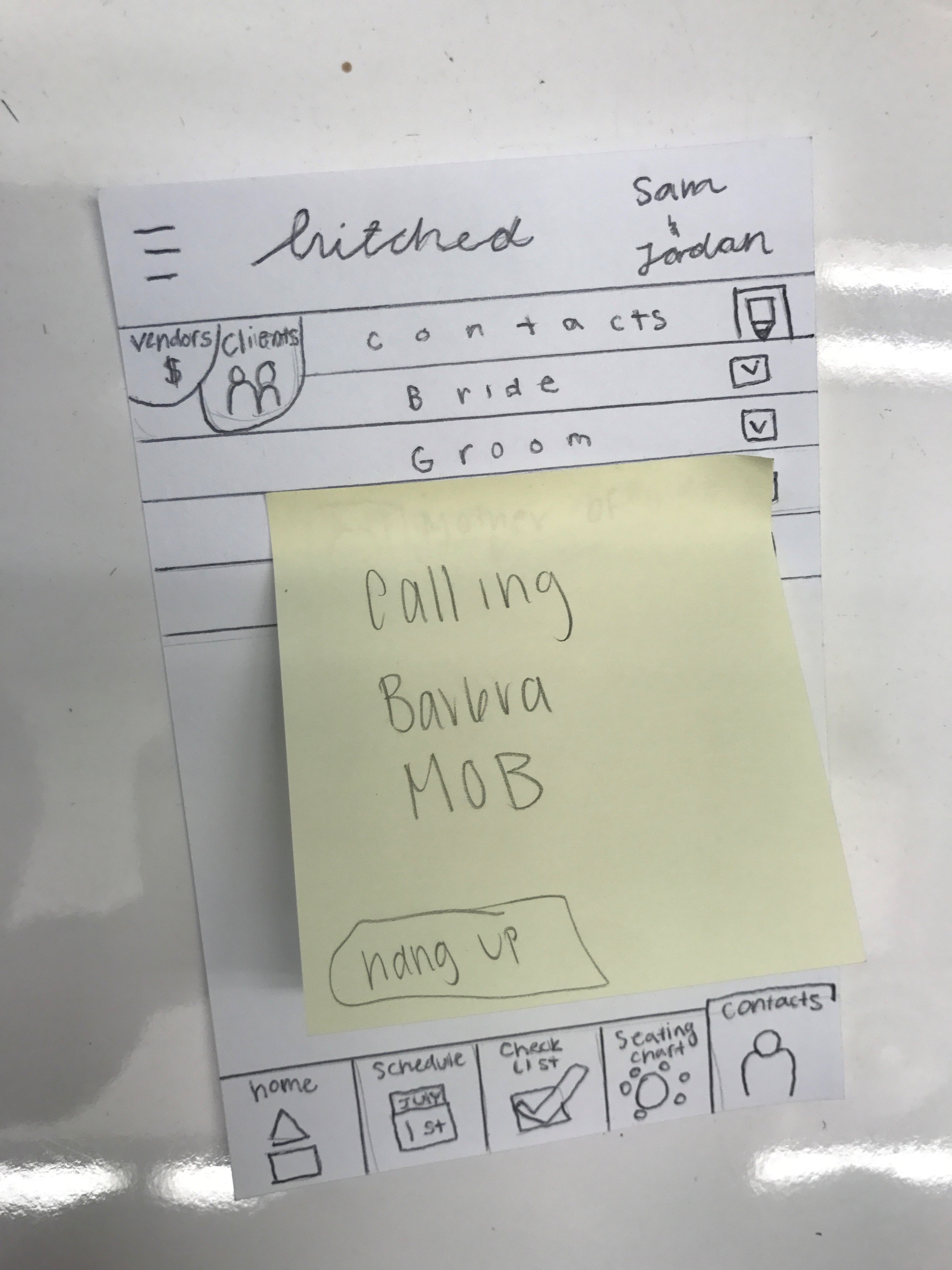
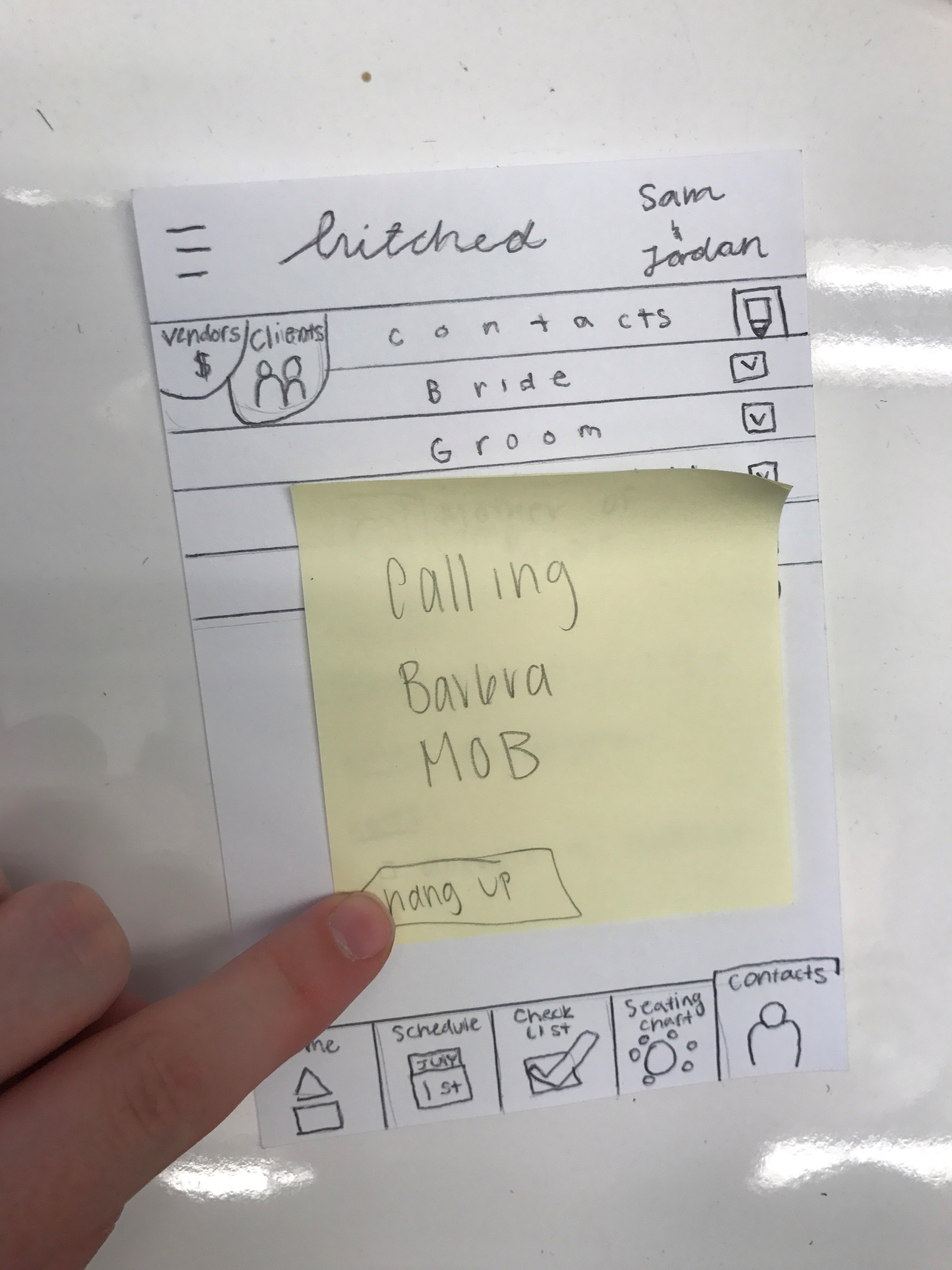
Usability Testing
Overview
Participants
Wedding coordinator and three participants with event planning experience
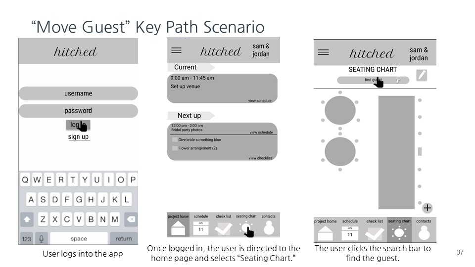
Five Key Path Scenarios
- Edit an event on the wedding day schedule
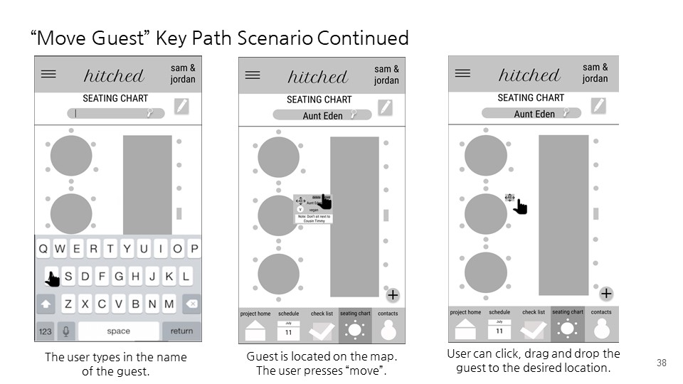
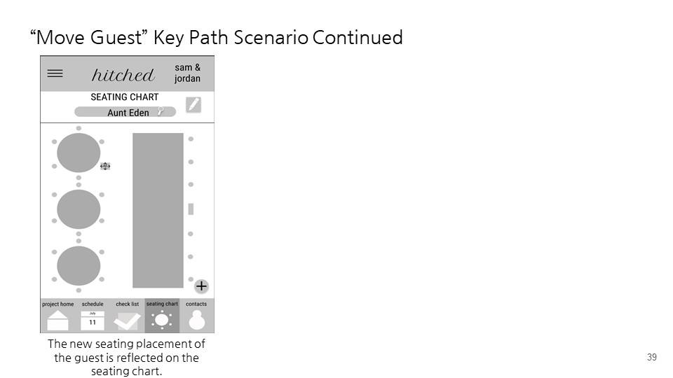
- Find and adjust the seating placement of a guest on the seating chart
- Check off that the flower arrangements have arrived
- Call the mother of the bride
- Access another wedding project
Takeaways
These usability tests helped identify strengths and weaknesses of our design.
Strengths
- Organization of the app is clear
- The app’s main features are useful for event and wedding coordinating
Weaknesses
- Editing the schedule did not have an intuitive interface
- Movement of individuals on the seating chart cause confusion
Wireframes
Overview
Using insight gained from the usability tests, we iterated upon the paper prototypes, creating annotated wireframes. The annotated wireframes provided the framework for the layout, text, and content on each page, transforming Hitched into a more concrete concept.
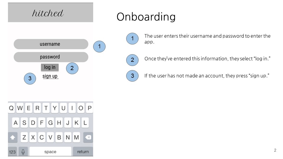
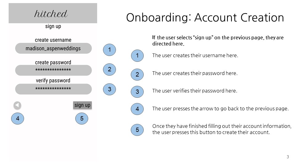
Takeaways
One of the major feedback we received during iteration of the wireframes was that the home screen from our paper prototypes were redundant with the navigation bar. Therefore, the home screen should instead provide a quick snapshot of the app’s upcoming contents for the coordinator.
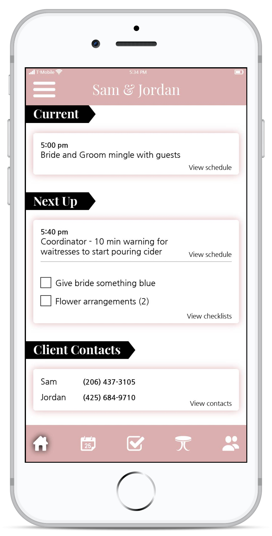
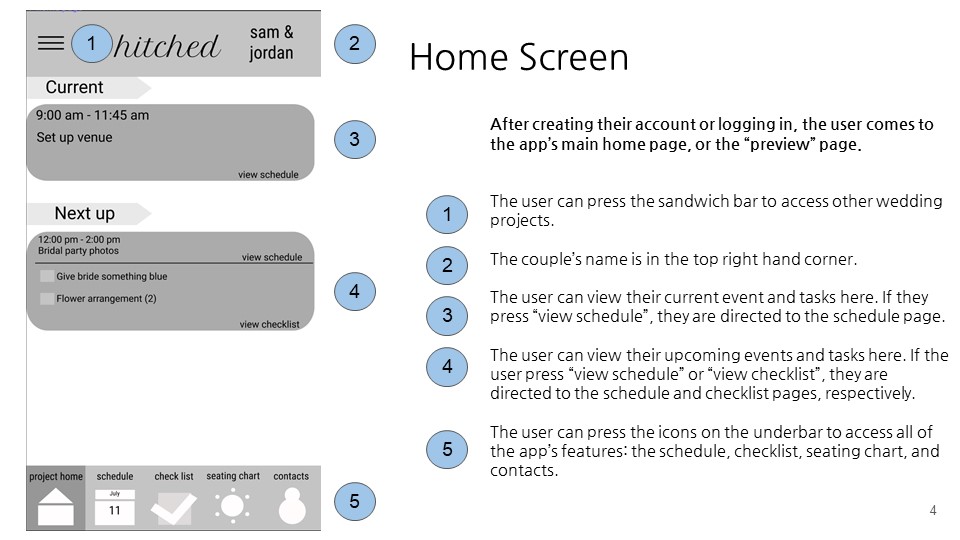
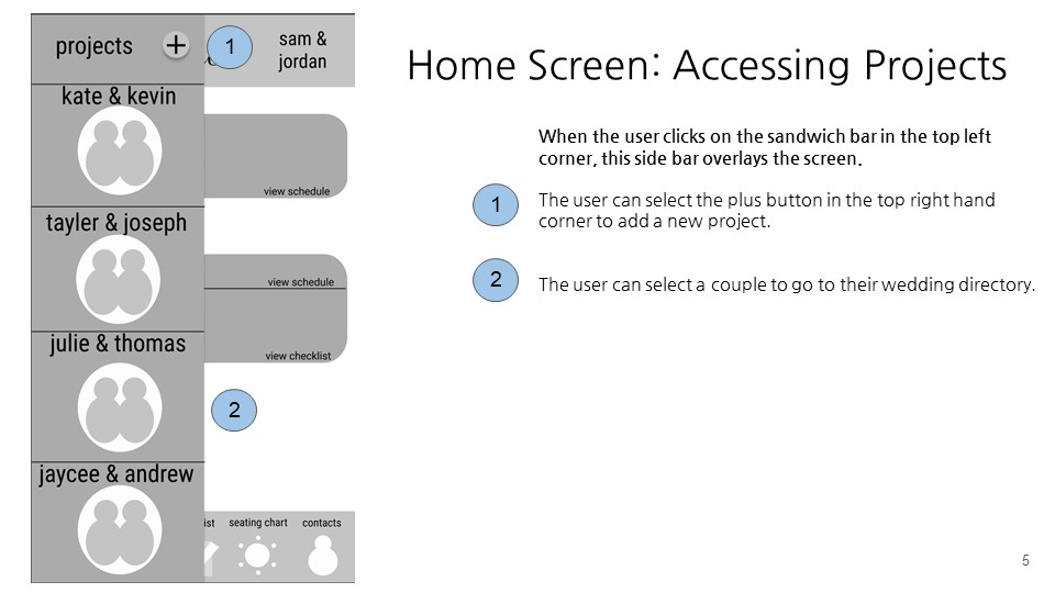
High-Fidelity Prototypes
Overview
Due to the scope of the project, we focused on three key features of our application for the high-fidelity mockup. Although our high-fidelity mockups are similar to our wireframes, some notable changes were made.
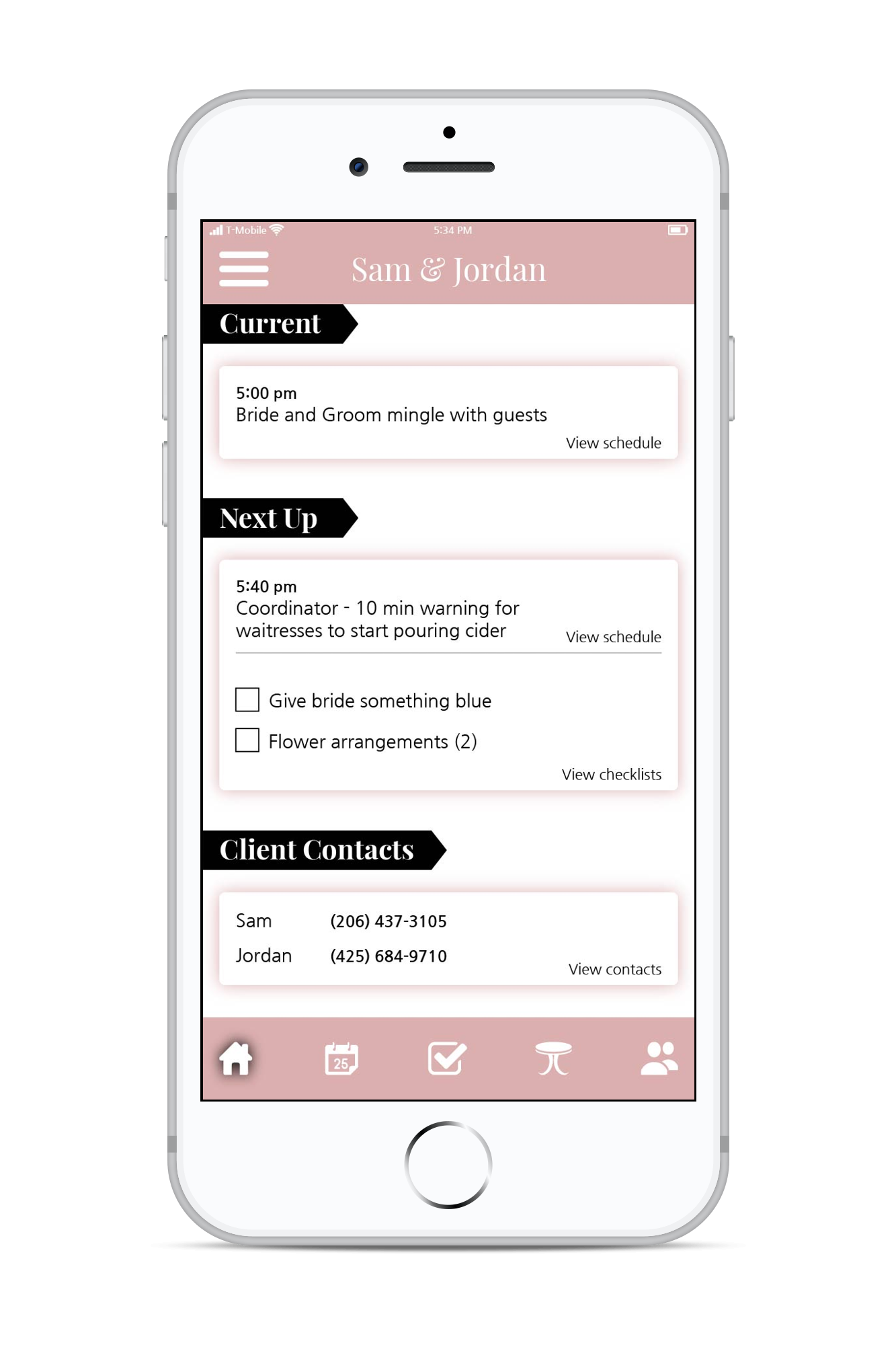
Home
On our home screen, we added important client contacts to the "at a glance" home screen so they were more easily accessible.
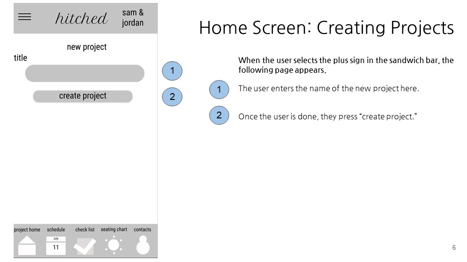
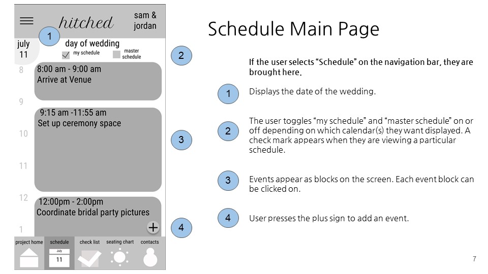
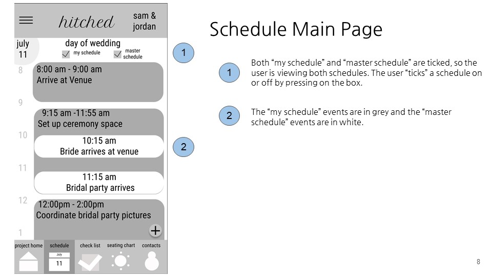
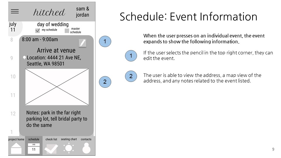
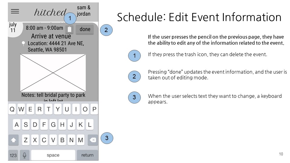
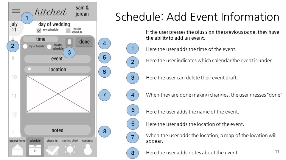
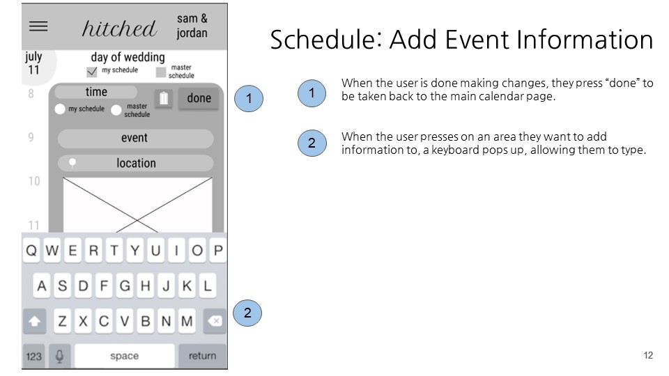
Schedule
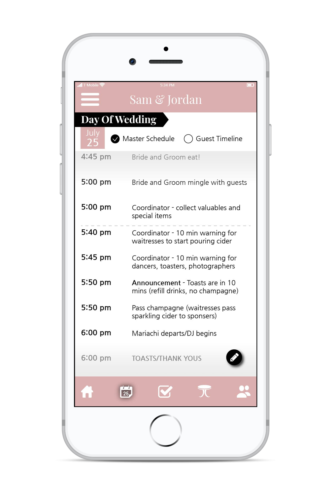
After feedback from a wedding coordinator, we readjusted our scheduling feature design to better accommodate the packed schedule of a coordinator. We additionally discovered that our original concept of “my schedule” and “master schedule” was inaccurate, and drew from an actual wedding coordinator’s schedule to create the high-fidelity mockup.
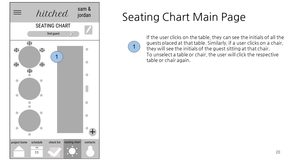
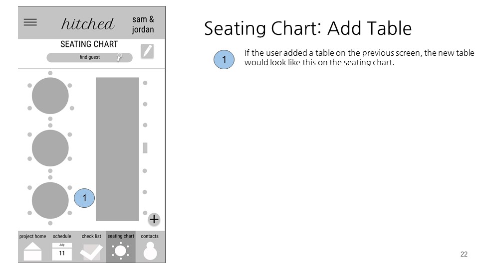
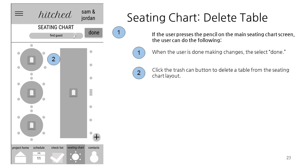
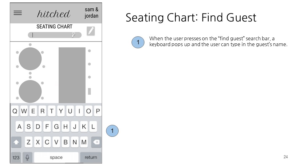
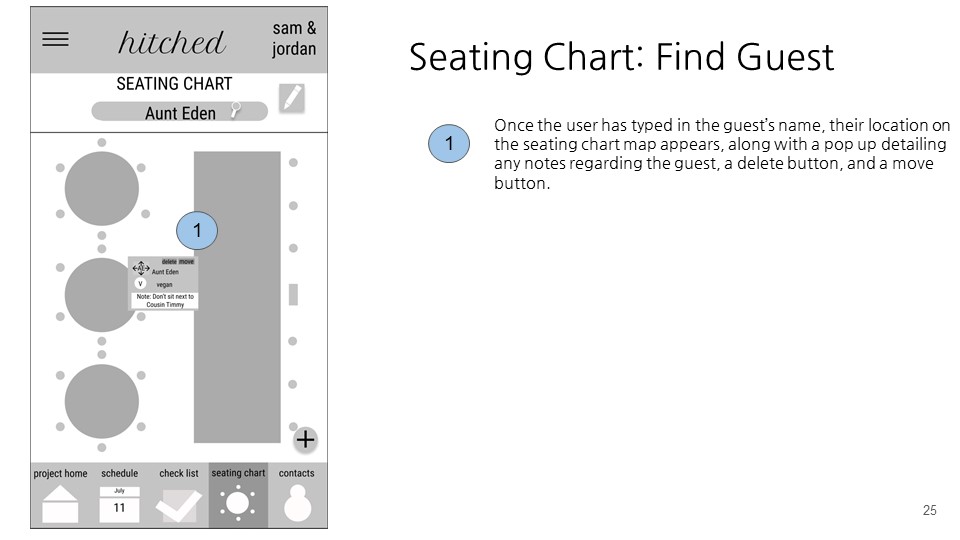
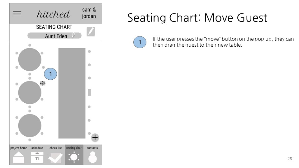
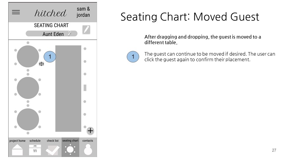
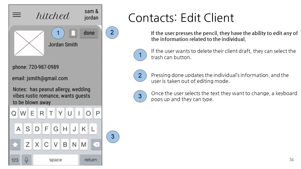
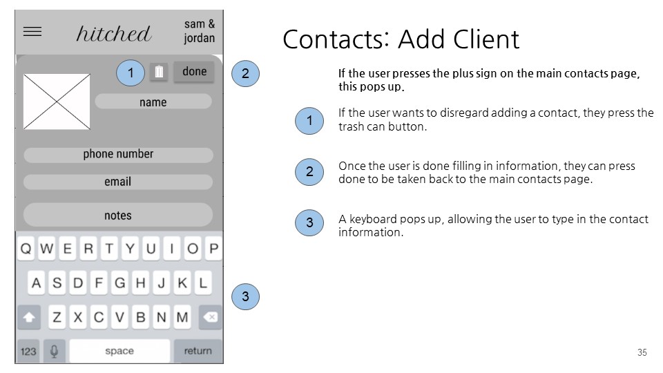
Seating Chart
On our seating pathway, as noted in the wireframes section, we changed our screens to accommodate feedback from our usability test. We created a more holistic display in which the user selects a table and all the guests seated there are listed, in addition to the existing "find guest" feature.
Takeaways
One of the major feedback we received during iteration of the wireframes was that the home screen from our paper prototypes were redundant with the navigation bar. Therefore, the home screen should instead provide a quick snapshot of the app’s upcoming contents for the coordinator.
Future Directions
In the future, we would have liked to…
- Conduct additional usability tests to further improve our prototypes.
- Incorporate both clients and full wedding planners into our user-group in order to round out the full wedding planning experience.
- Add a chat feature to better satisfy our design requirement of seamless communication between all wedding stakeholders.
- Create an web platform for wedding planners that would sync with our day of coordination app.