CHID Website
for the Comparitive History of Ideas program
From the program, "CHID is a one-of-a-kind program where students enjoy the freedom of an interdisciplinary liberal arts degree within the context of a renowned research university." As a growing and important major, it was crucial to update the program's website because prospective students often look first at the program's website.
Context
Project as part of a team spearheaded by the CHID program
Duration
3 months (March 2018 - June 2018)
My Role
Ux designer
Tools
Adobe Illustrator
Team
Leader: Michael Beach | Group Members: Sung-Duk Kang, Sruthi Dikkala, Fengdan Wu, Haimeng Gan, Theresa Tran, Mengjun Guo, Woody Gu, Michael Palomo, Ahlaam Ibraahim, Geoff Lloyd, Rio Faltys-Burr, Mary Hinsvark (italicized indicates the website team) | Website Sub-Team: Sruthi Dikkala, Michael Palomo, Theresa Tran
Purpose
How might we improve CHID's website in order to...
- ...increase awareness?
- ..clarify CHID's vision and mission?
- ...destigmatize CHID?
- ...showcase student work?
Immerse
Overview
As a group, we talked with the CHID outreach coordinator to understand the needs and wants of the program. We also analyzed the current CHID website in order to pinpoint problem areas as well as successful features.
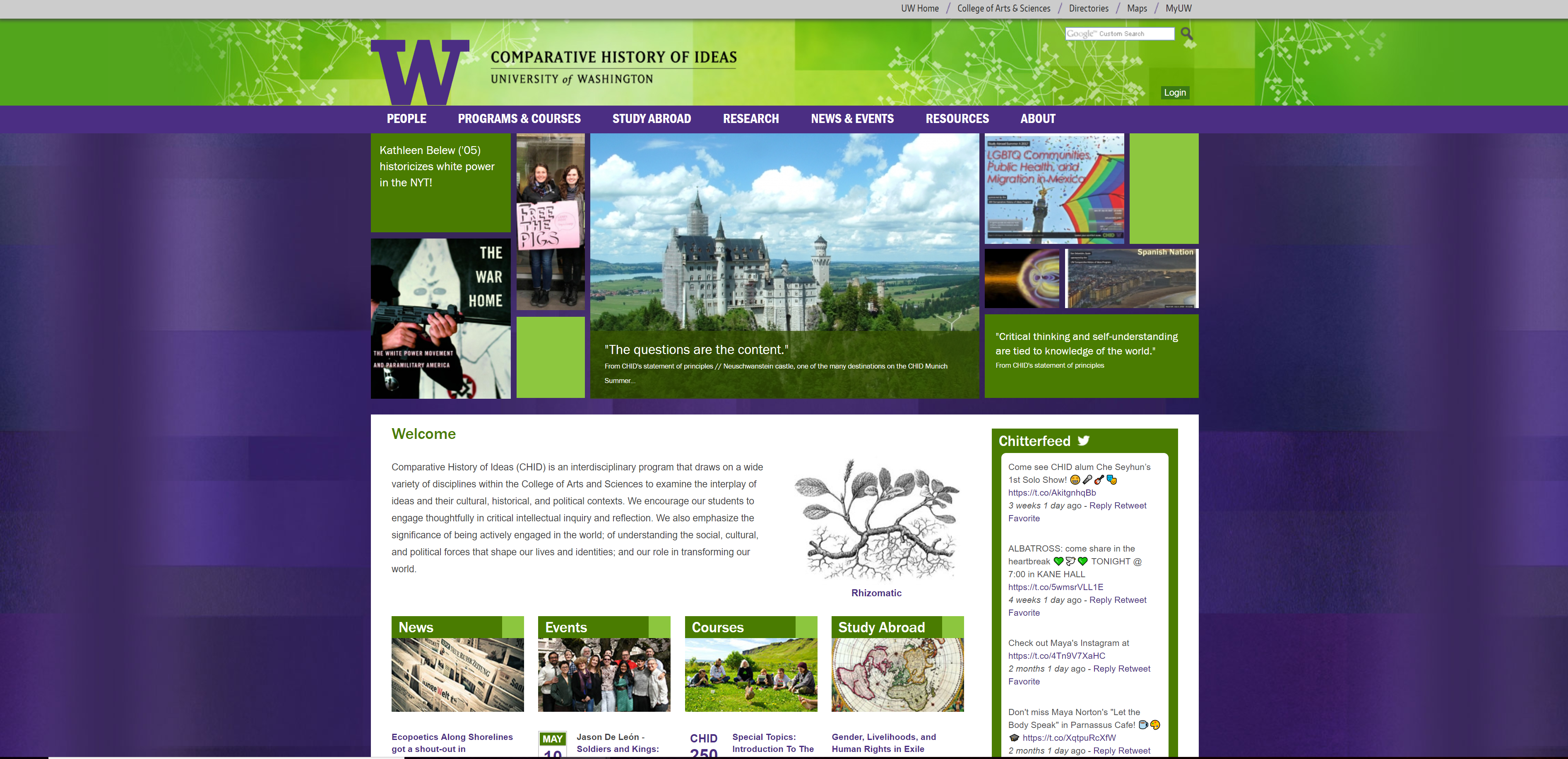
Problem Areas
| The layout of the homepage was disorganized and unappealing. | Photos do not effectively highlight student work. | The colors contrast and distract from the content. | Information is lost in the amount of content displayed. |
Ideating
Overview
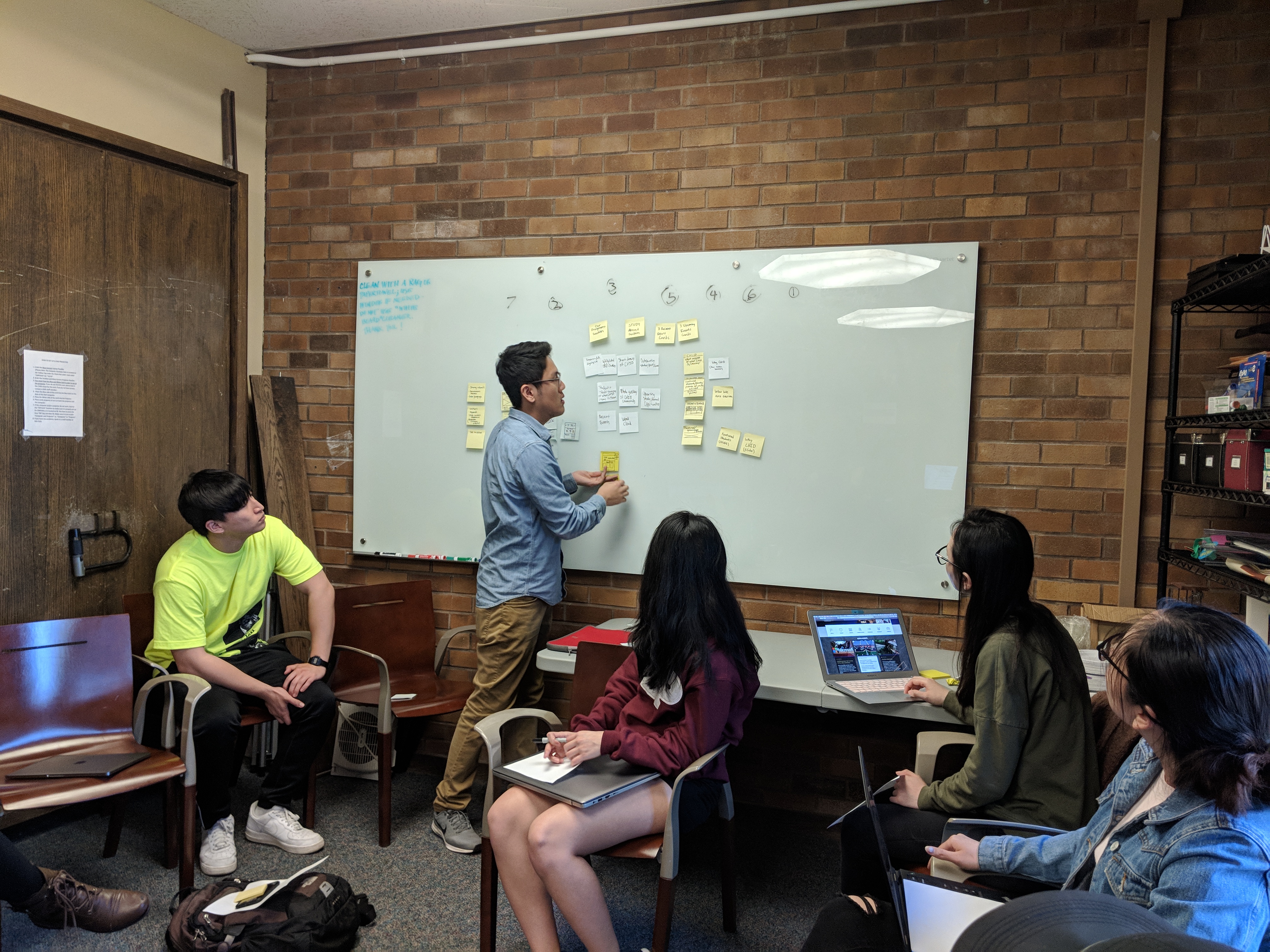
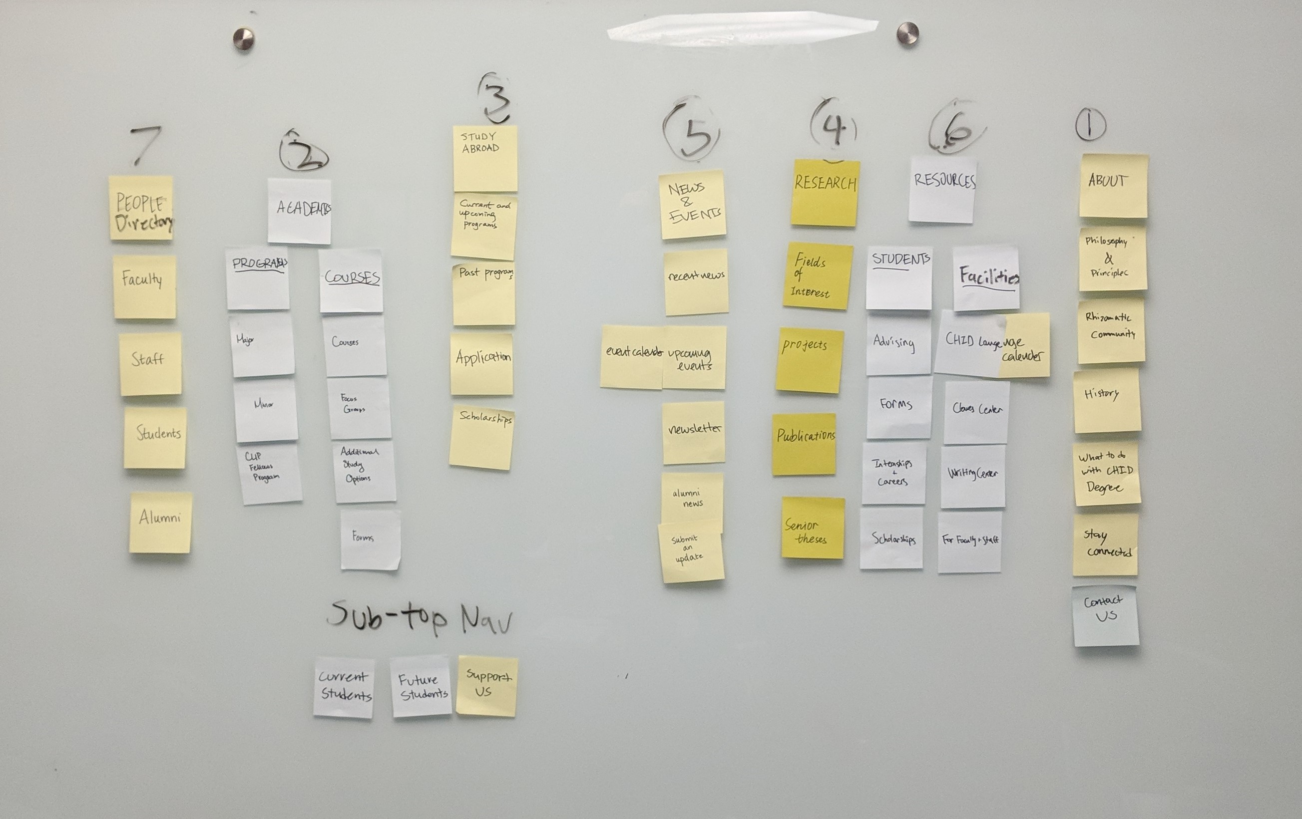
Using the hivemind methodology, the group pinpointed what was most important to include on the homepage of the website, and what should be included on the navigation bar. We also looked at other department websites for inspiration.
Prototyping
Overview
As a website team, we pooled together the wireframes that we created individually.
Iterating
Overview
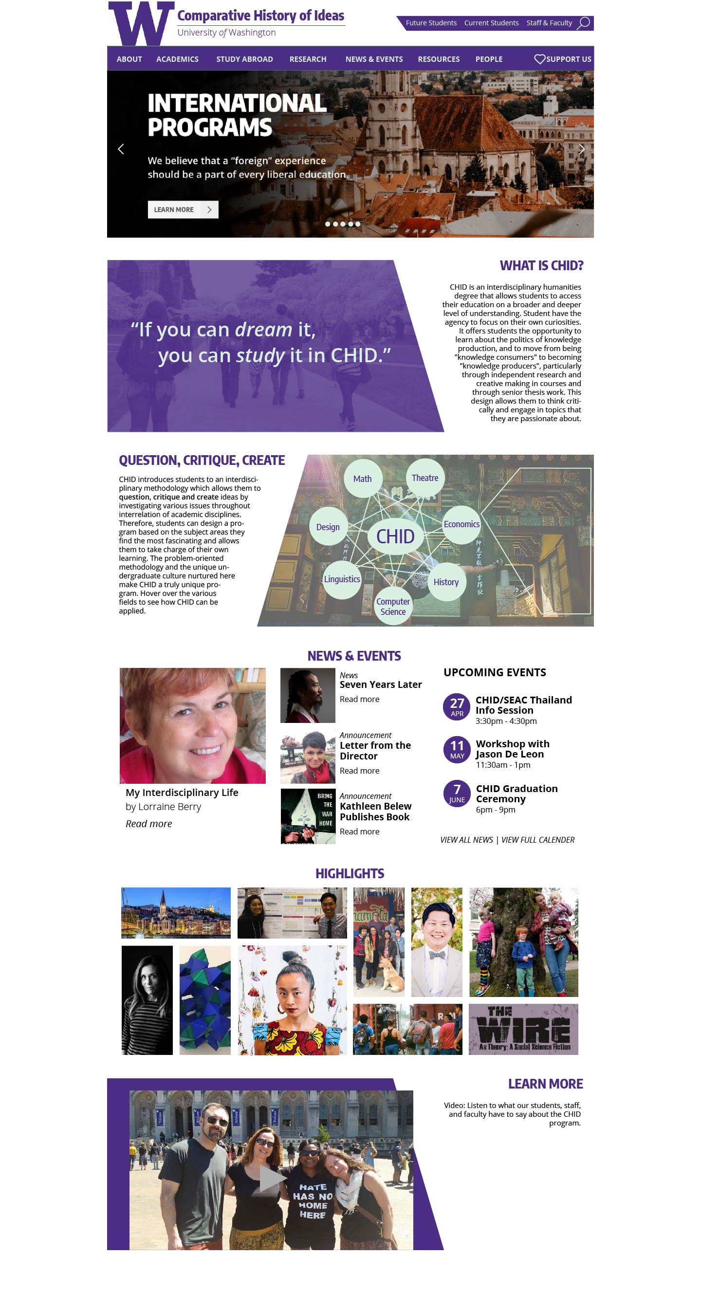
With the wireframes, we conducted heatmapping to decide on the most important features and designs for the homepage. Heatmapping allowed us to hightlight desired features and layouts from the various wireframes. Drawing on the desired features, as a website sub-team of three, we created a hi-fi prototype.
Feedback
Overview
Our sub-team performed usability tests to discover flaws and successes, and note down likes and dislikes from users. Following, the website sub-teams came back together to discuss findings and presented the two hi-fidelity prototypes and usability test findings to the group leader.
Michael Beach, the group leader, worked with the University technology team to pass along the prototypes and develop the new website.